UI/UX Design Portfolio: Year 6 Edition
HELLO RAVEN
Case Study
Icons for an Icon
How might we standardize company icons for a seamless user experience?
0 to 1 Design
Enterprise Design System
Illustration
Multi-Brand Design Alignment
A Collaboration Between 2 Teams:
User Experience (Design System Team) & UX Engineering
Fine Print
Role
Lead UX Designer
Lead Visual Designer
Responsibilities
Design System Creation
Design System Maintenance
Icon Illustration
Duration
8 Months
Tools
Figma
Adobe Illustrator
Primary Deliverables
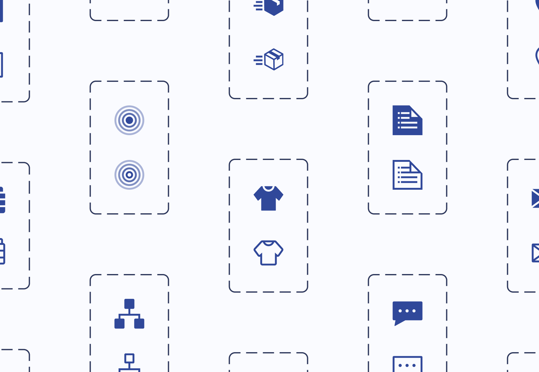
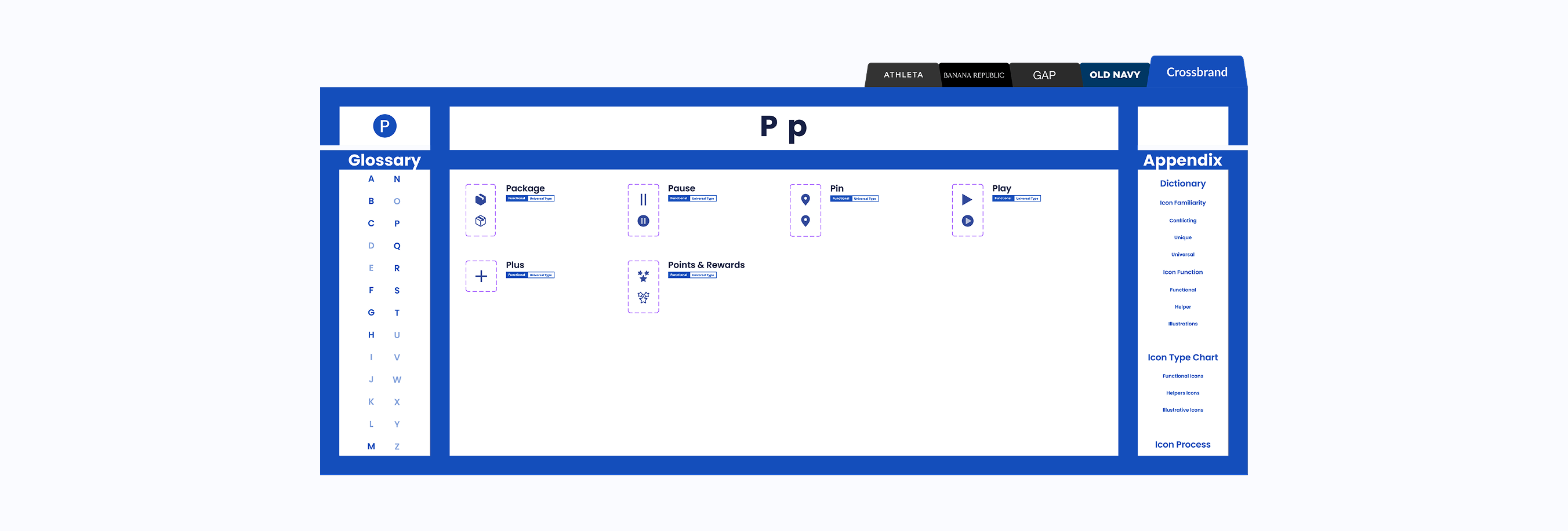
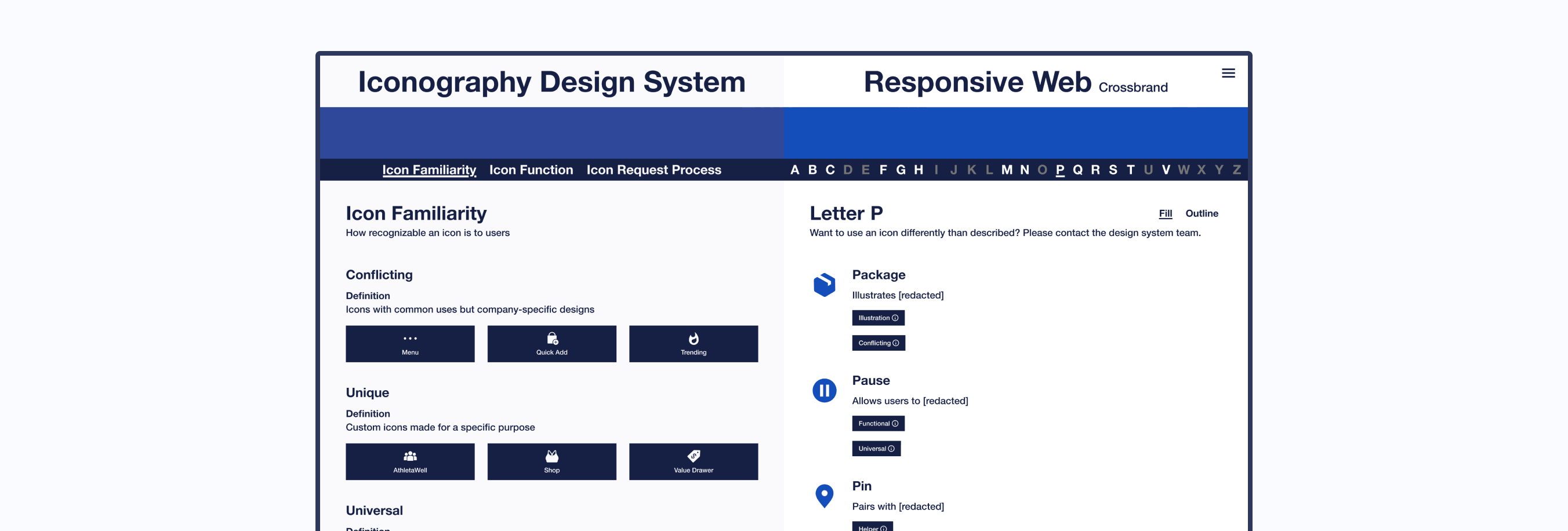
Icon Design System
10 Component Libraries
Icon Usage Guidelines
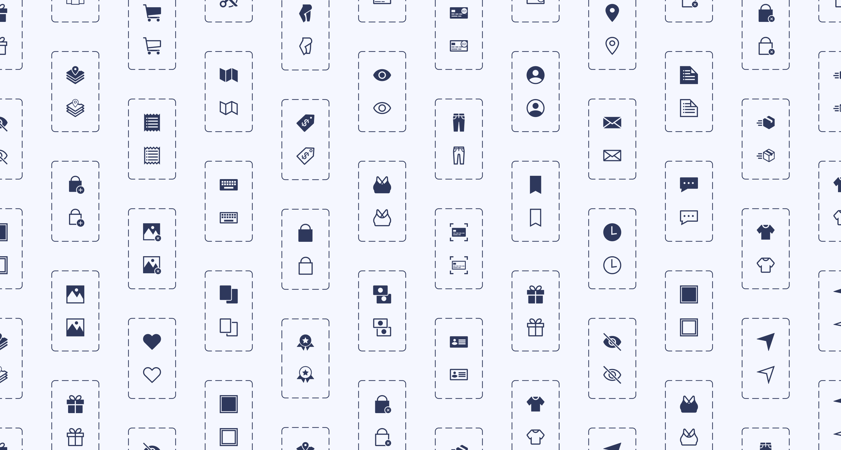
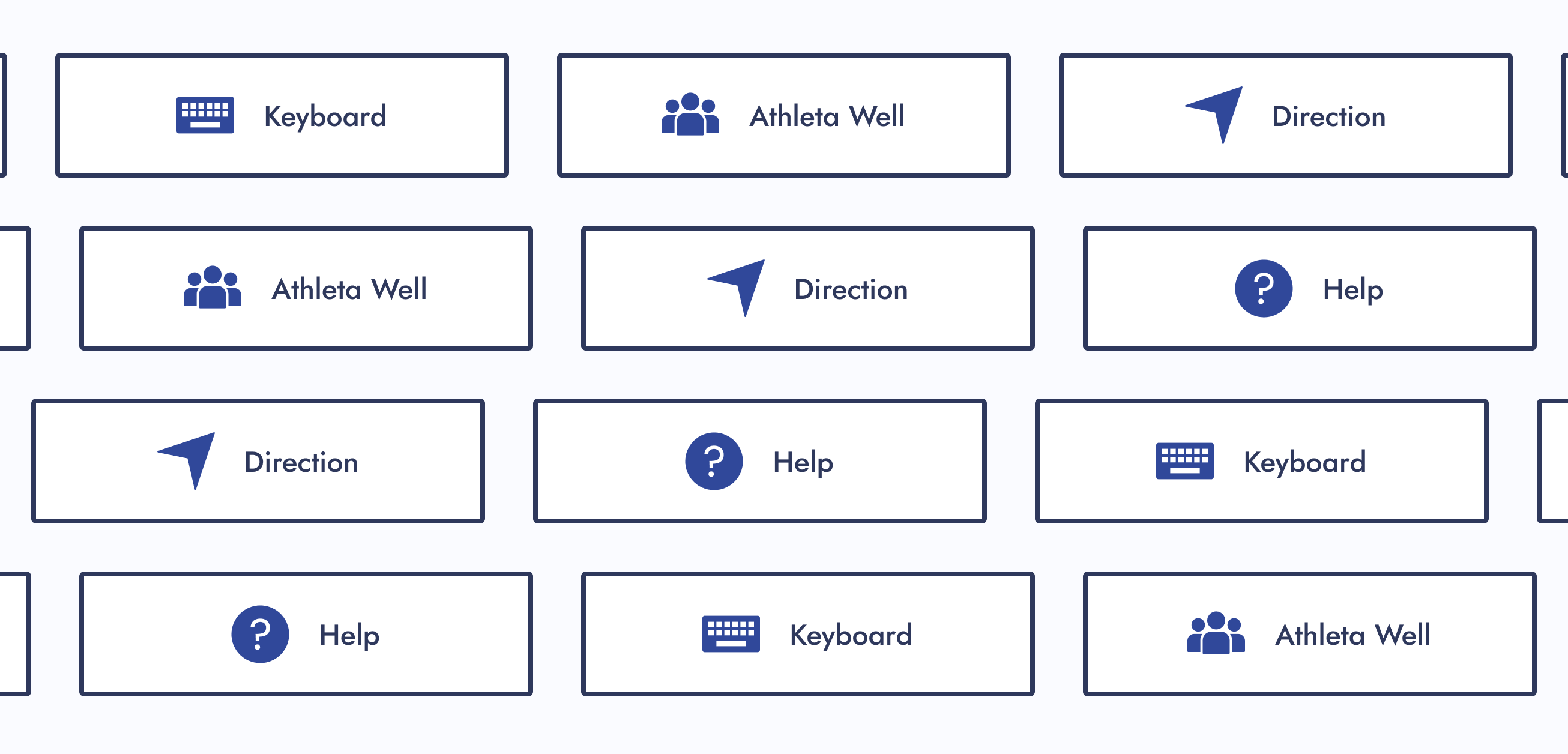
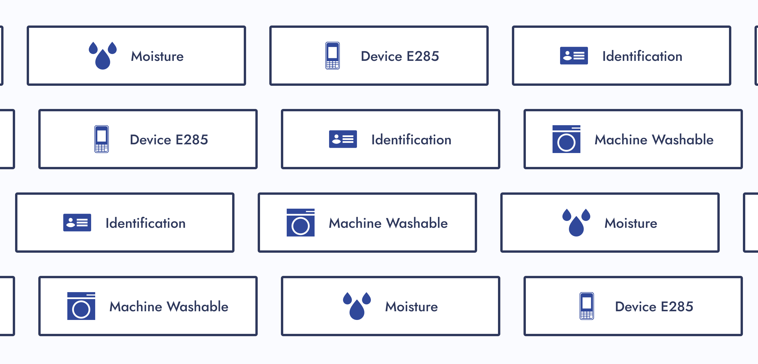
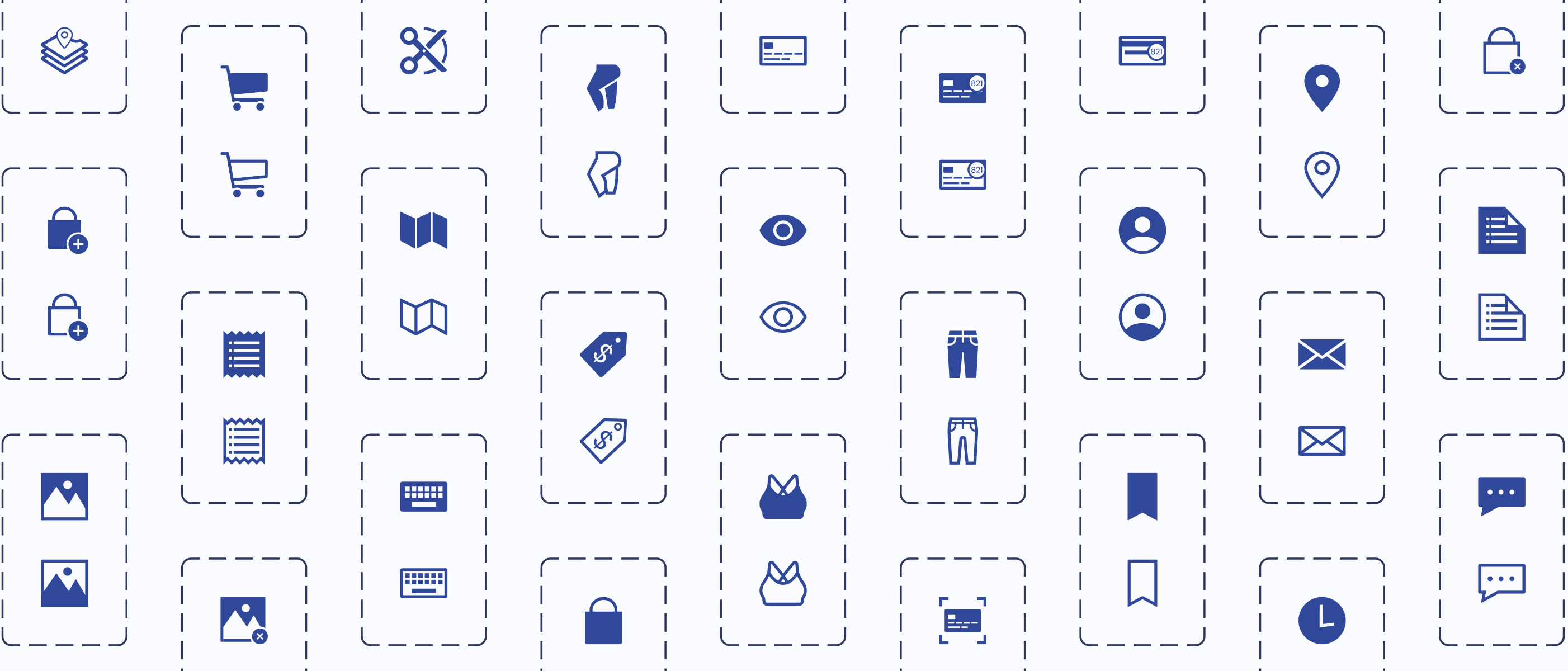
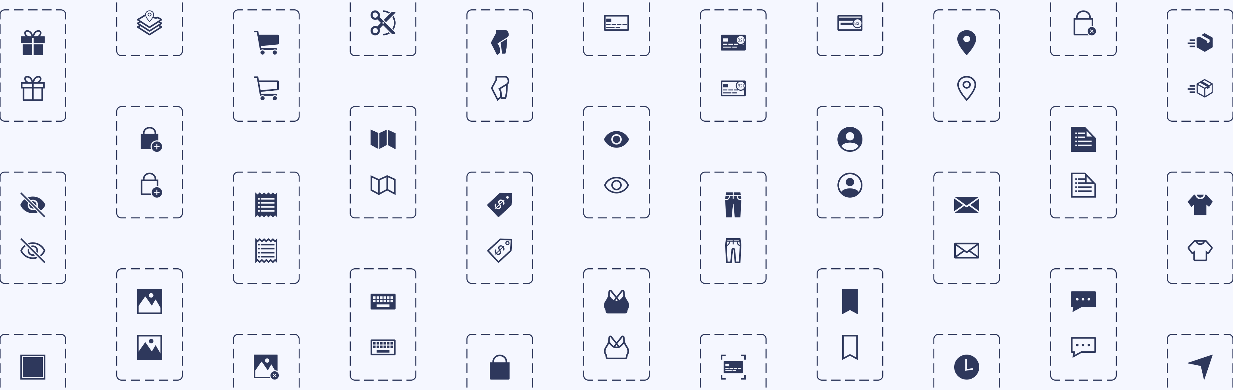
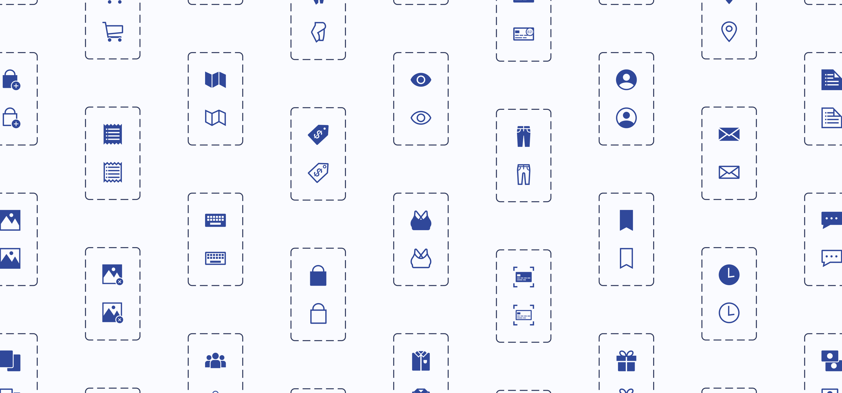
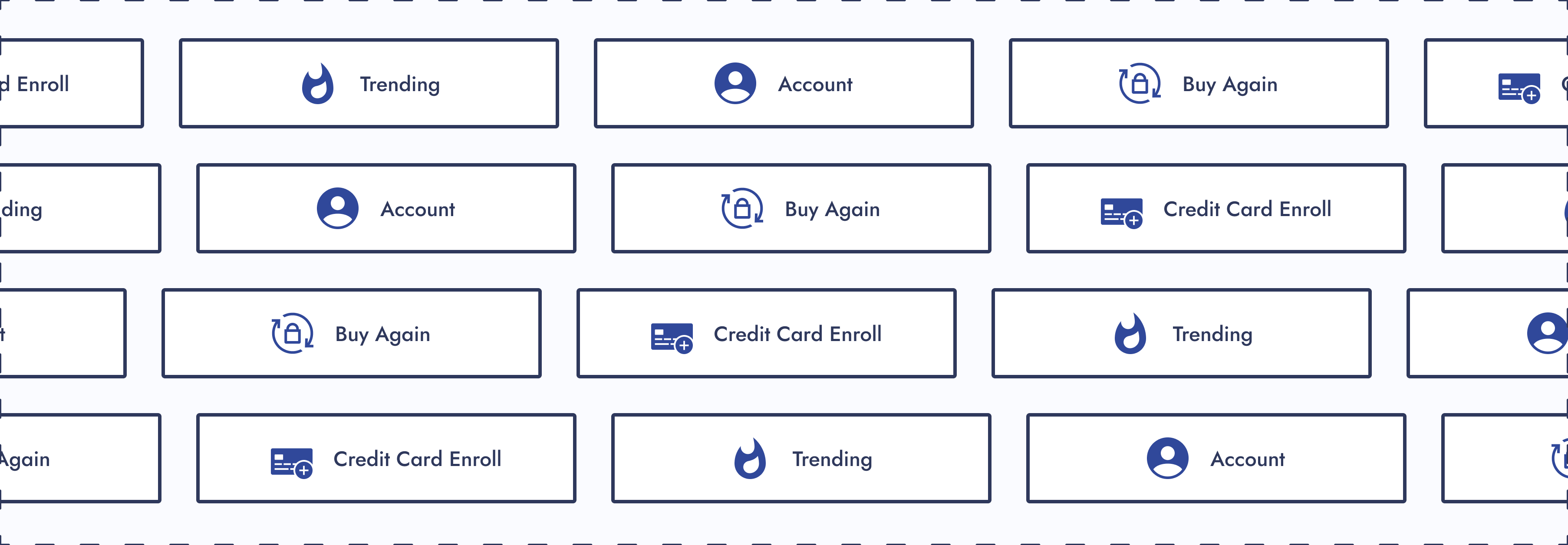
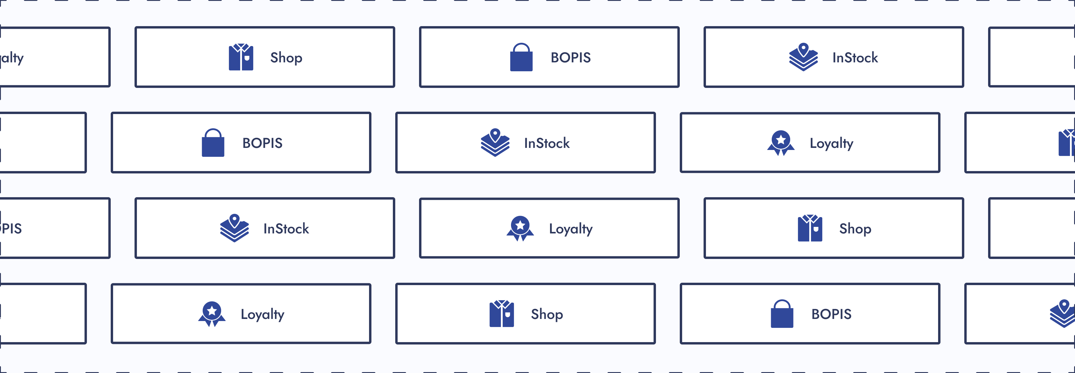
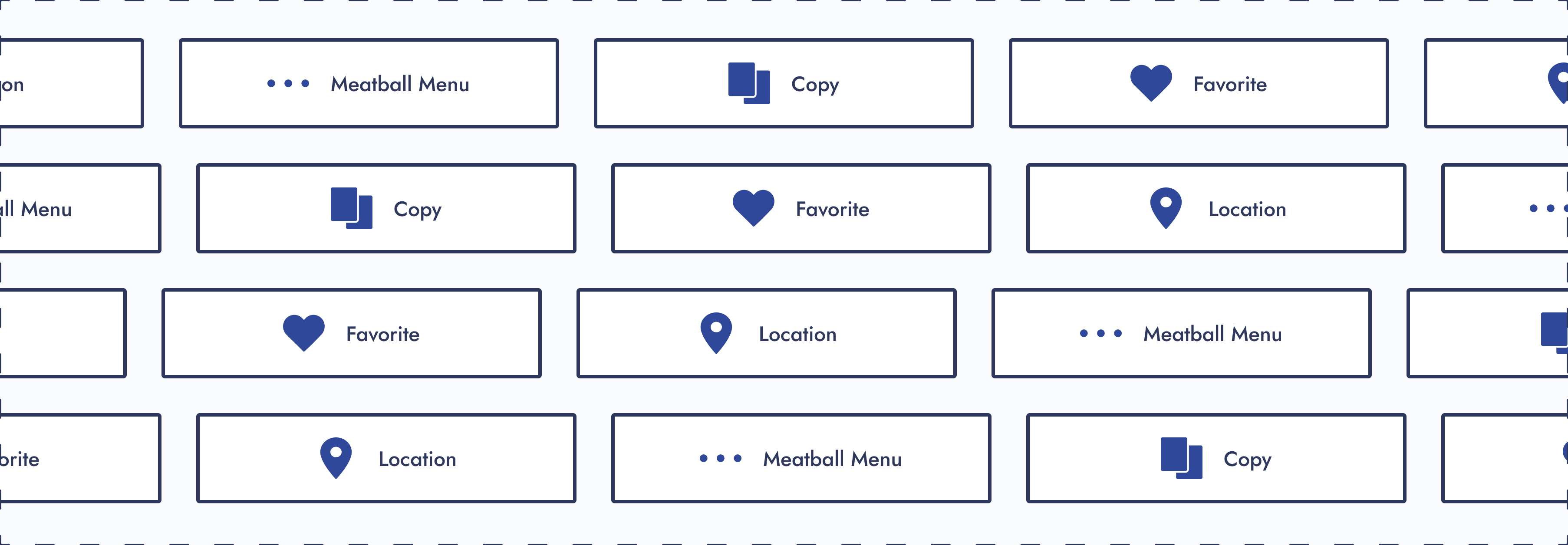
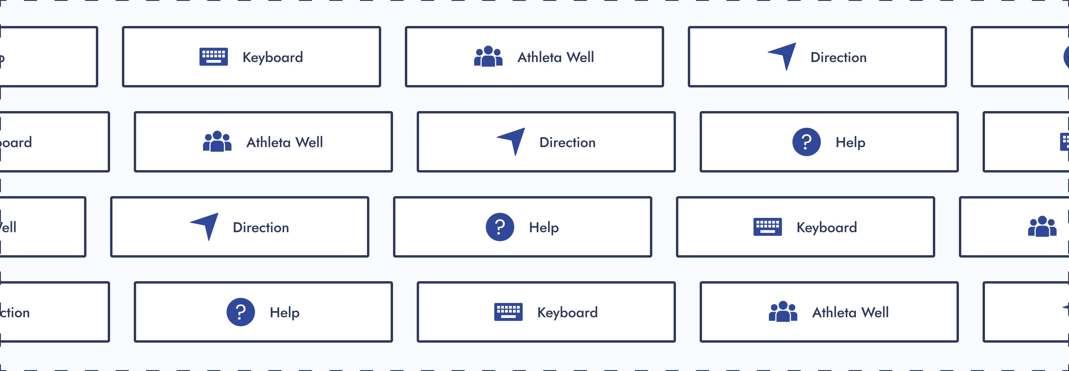
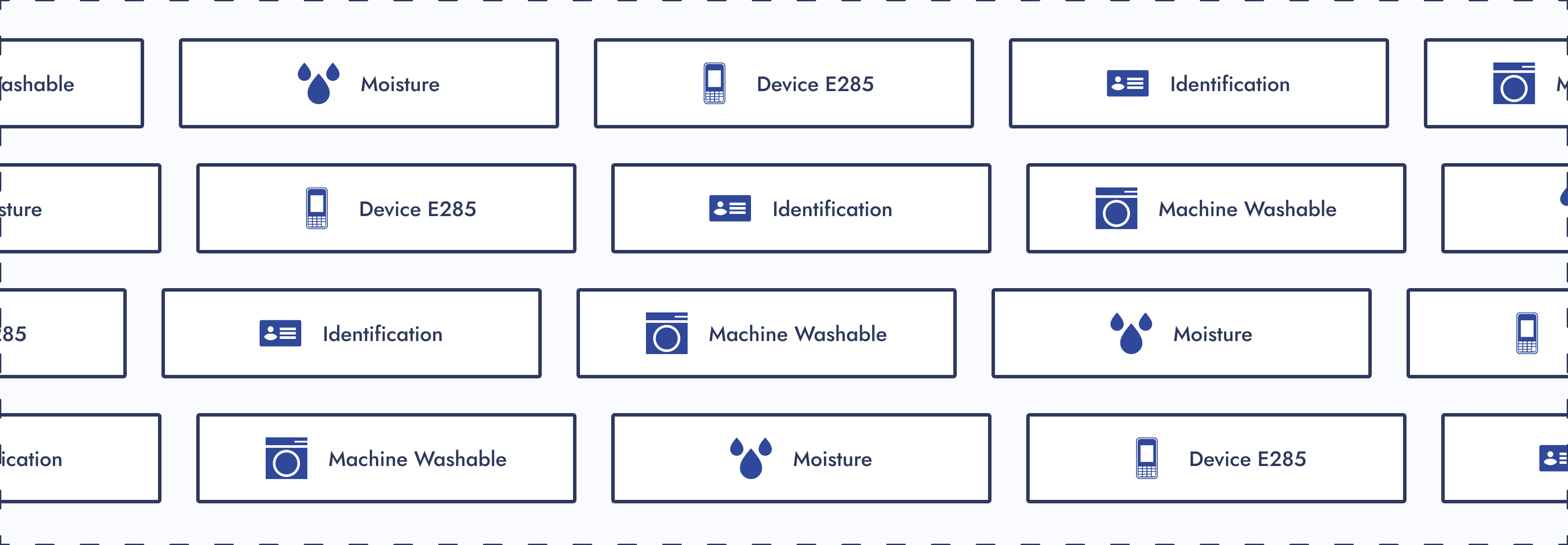
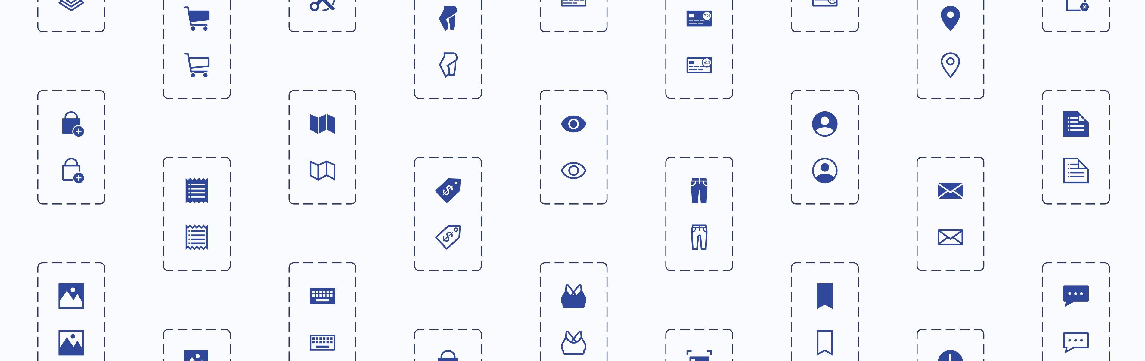
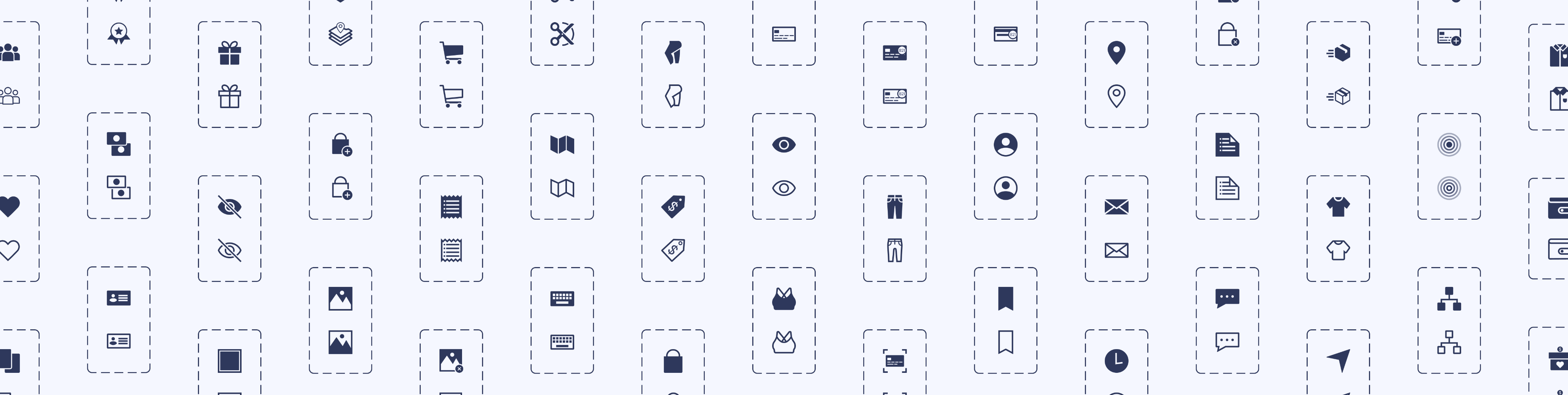
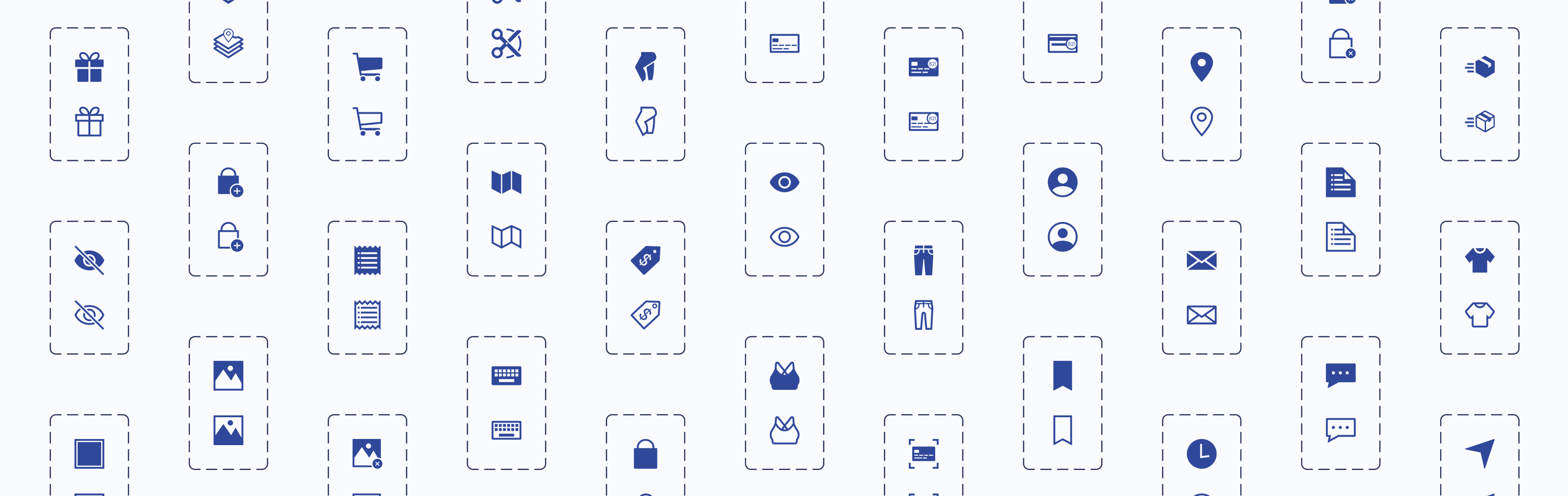
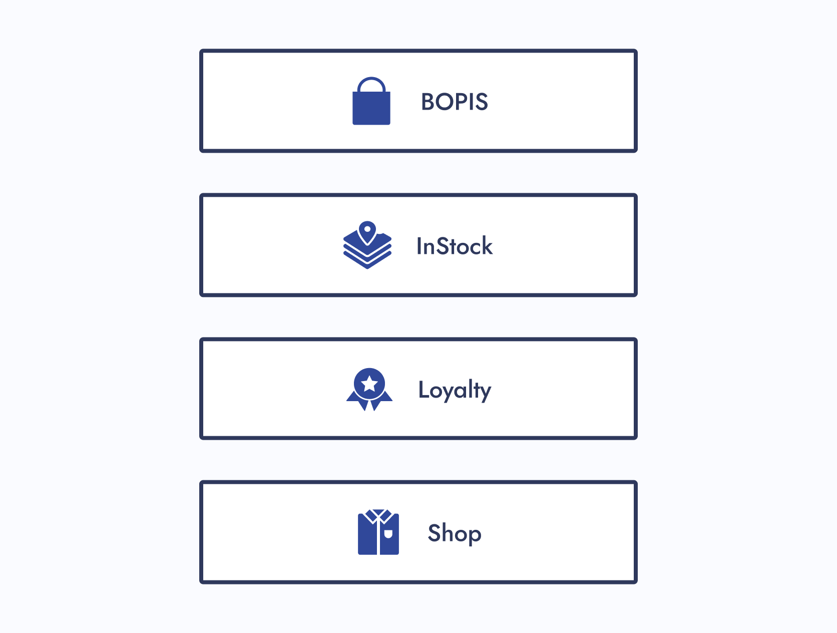
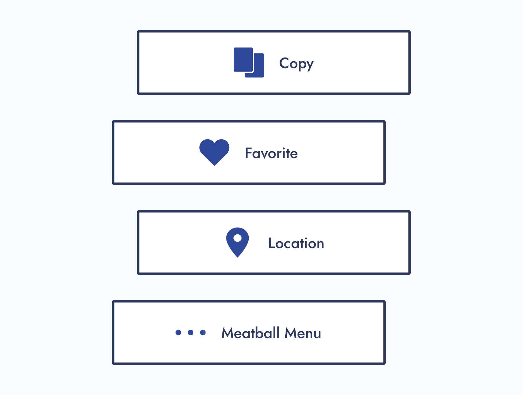
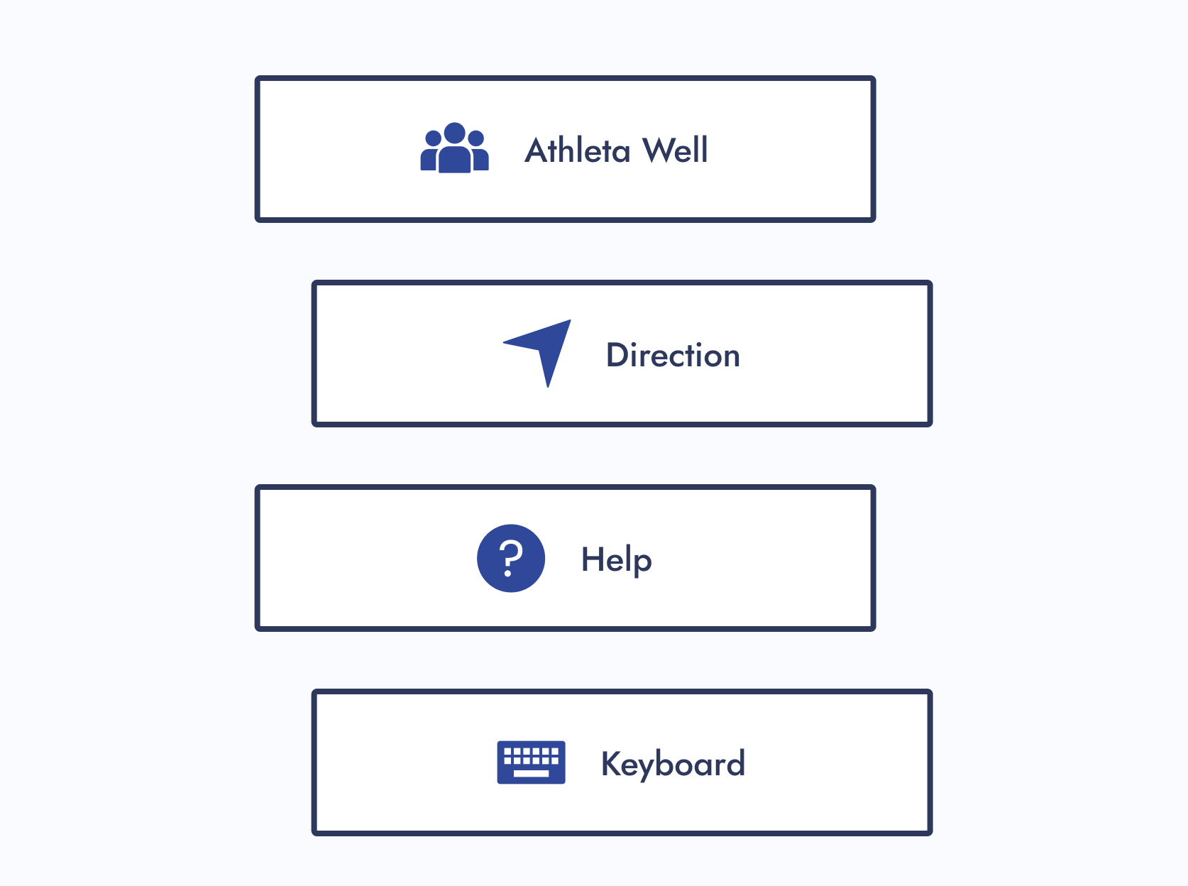
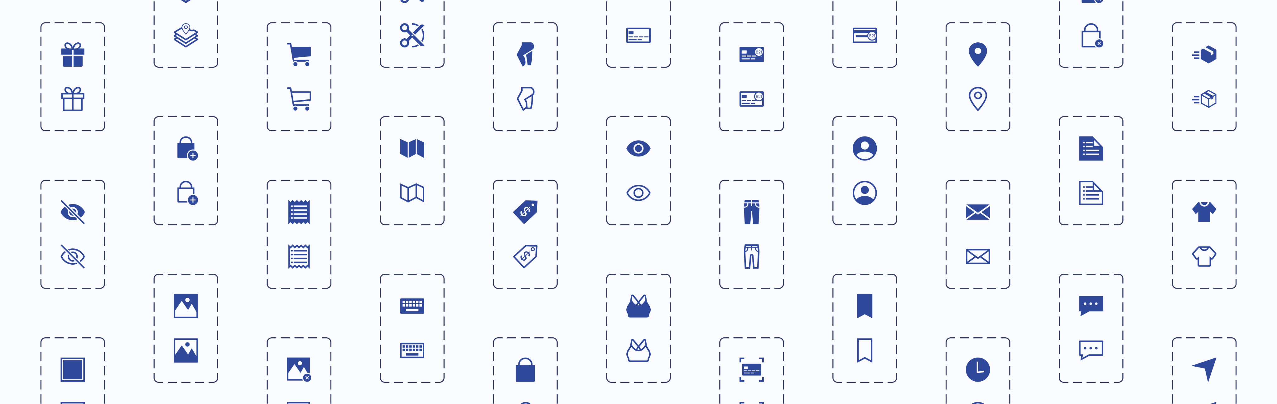
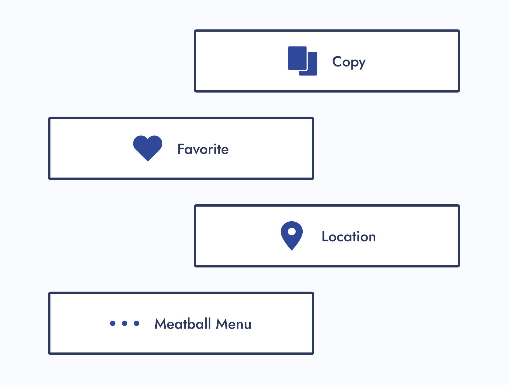
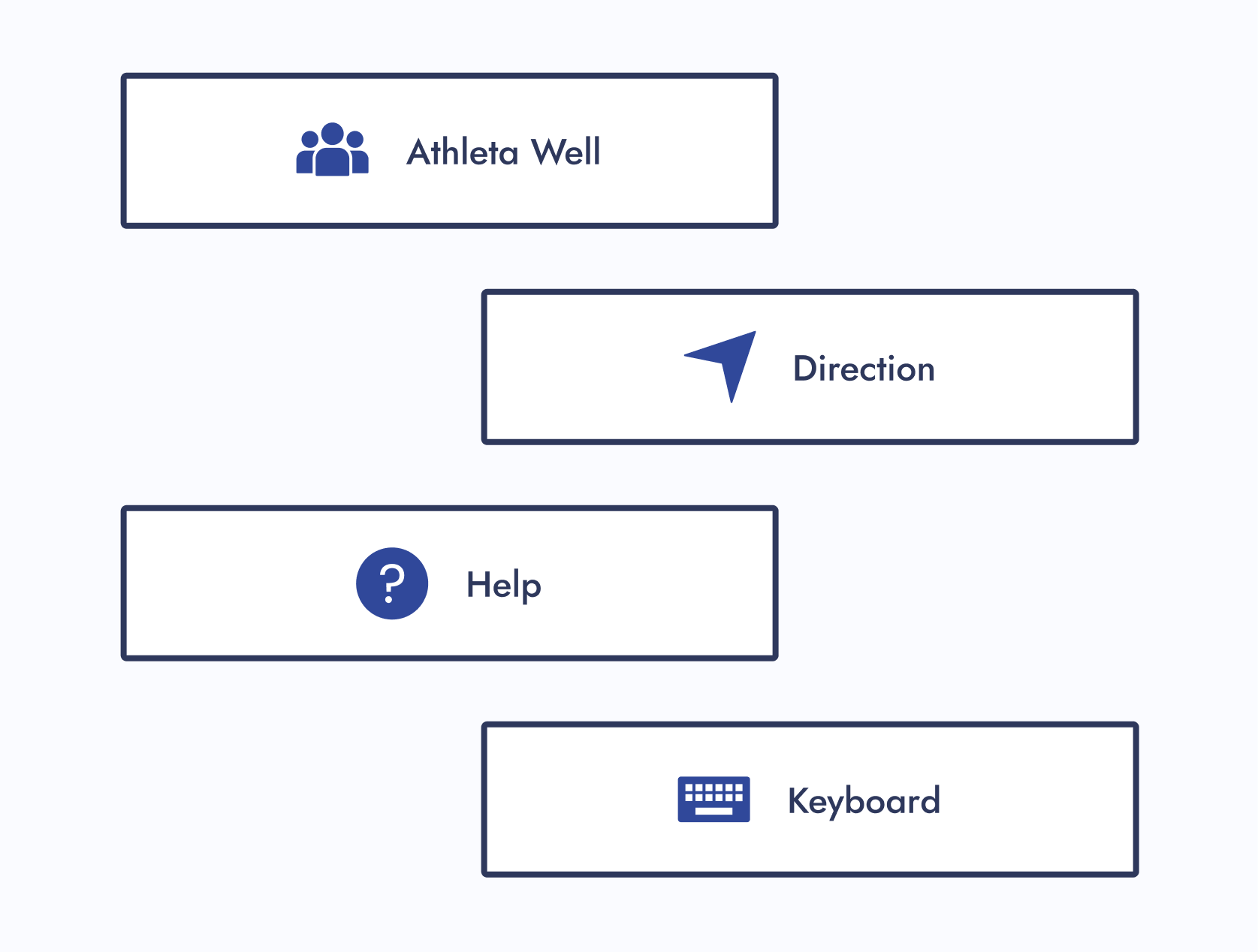
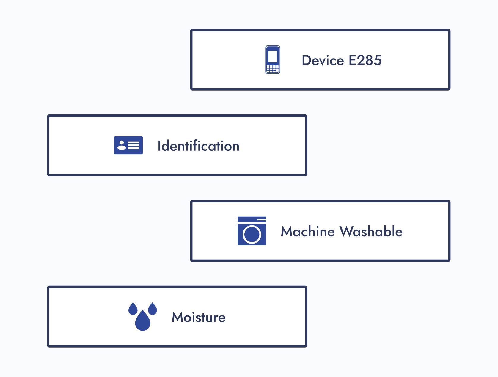
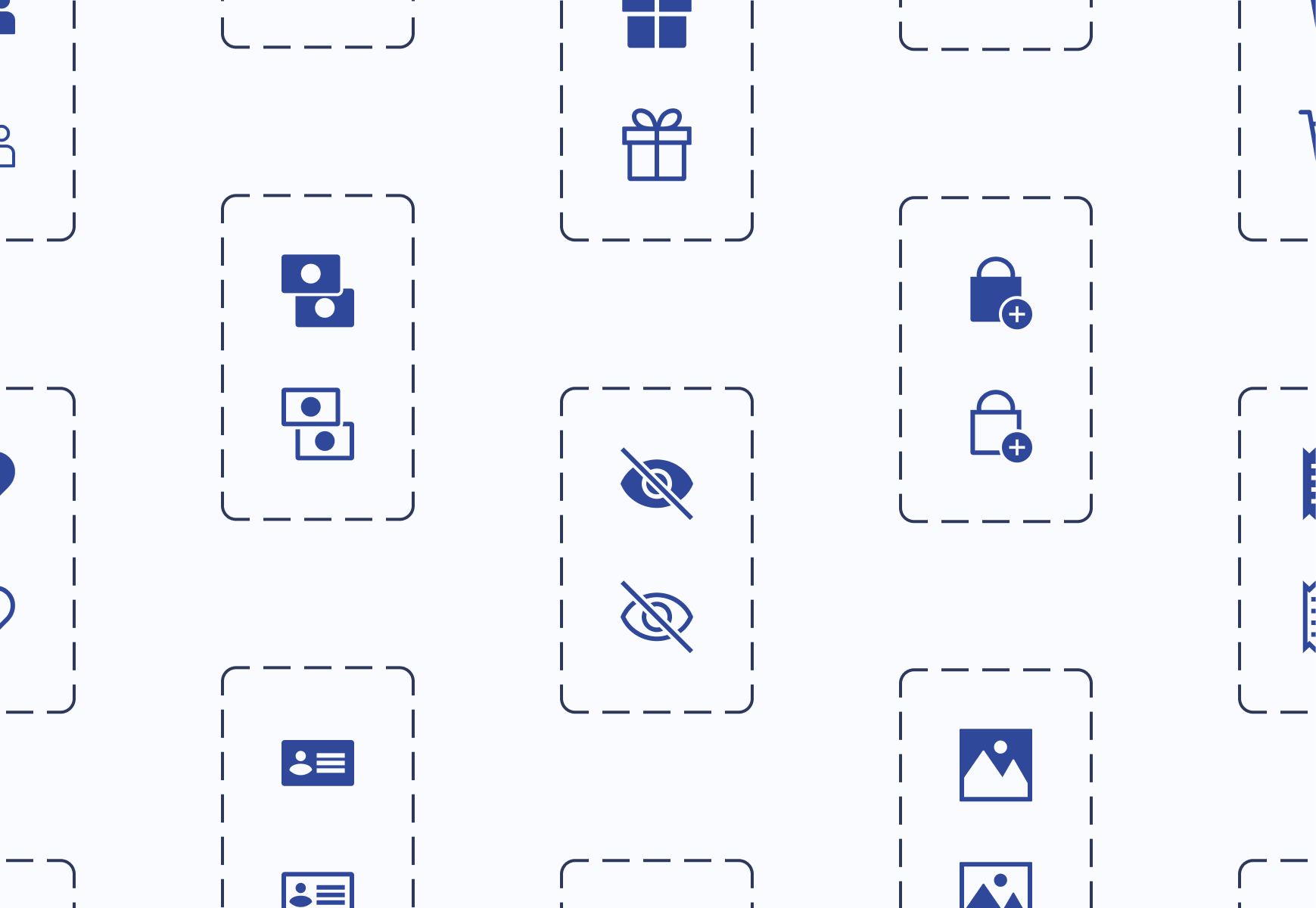
200+ Illustrated Icons
Icon Illustration Guidelines
Icon Request Process
Icon Category Dictionary
Company
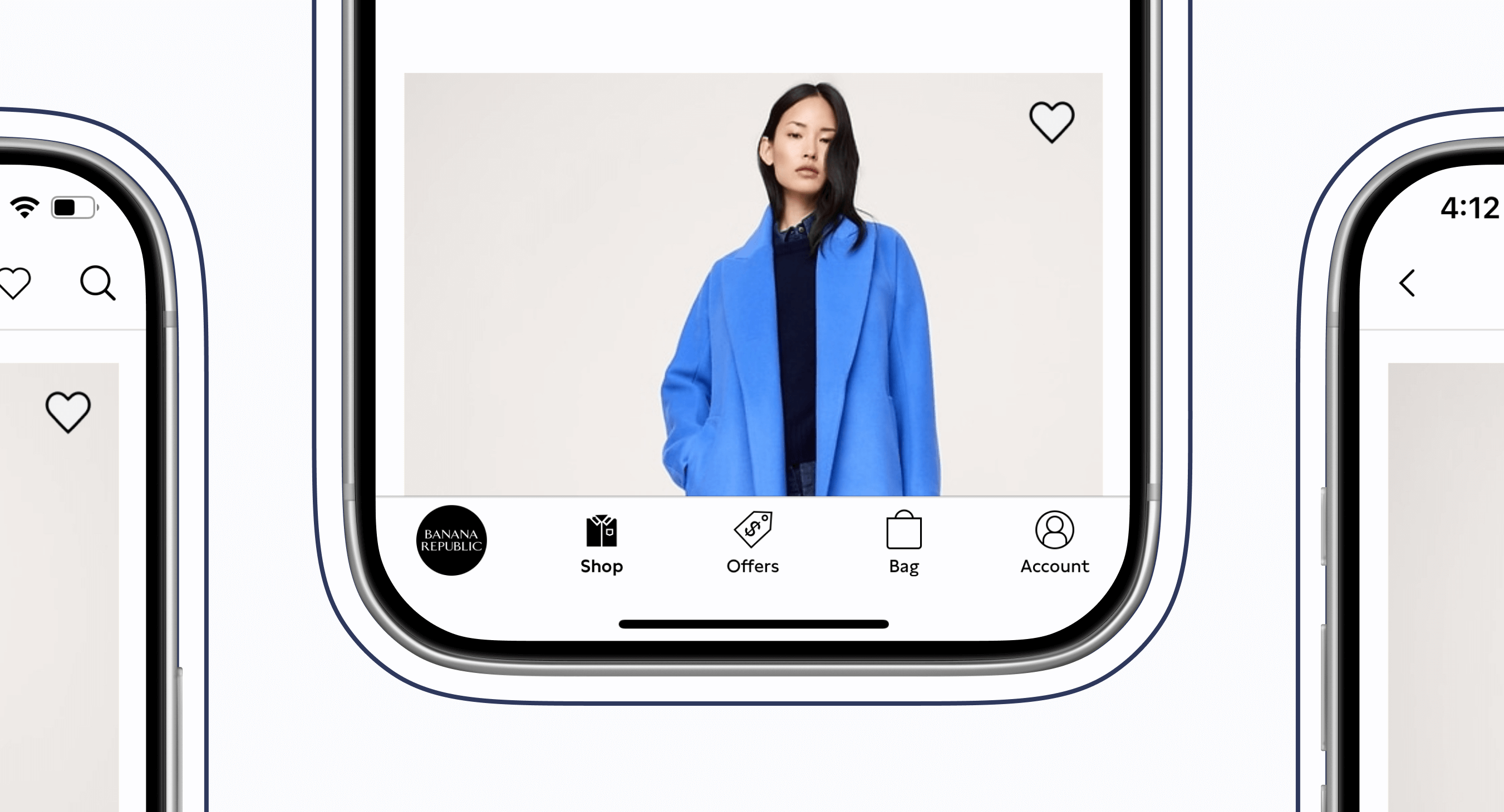
Gap Inc.
Industry
Apparel Retail
At a Glance
Chapter 01
The Pain Points
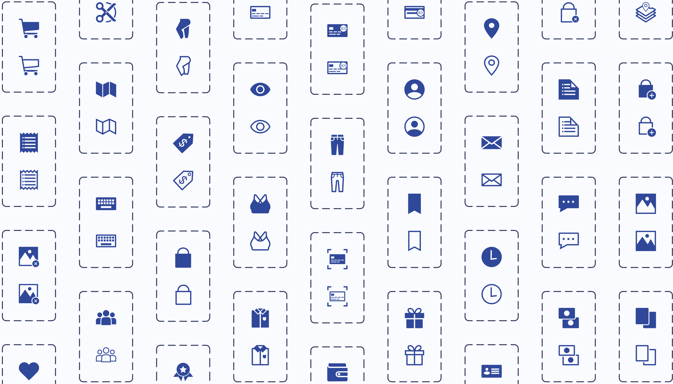
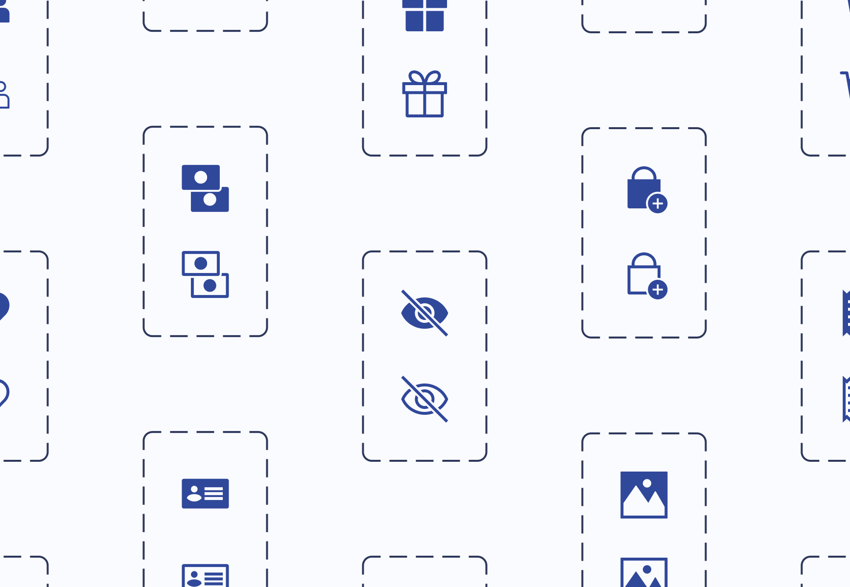
- Company icons weren’t located in one place.
- There were barely any usage guidelines for icons.
- One icon would have many style variations.
- Other designers were either creating their own icons or externally sourcing them.
Solution: Let’s build a dedicated design system for company icons!
Chapter 02
The Discovery
Designers needed to work as efficiently as possible, easily find icons, and know how to use them. I had some thoughts on how to address these business and user needs while tackling the project challenges.
Chapter 03
The Minimal Viable Product (MVP)
The following steps were completed to publish the MVP of the living icon design system:
- Step 1: Alignment
- Step 2: New File
- Step 3: Categorization
- Step 4: Design System UX
- Step 5: Icon Request Process
- Step 6: Publish
Chapter 04
The Final Results
- 1 source-of-truth icon design system
- Over 370 parent icons componentized
- Over 200 icons illustrated
- 10 themed component libraries created
- 1 Icon request process created
My Takeaway: Nesting components and adding menus within a Figma file are a Godsend. These features were extremely helpful in keeping the design system user-friendly and organized.


The Introduction
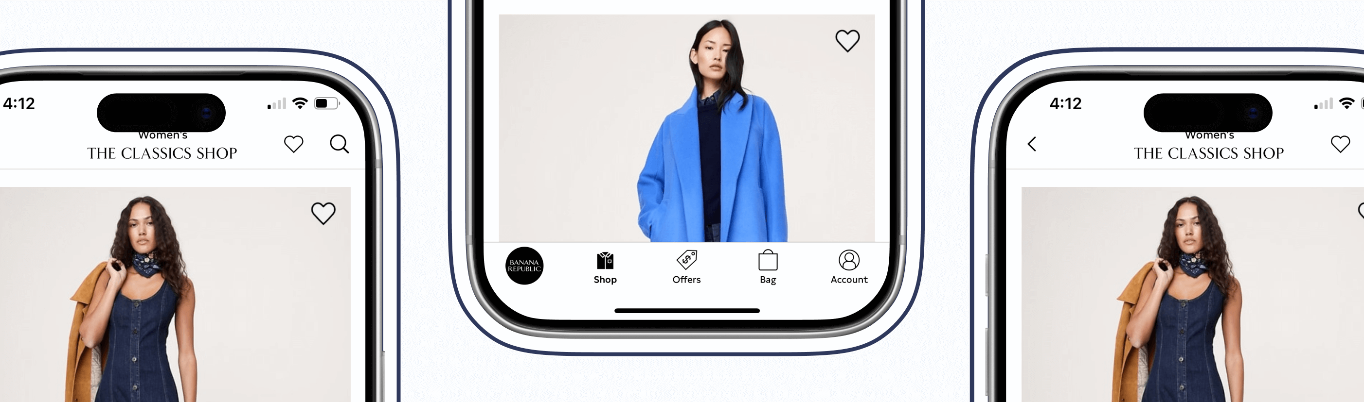
Imagine working on a project and realizing an icon is needed. While searching for one, you notice that icons are located in various Figma–and even Adobe XD—files. You also notice that one icon can have many style variations. What if the current variations don’t match the style you're looking for? Should you just create another one?
That was the experience of Gap Inc. UX designers. As the Design Systems team, my manager tasked me to solve this problem.
The Pain Points
Unorganized Icons
Company icons weren’t located in one place.

Thought
This would get annoying. Imagine seeing an icon housed somewhere, but you couldn’t remember where.
No Usage Guidelines
There were barely any usage guidelines for icons.
Thoughts
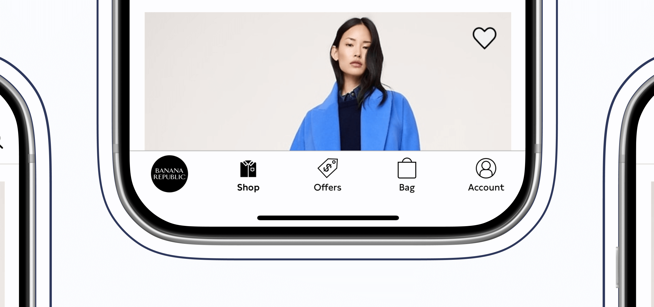
How were designers supposed to know how to use an icon? Should a heart be used for “favorites”, or should “favorites” be a star? Lack of usage guidelines could lead to an inconsistent user experience.
Many Style Variations
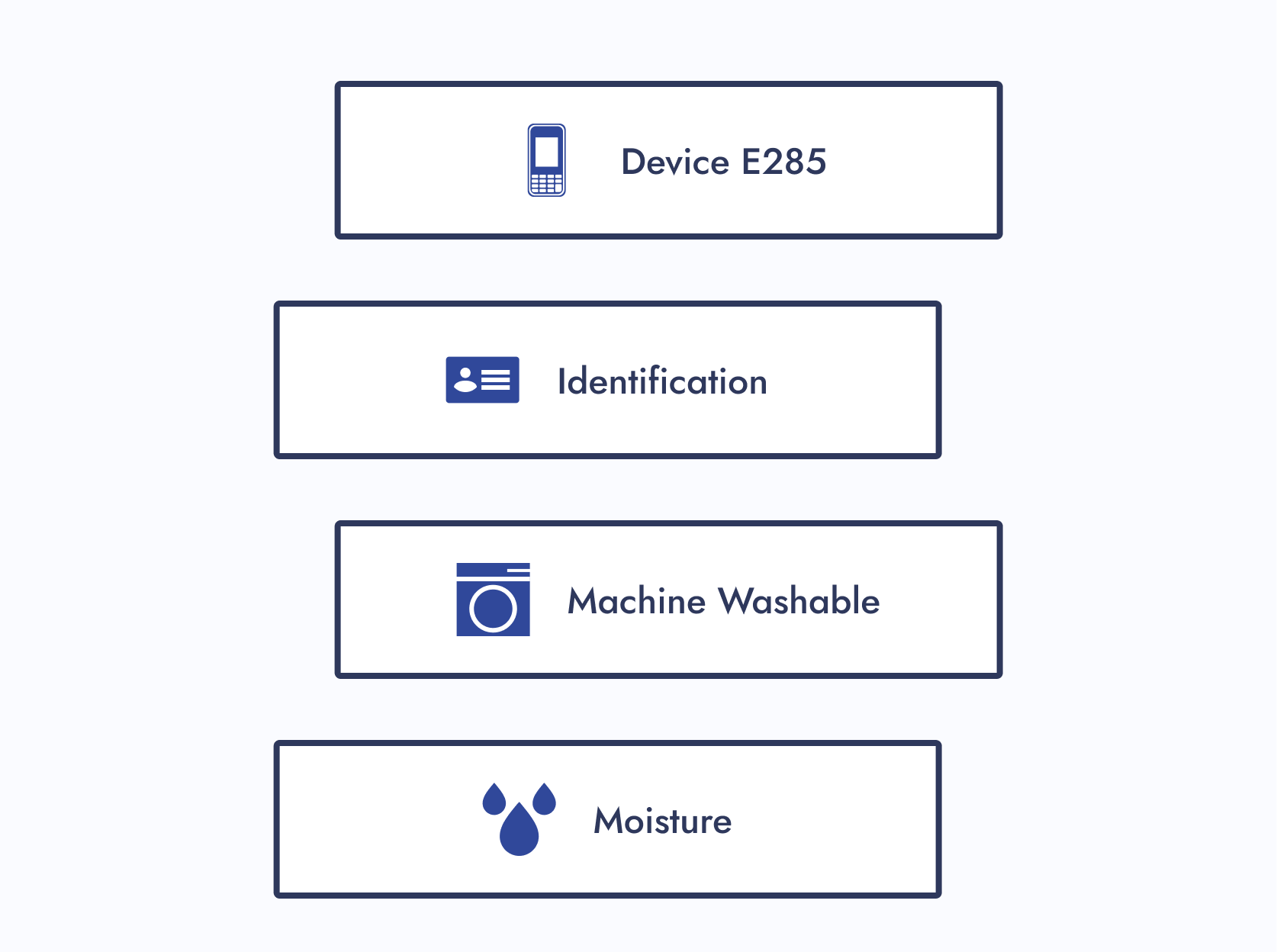
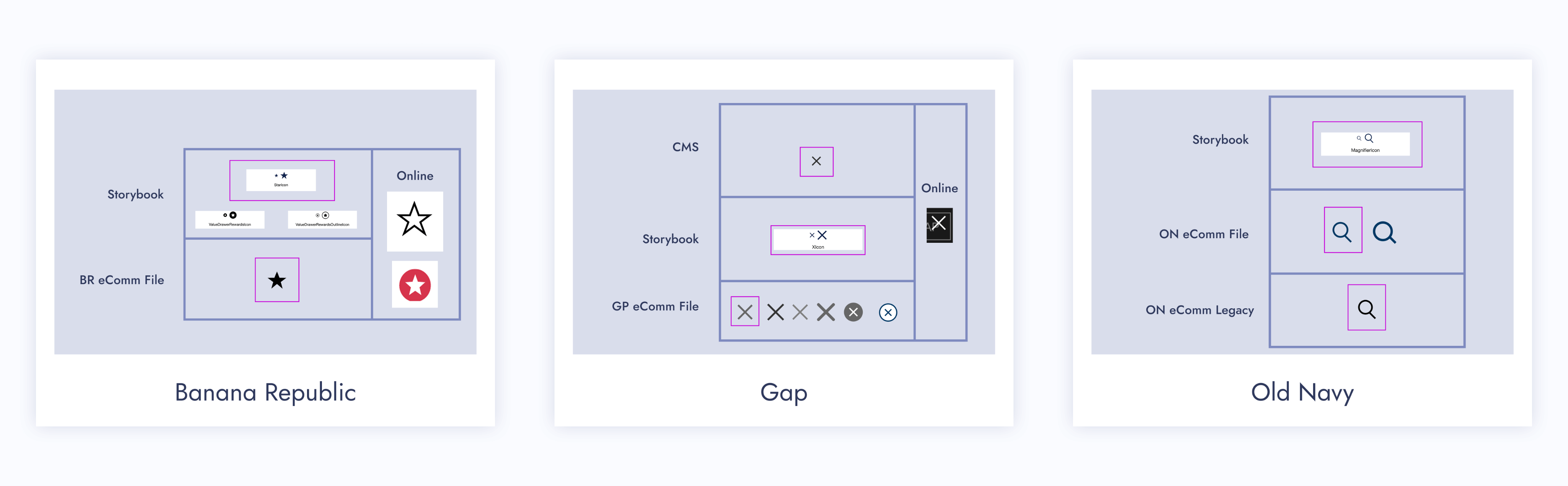
One icon would have many style variations.
Thoughts
What would happen if the current variations didn’t match the established icon styling within an experience? Would the designer create another variation, therefore, adding more to the mess?
No Source of Truth
Other designers were either creating their own icons or externally sourcing them.
Thought
This only deepened the ongoing issues.
How Might We...
How might we ensure icons are being used correctly and are found in one place?
How might we give users a consistent experience with our icons?
How might we standardize company icons for a seamless user experience?
The Pain Points
The Solution
Let’s build a dedicated design system for company icons!
The Discovery
Business Needs
Have designers work as efficiently as possible.
User Needs
Designers need to easily find icons and know how to use them.
Thoughts
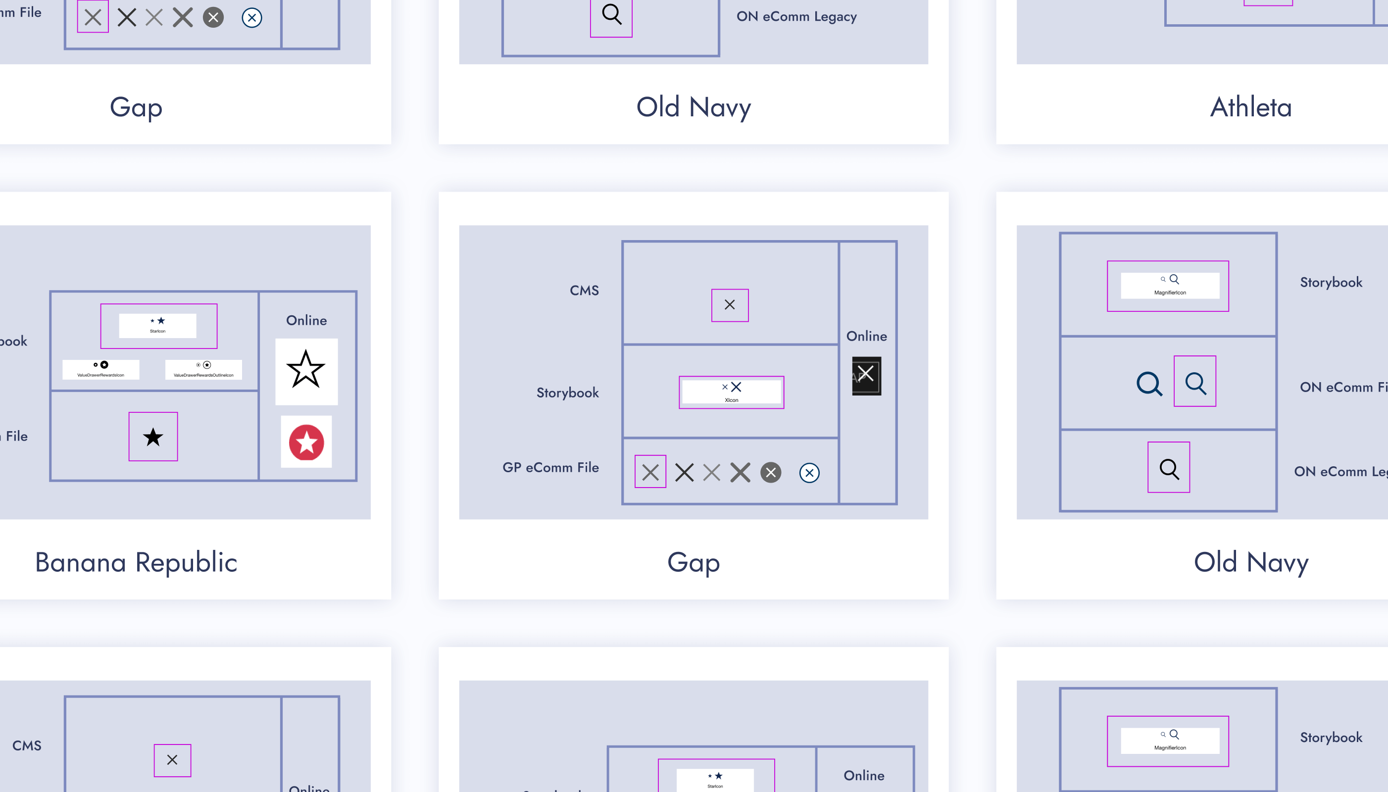
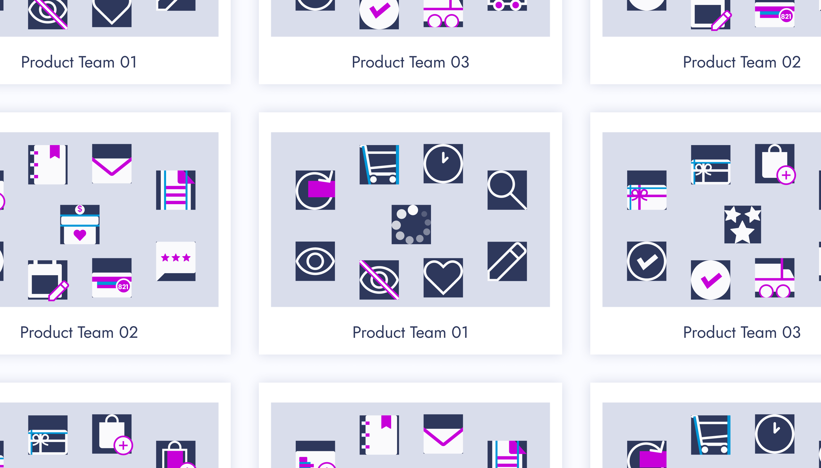
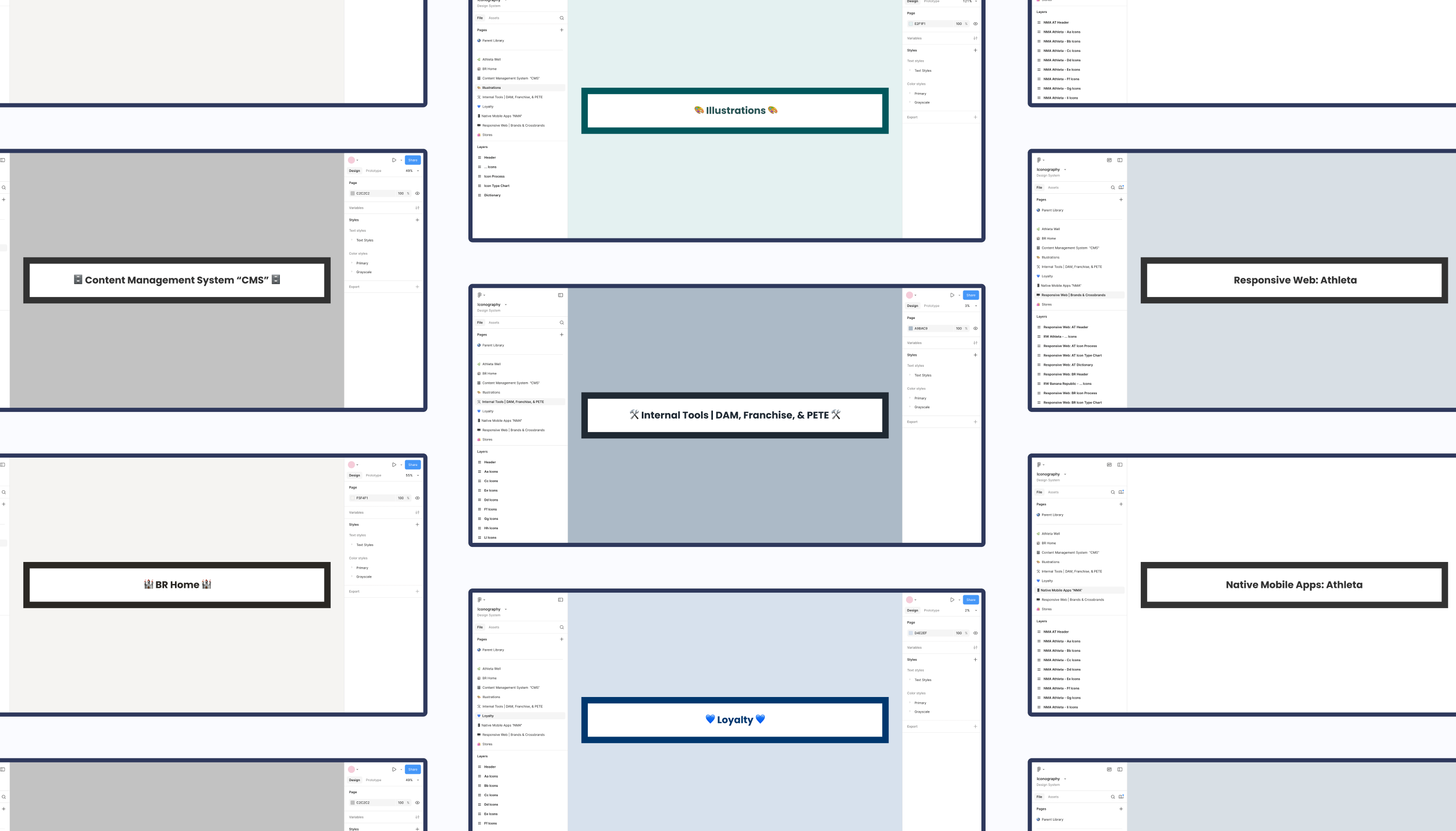
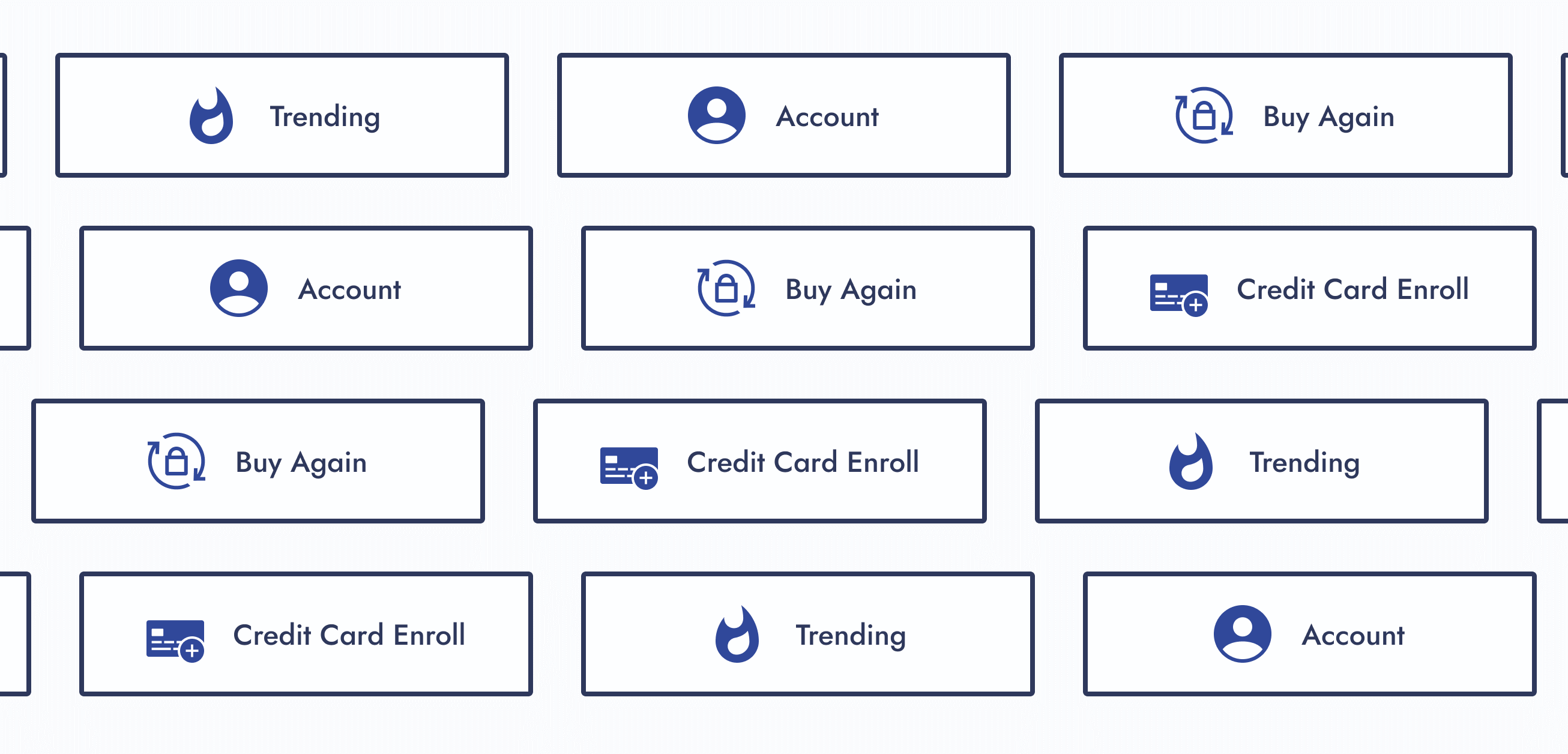
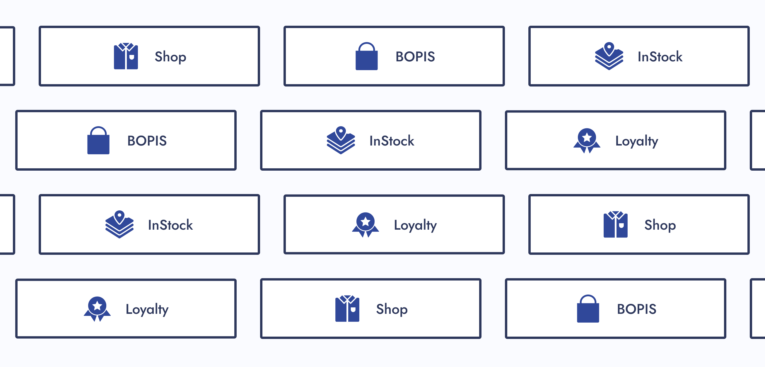
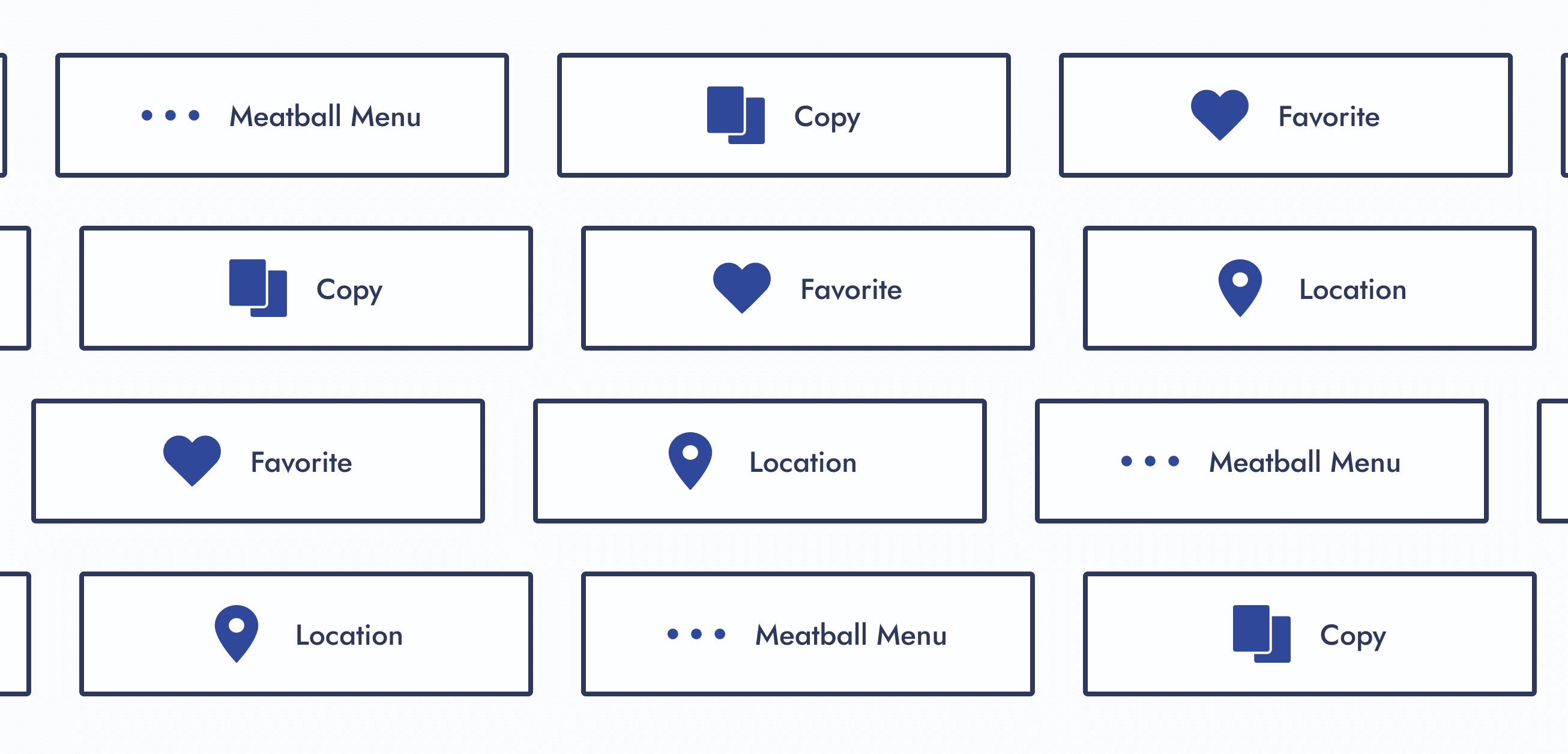
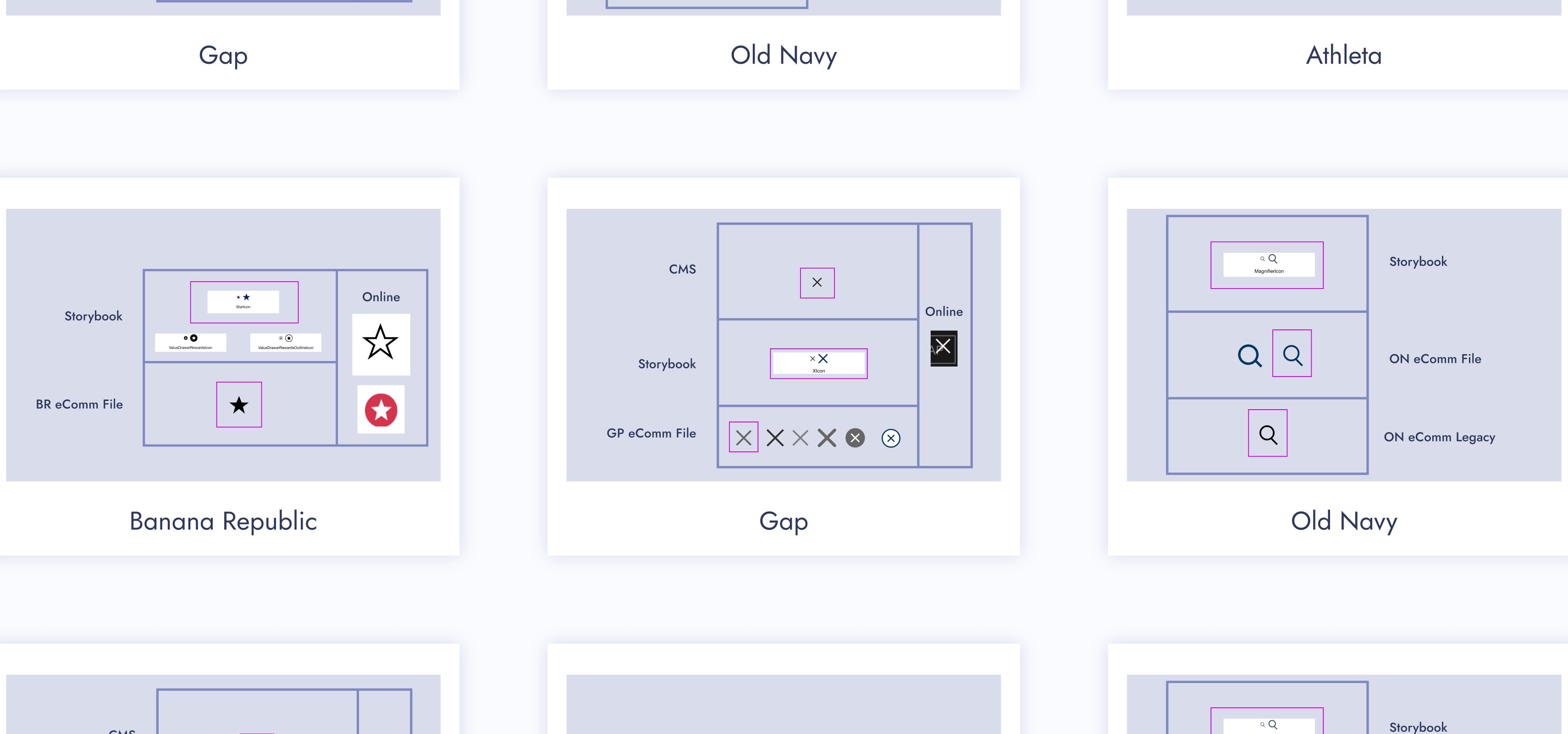
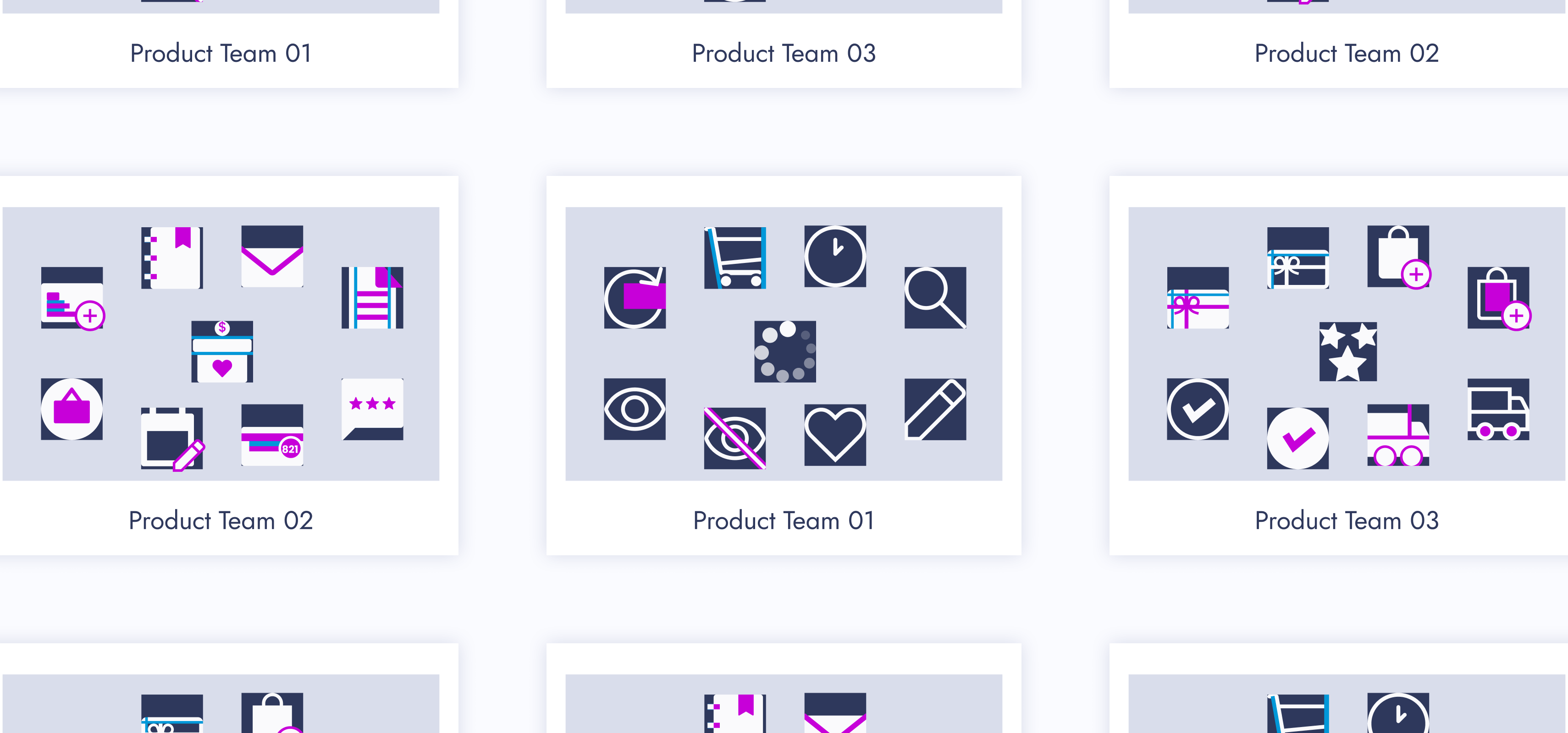
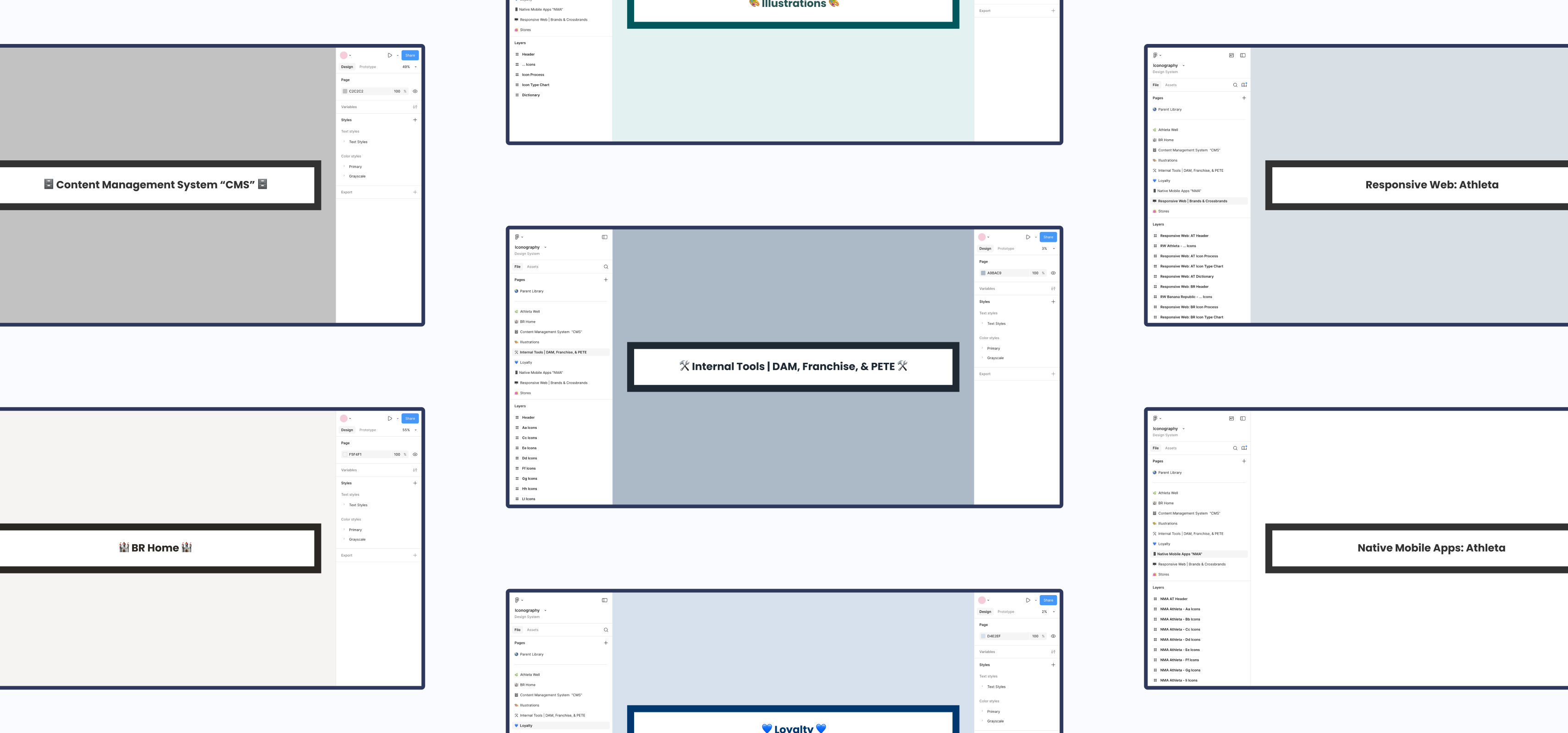
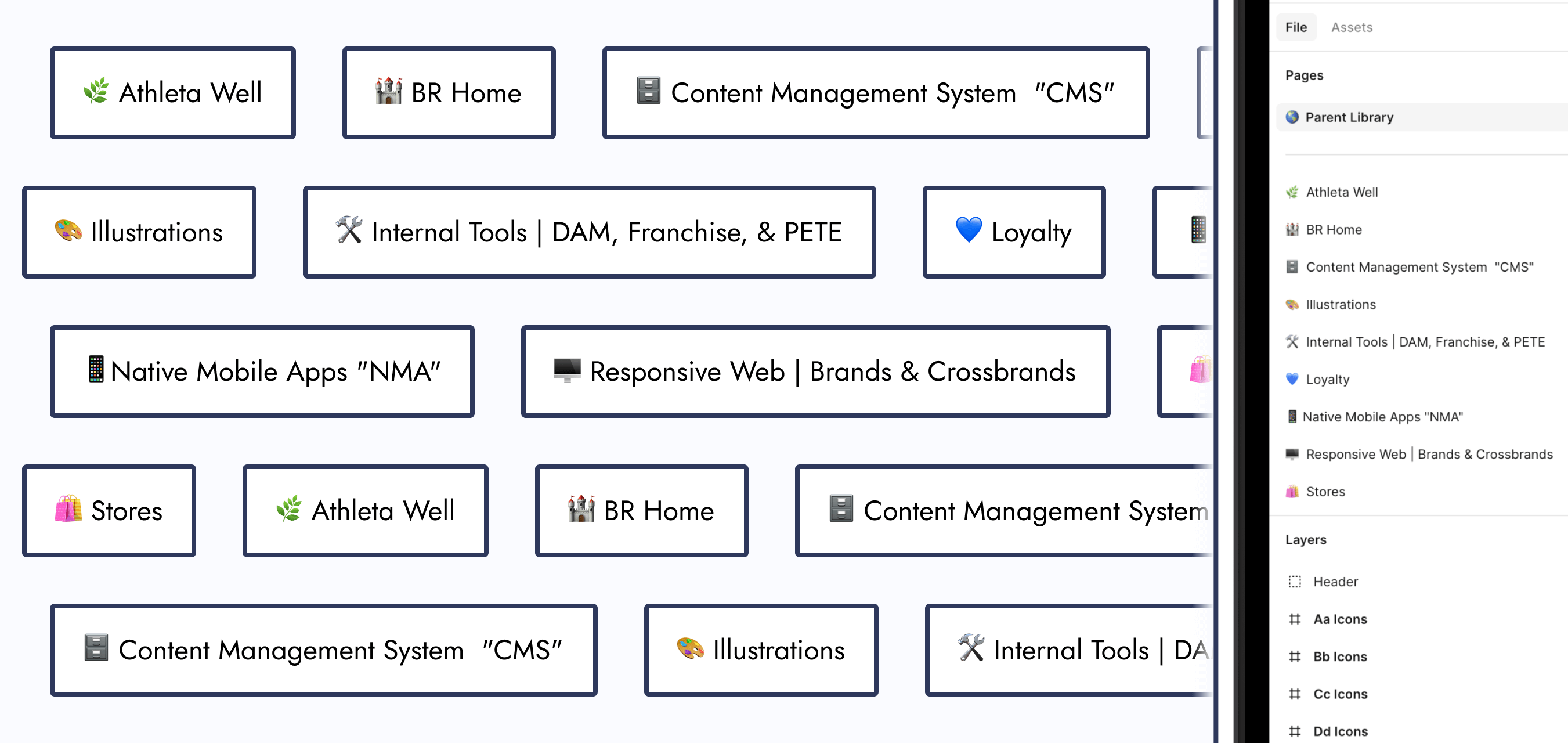
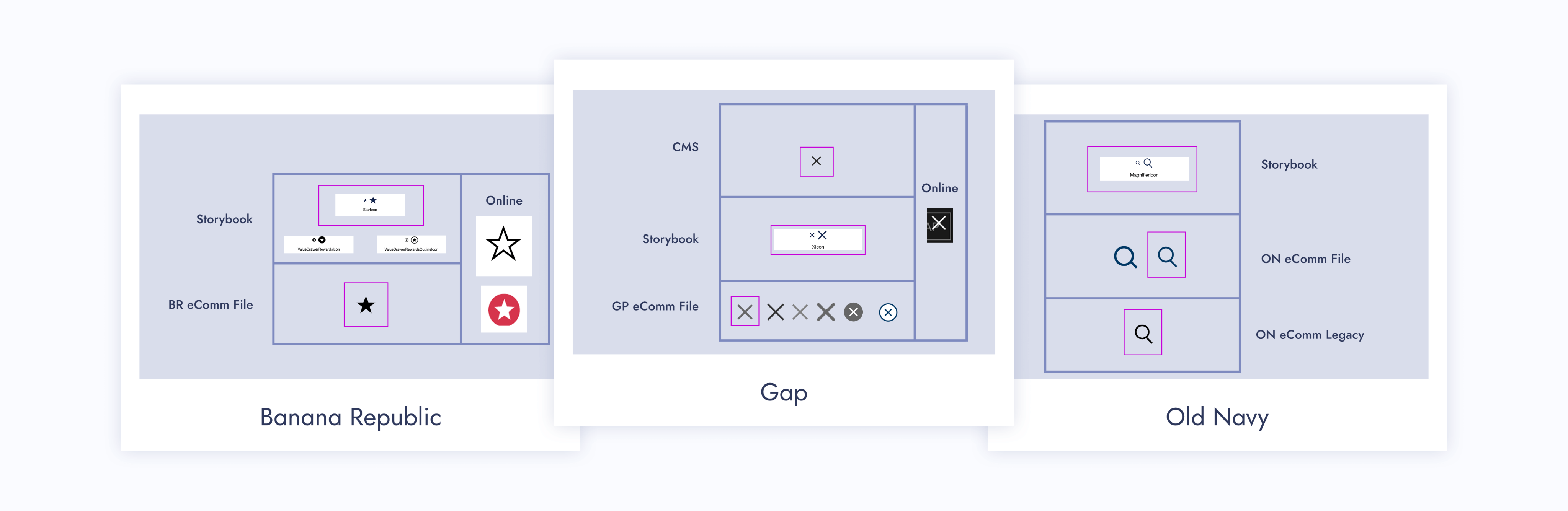
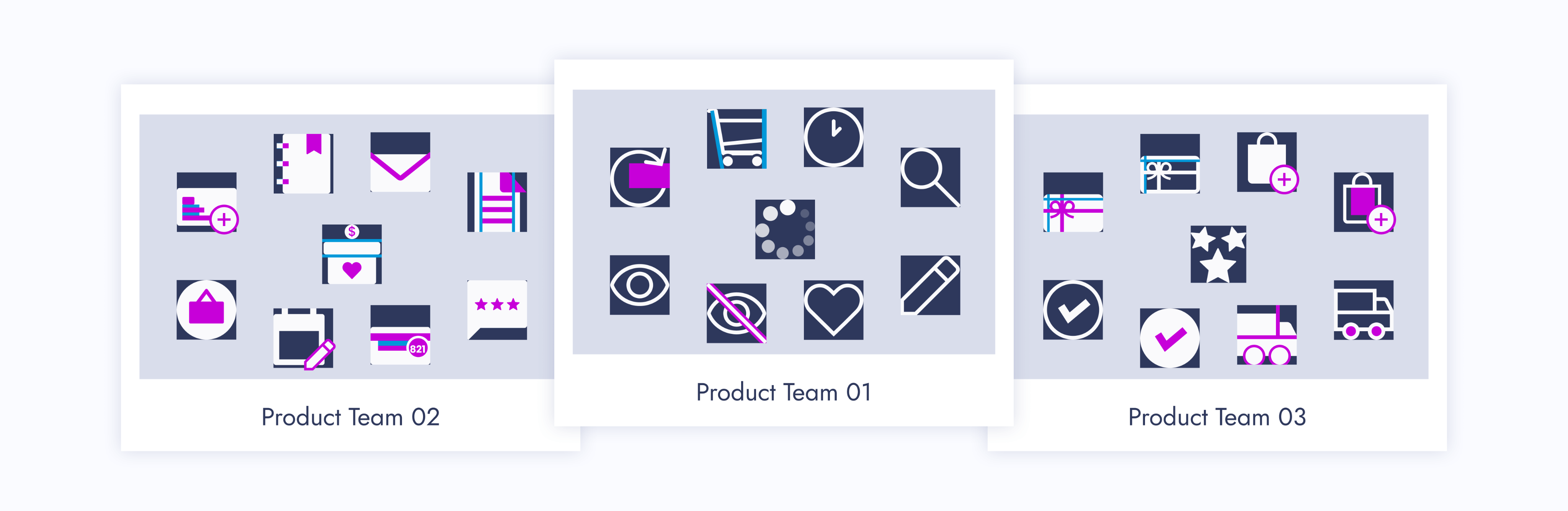
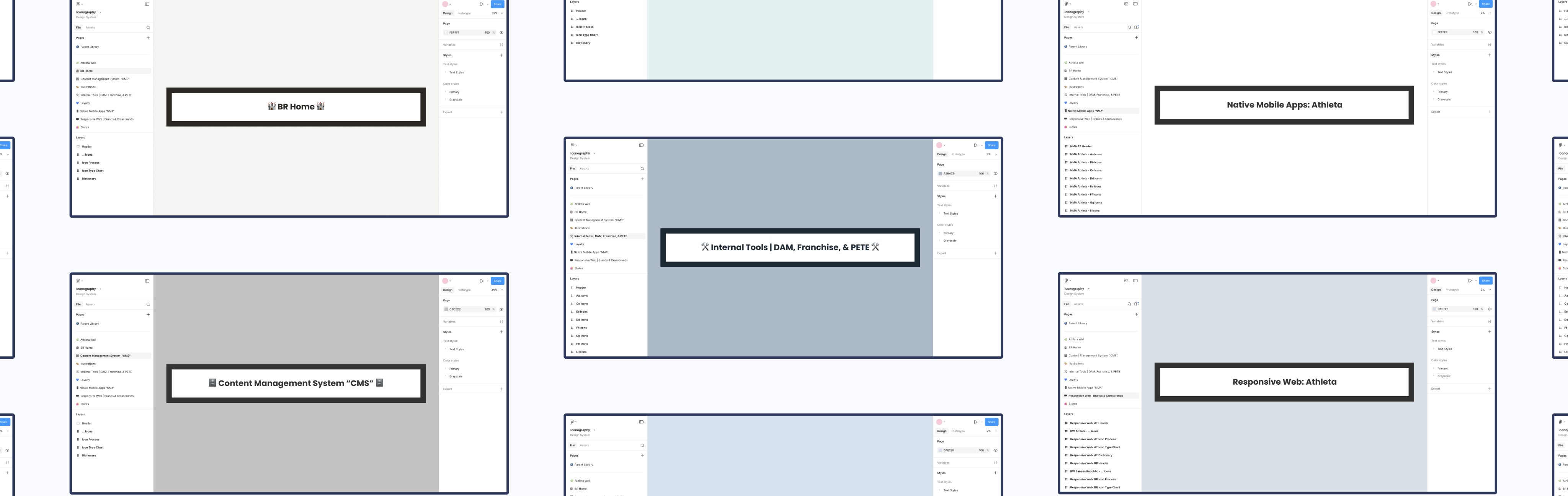
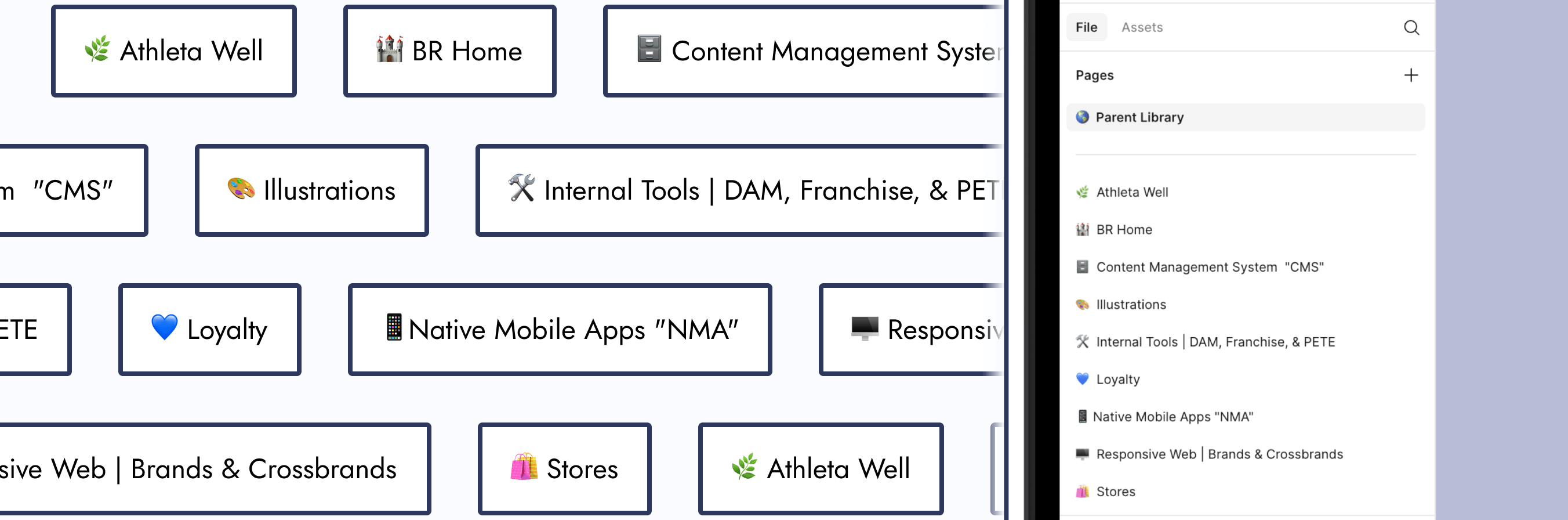
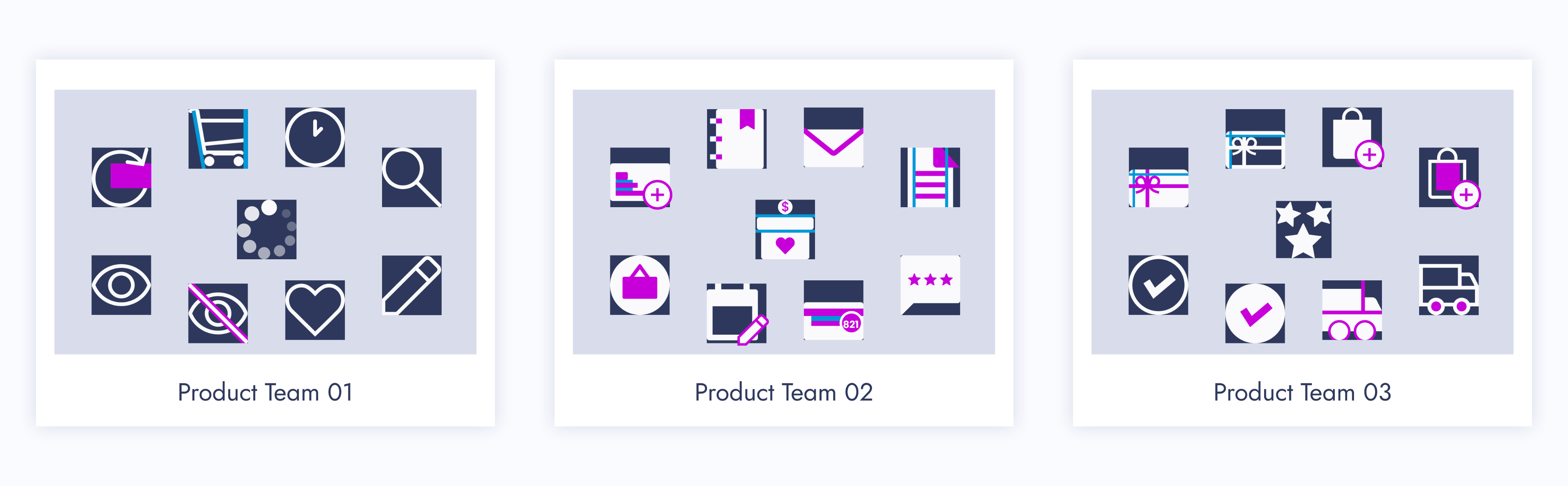
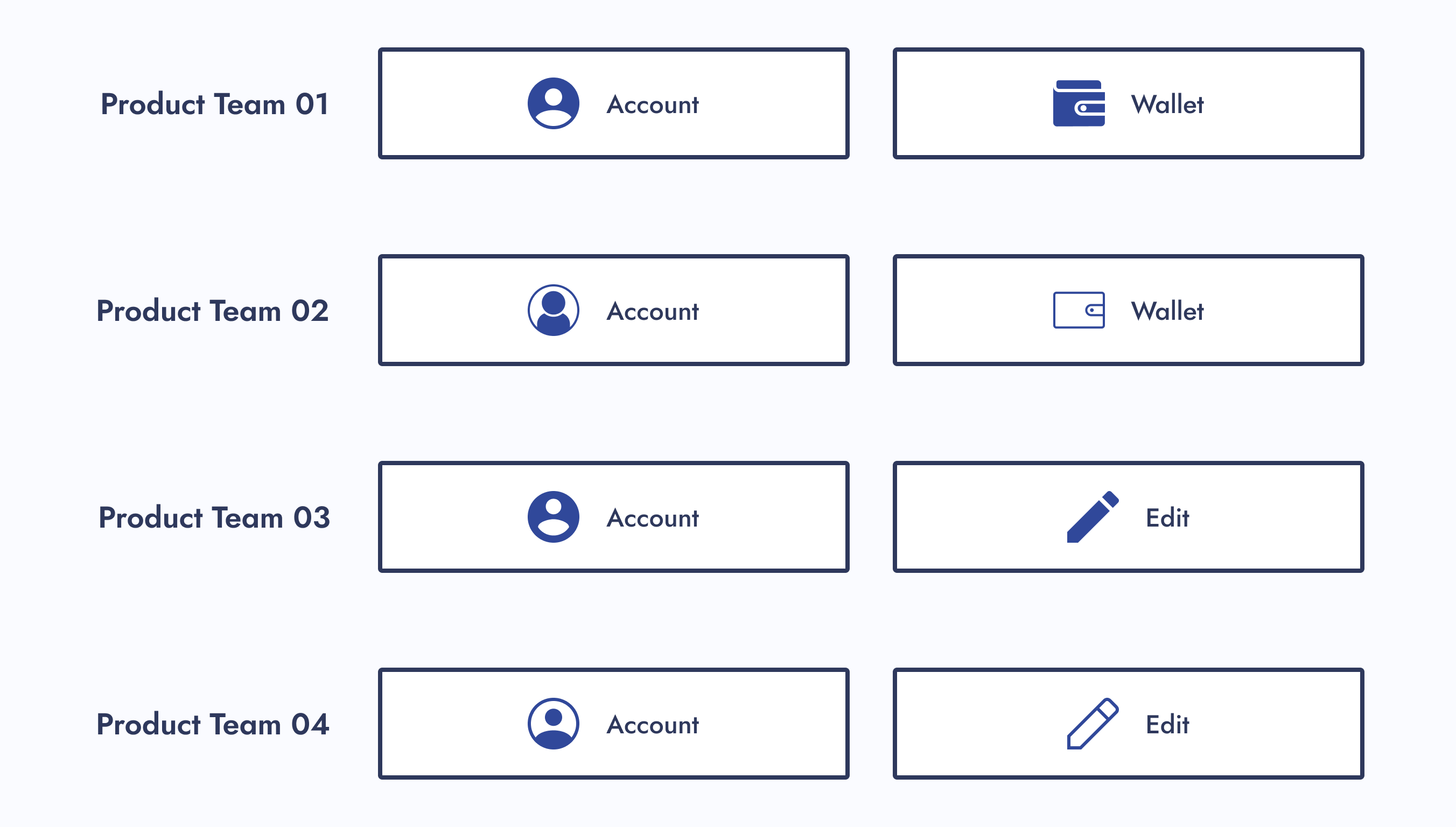
What’s needed from this design system to help designers be as efficient as possible? The UX department had 8 different product teams that had their own set of stylized icons.
Component Library Quantity
Should I create component libraries for each of those 8 product teams? That way, the designers who work within them know exactly where to go when looking for an icon.
Action Item:
I created component libraries for each product team.
New Icon Requests
What if designers look within those individual component libraries, but couldn’t find the icon they need? Also, what if they want a specialty version of an icon, like for the holidays? Should there be a process for designers to request new icons?
Action Item:
I created an icon request process.
Icon Style Guides
As the icon point of contact, what happens if I’m unavailable and there’s an icon request? Should there be a style guide for each icon set?
Action Item:
Inspired by Material Design, I created icon style guides for each of the 8 product teams.

Icon Usage Guidelines
What stops designers from using an icon incorrectly? Should there be usage guidelines?
Action Item:
Icon function categories were created and paired with a dictionary. Each icon was assigned to 1 of 3 categories.
Explorations
Since I was building this design system from scratch, I had the opportunity to explore new ways of displaying components within a Figma file.

Navigation Improvement
How do I improve navigation within a design system?
Idea:
Add a menu that allows designers to navigate to other parts of the Figma page.
Aesthetics
How can I make this design system more visually appealing?
Idea:
Stylized component sections and product team pages.
Design Research
My manager found an article called “Icons as Part of a Great User Experience”, and it explains why icons are more important to a user’s experience than one may think. After reading this article, we walked away with a couple of action items:

Action Item: Icon Categorization
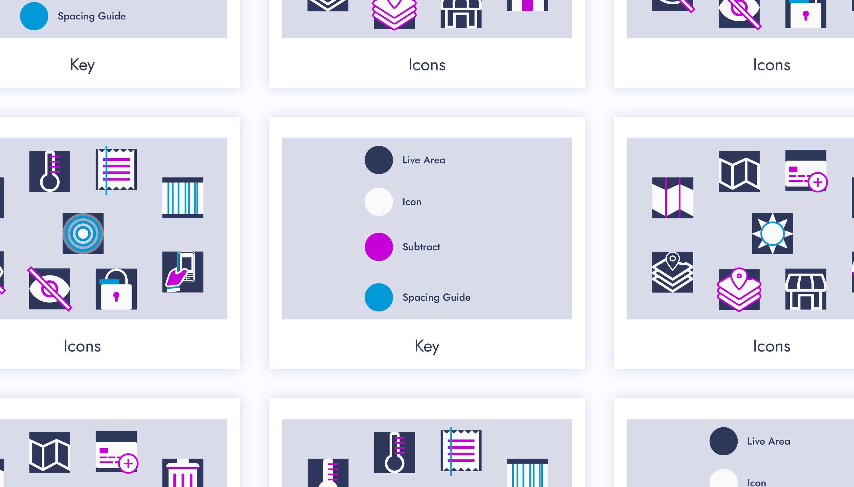
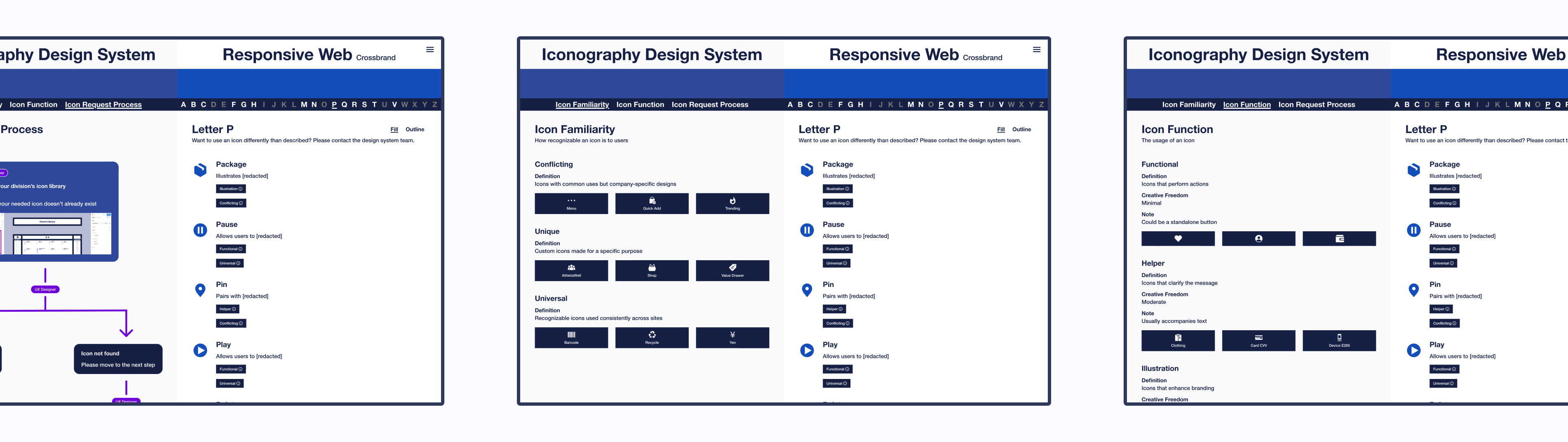
Let’s categorize our icons by familiarity and function. The article mentions universal, conflicting, and unique icons. We should categorize our icons similarly.
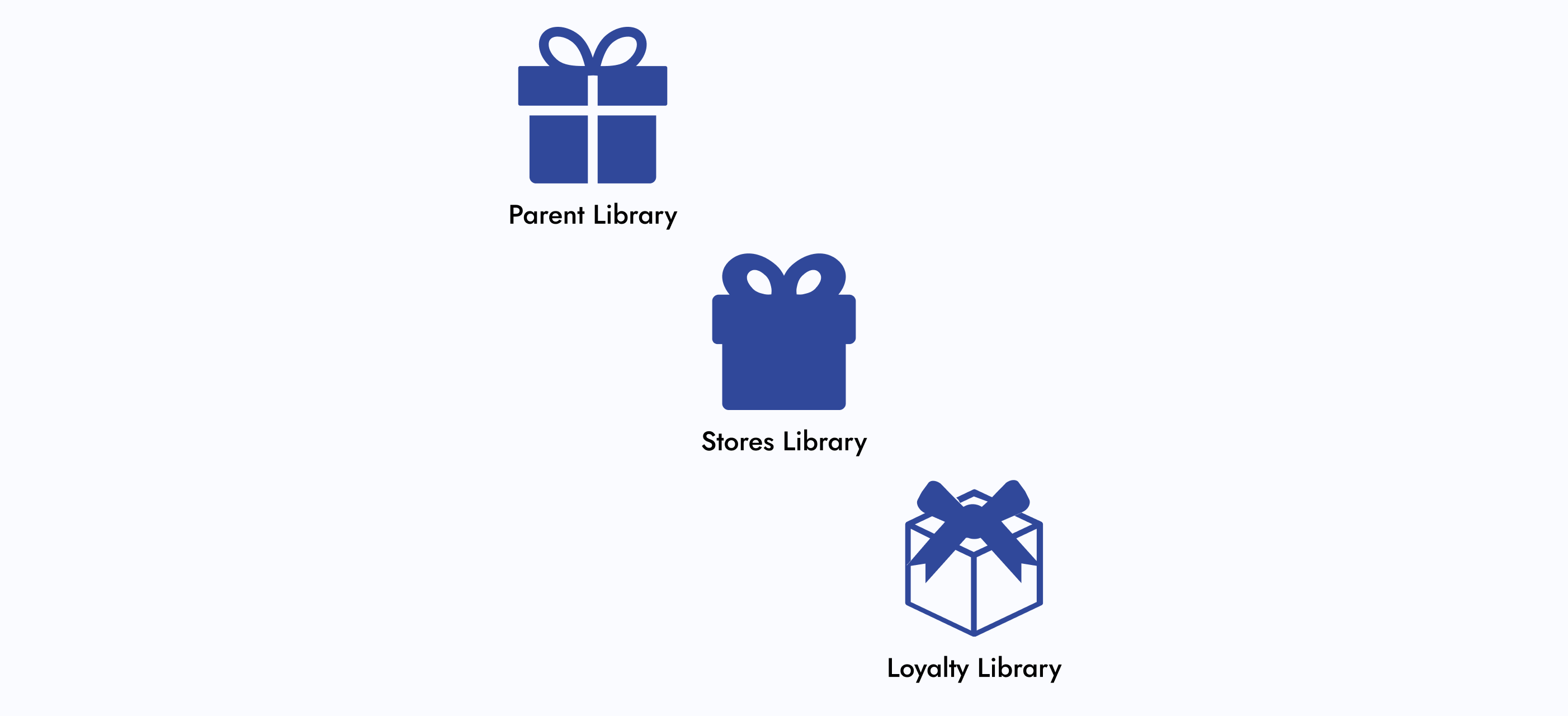
Action Item: Parent Library
We should have a parent component library that all icon designs and functions sourced from. If a designer wanted to deviate from the design or function of a parent icon, a discussion would be required.
Note:
Changing the style of a parent icon, such as line width or corner radius, wouldn’t require a discussion, unless it deviated from the established styling pattern of a designer’s product team.
The Minimal Viable Product (MVP)
Since design systems are living documents, what needed to be completed for this project to be considered “done”?
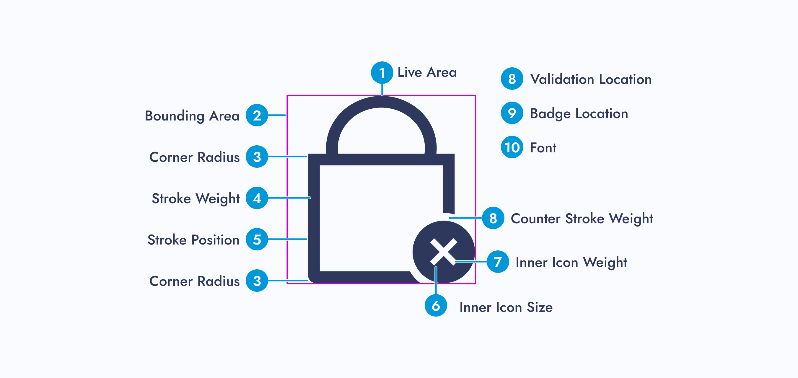
Step 01: Alignment

01 - Icon Audit
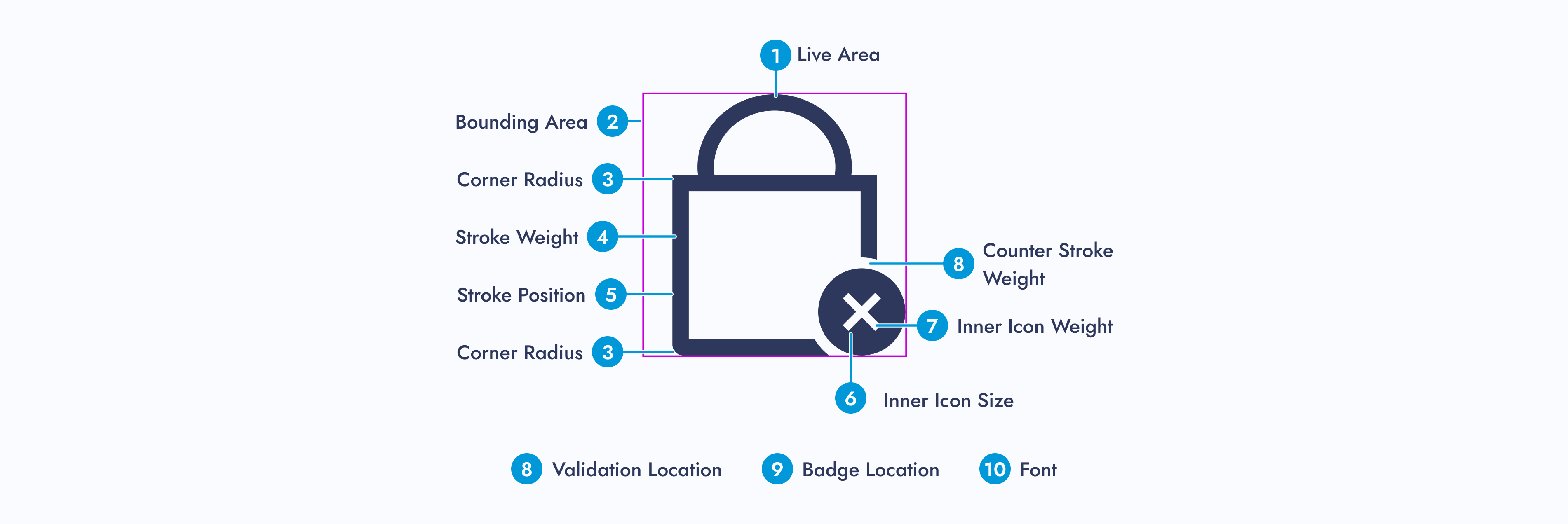
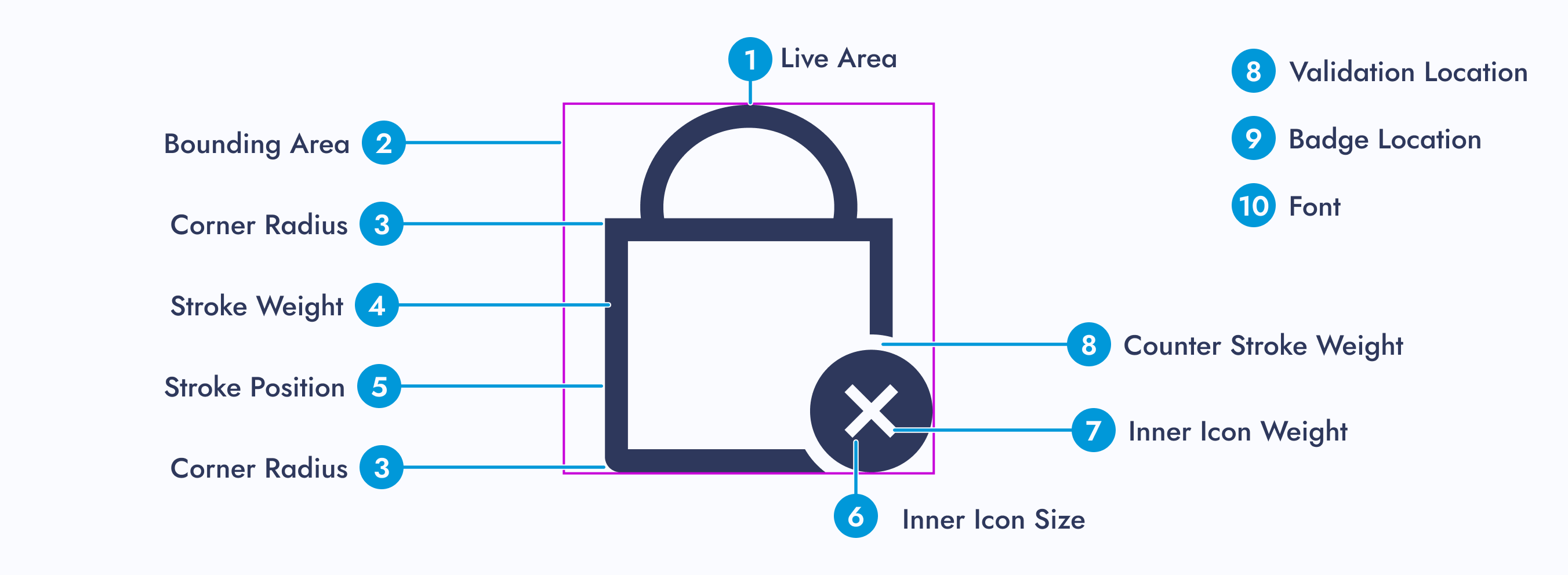
Do an icon audit to ensure all icons are accounted for and to see how far similar icons stray from one another.
02 - Recreate Icons
Recreate icons for the parent library, ensuring to save the “working” version. Ensure each icon has a filled and outlined version.
03 - Update or Recreate Misaligned Icons
Update or recreate misaligned icons from each product team and make a style guide for them. From corner radius to line width, each icon within a set needs to be consistent.
Step 02: New File
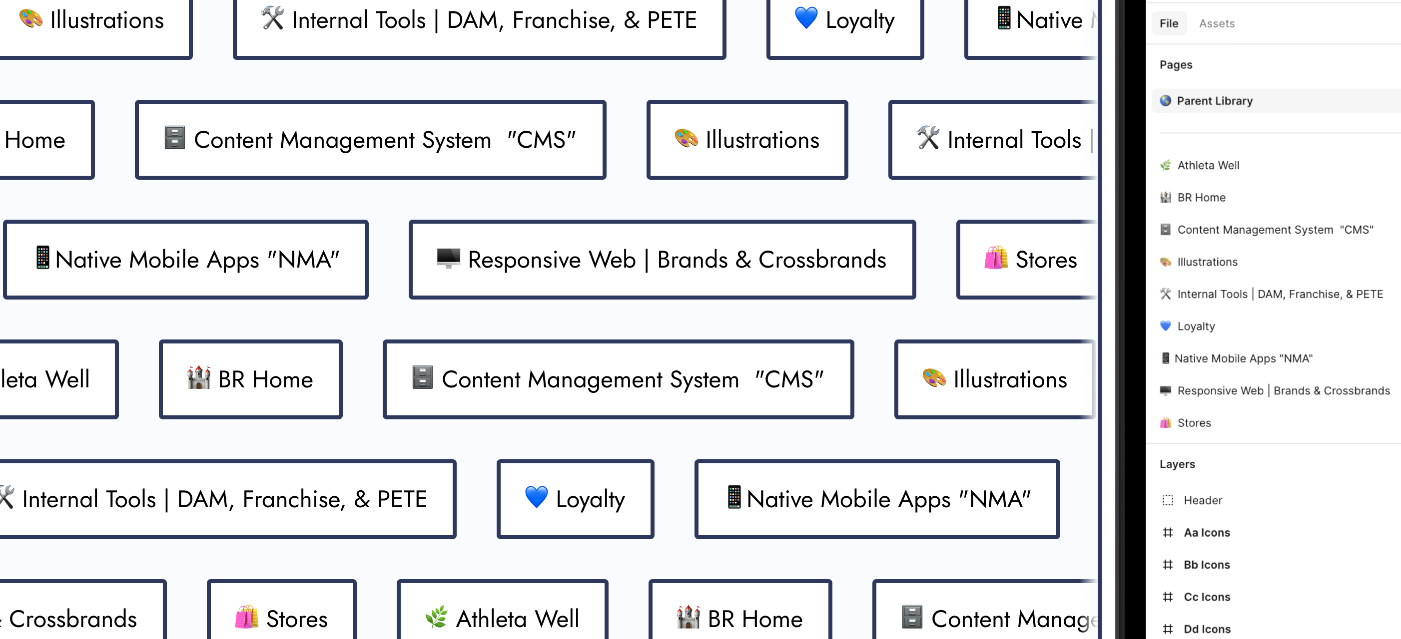
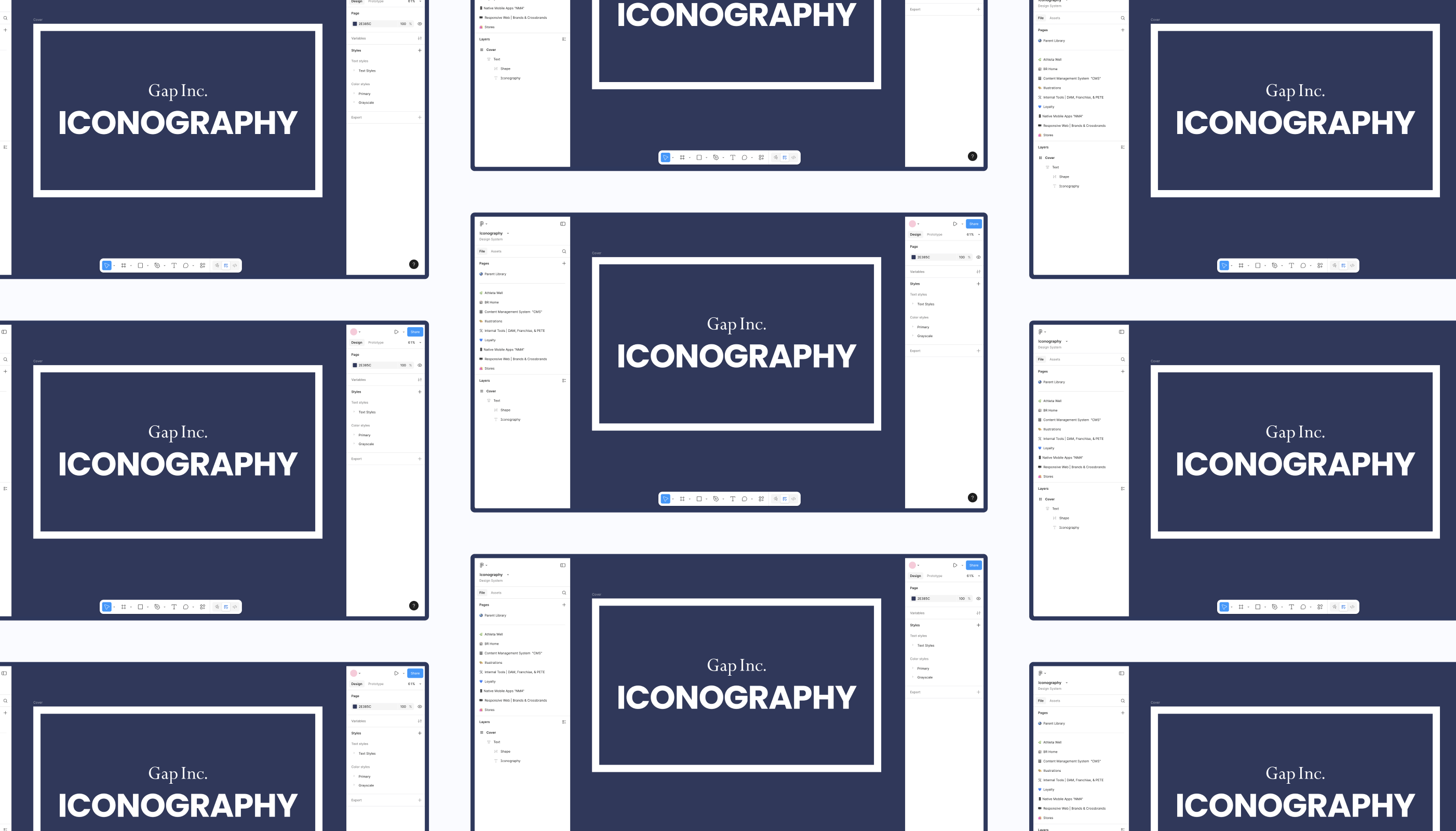
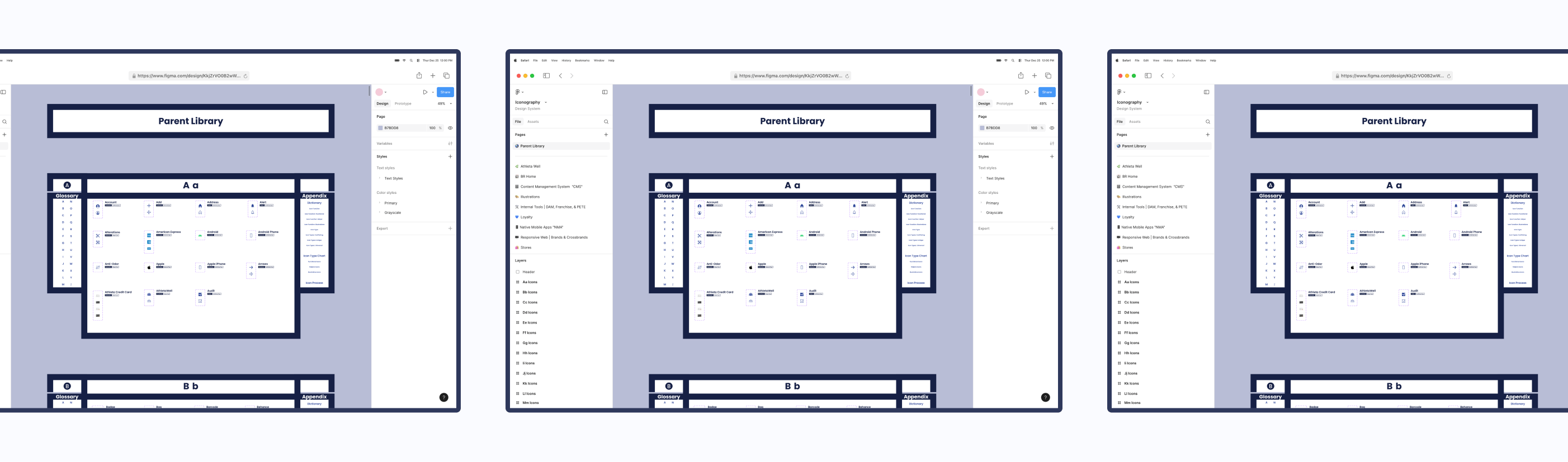
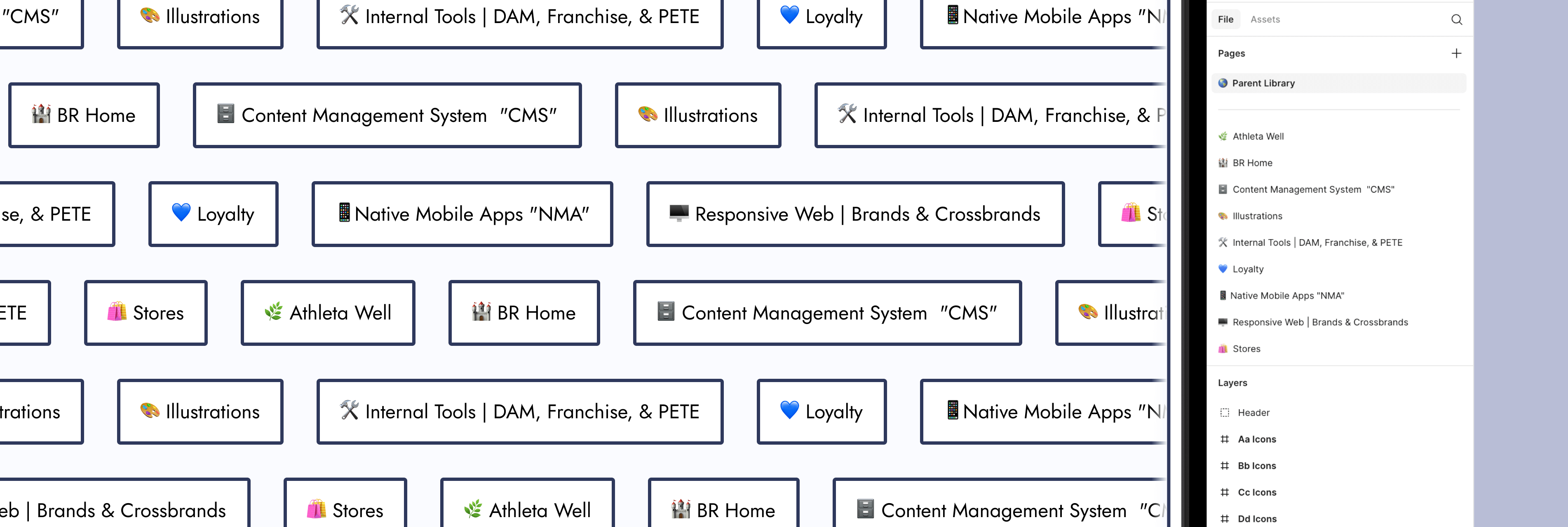
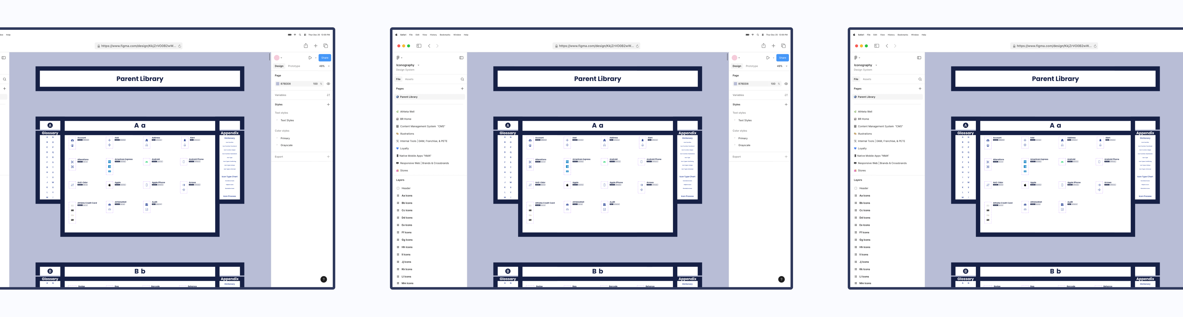
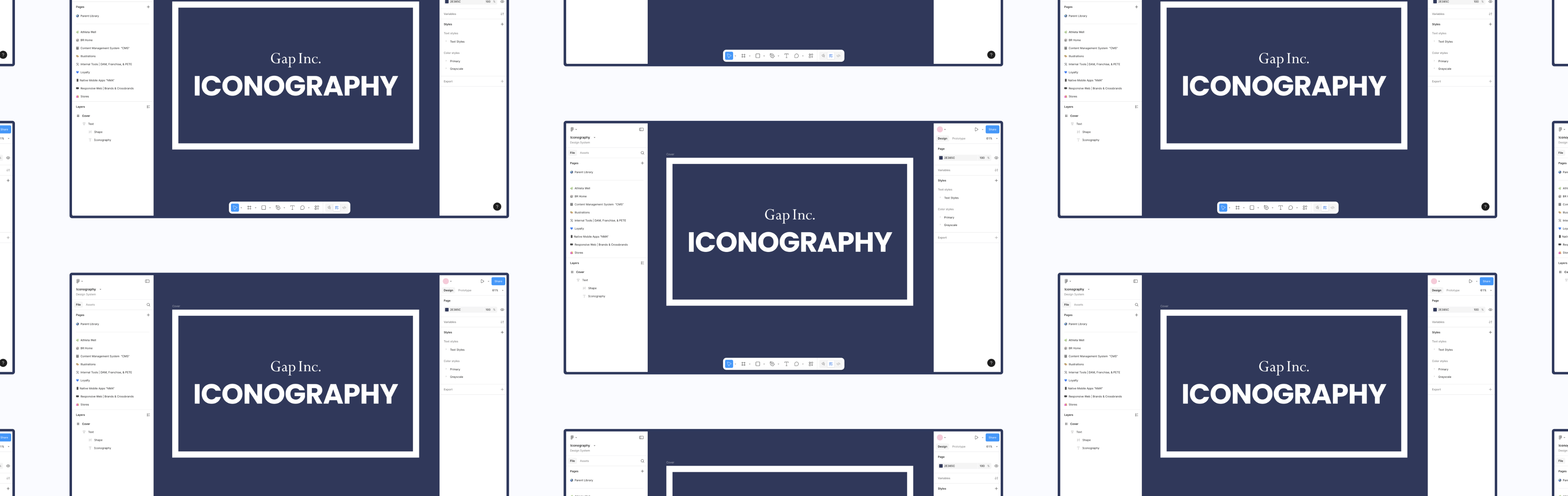
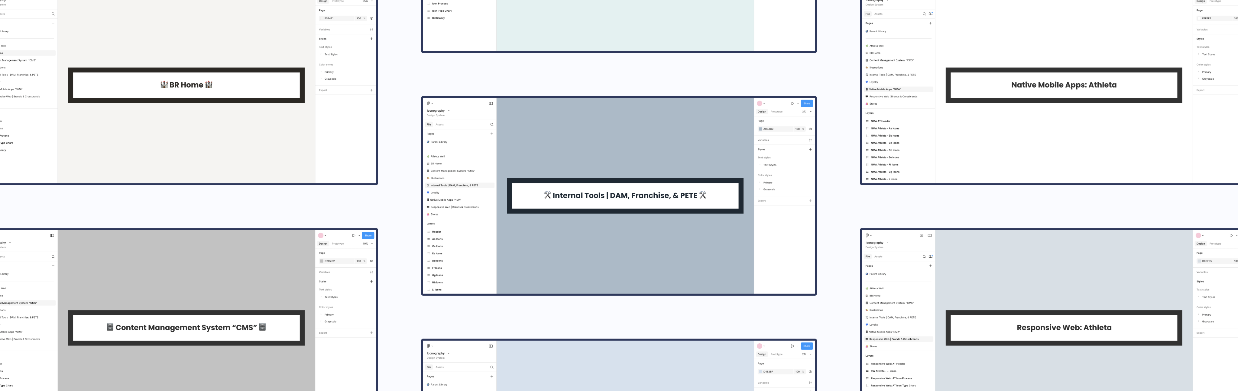
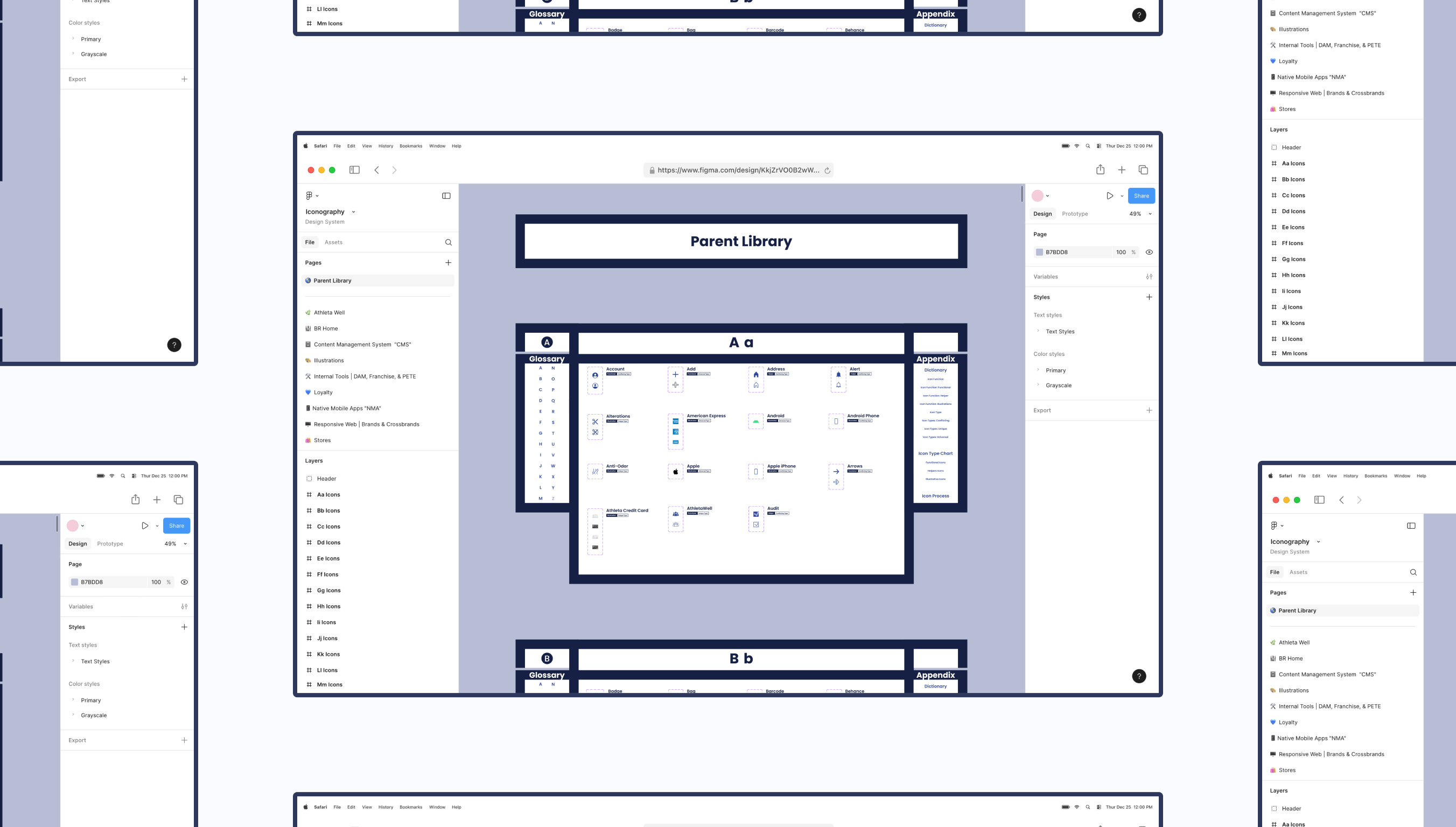
01 - Create New Figma File
Make a brand new Figma file that only the design system team can edit. Other designers can simply view and copy components from it.
02 - Separate Icons
Separate the icons for each product team and place them within their own page.
03 - Make Components
Make components out of every icon.
Step 03: Categorization
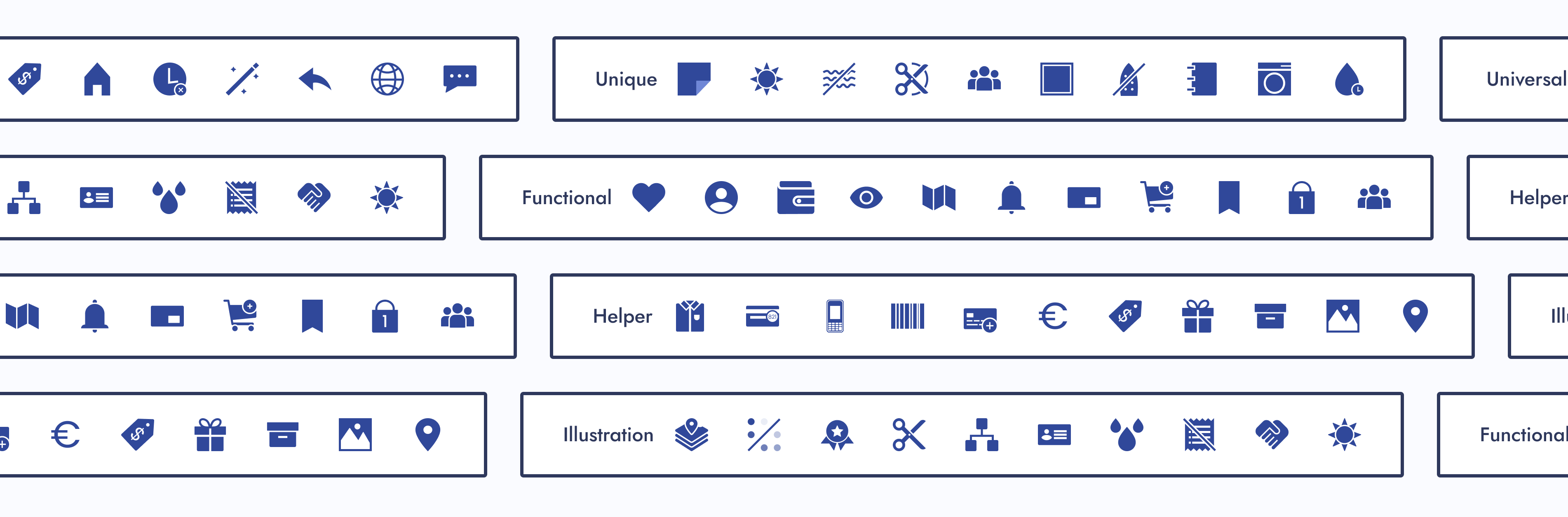
Based on the “Icons as Part of a Great User Experience” article, my manager said we were going to categorize icons by user familiarity and function.
Categorize Icons
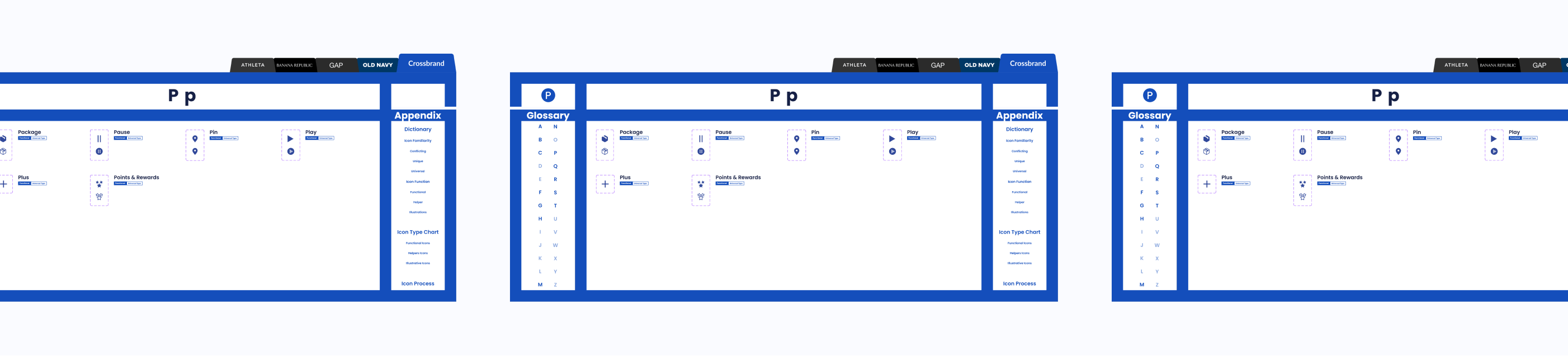
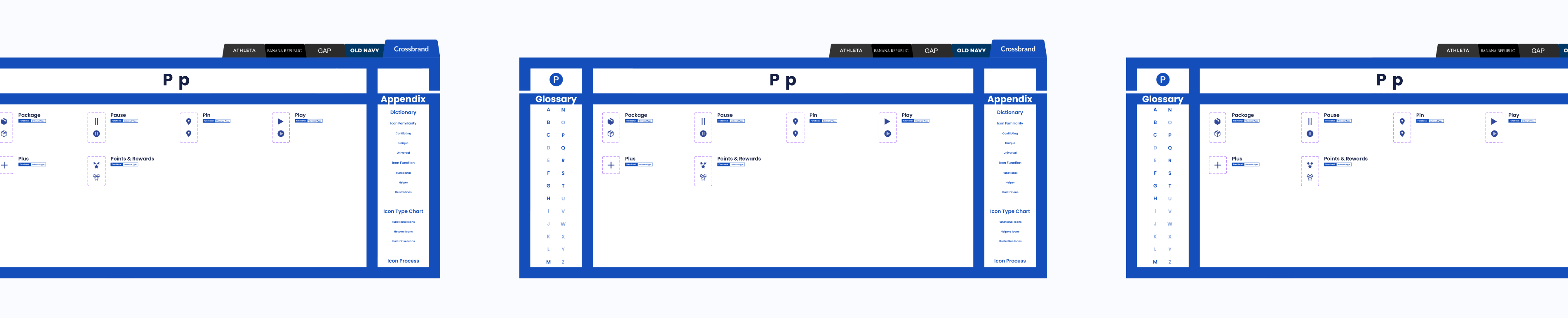
Give each icon from the parent library a familiarity and functional category. Then give any children the same categorizations.
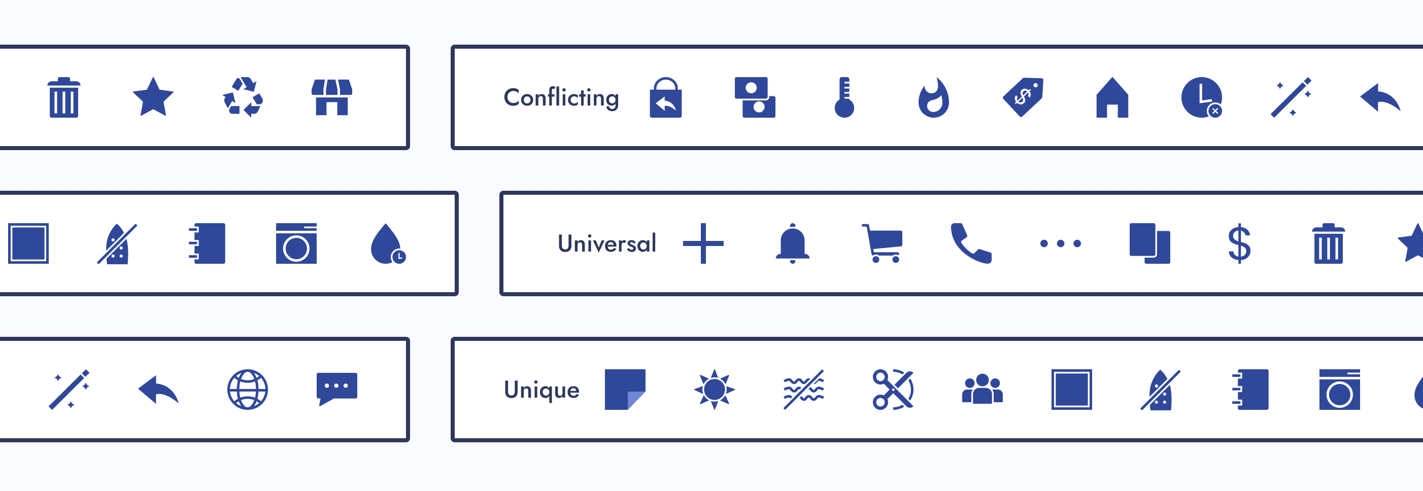
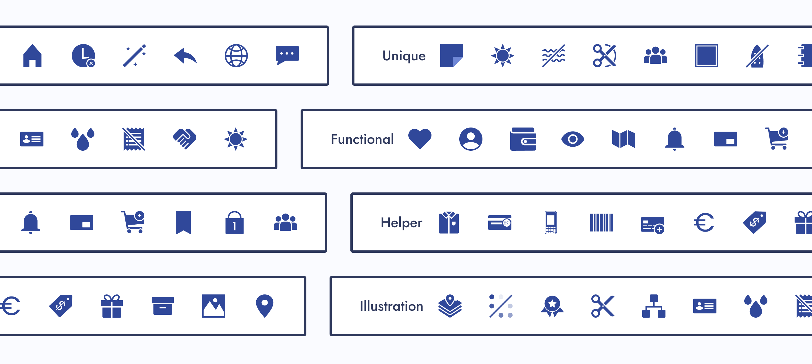
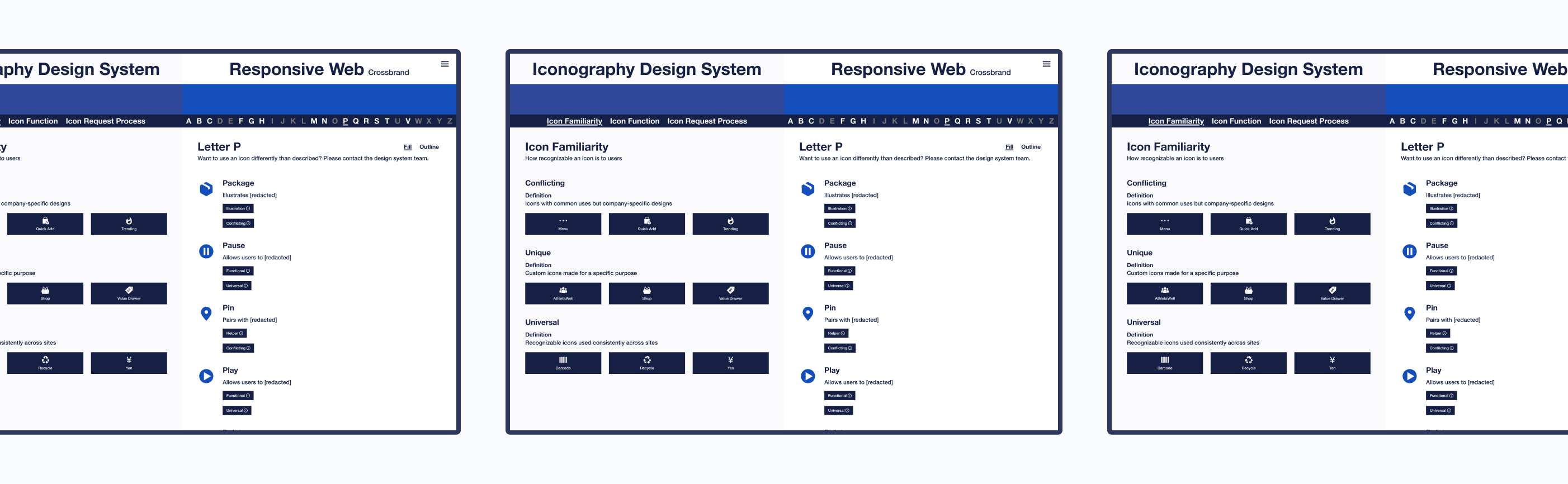
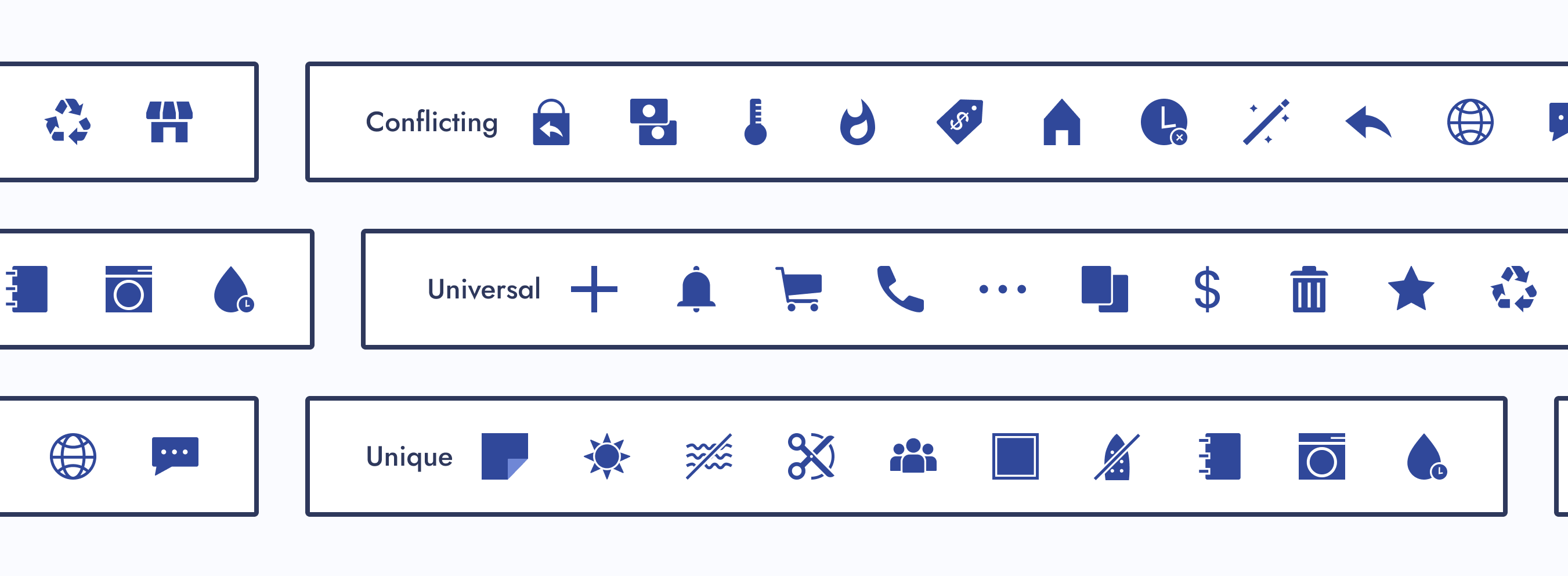
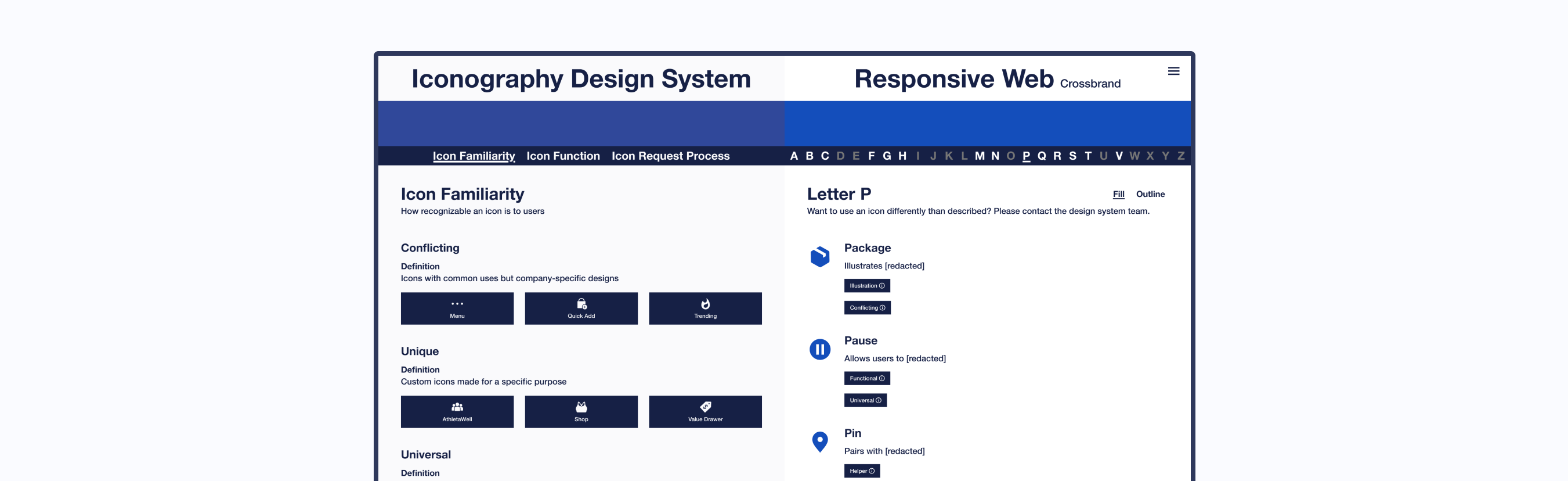
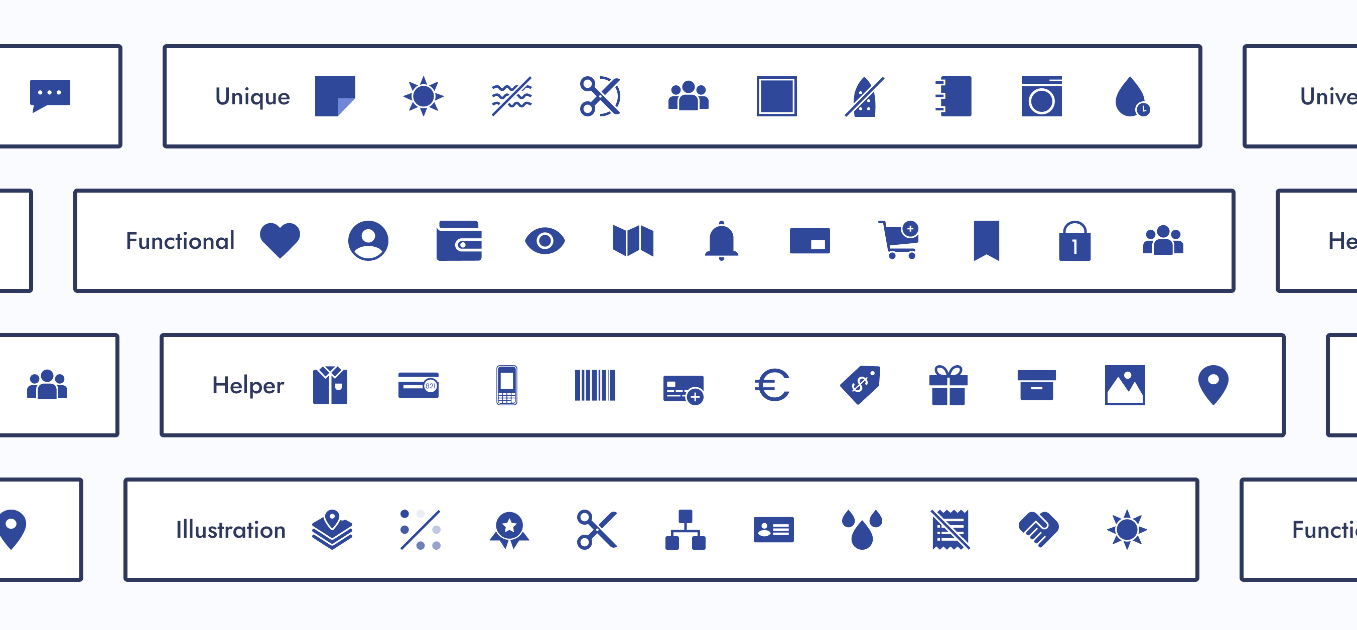
Category: Icon Familiarity
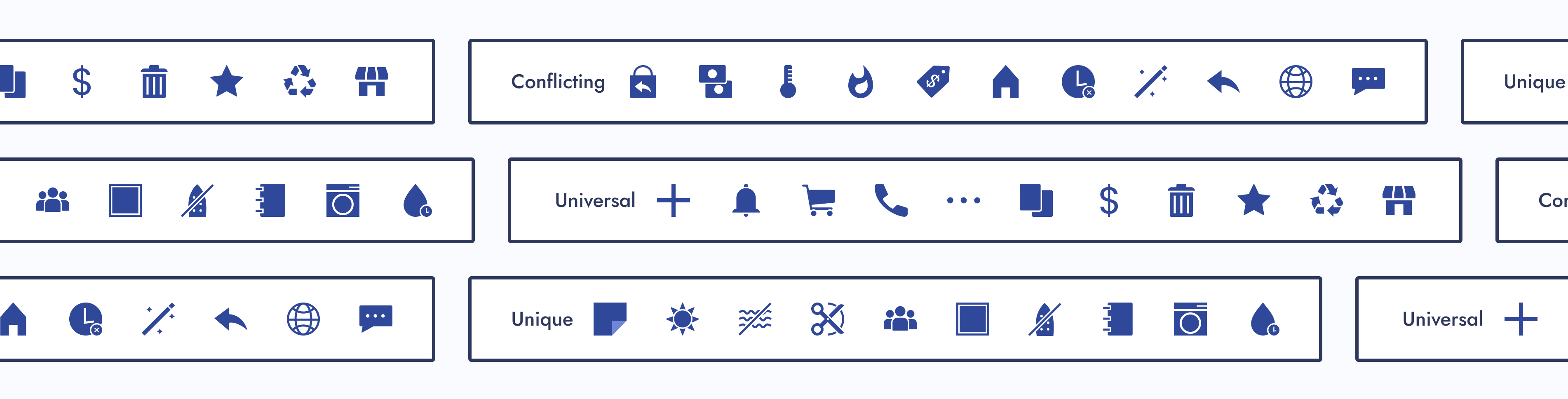
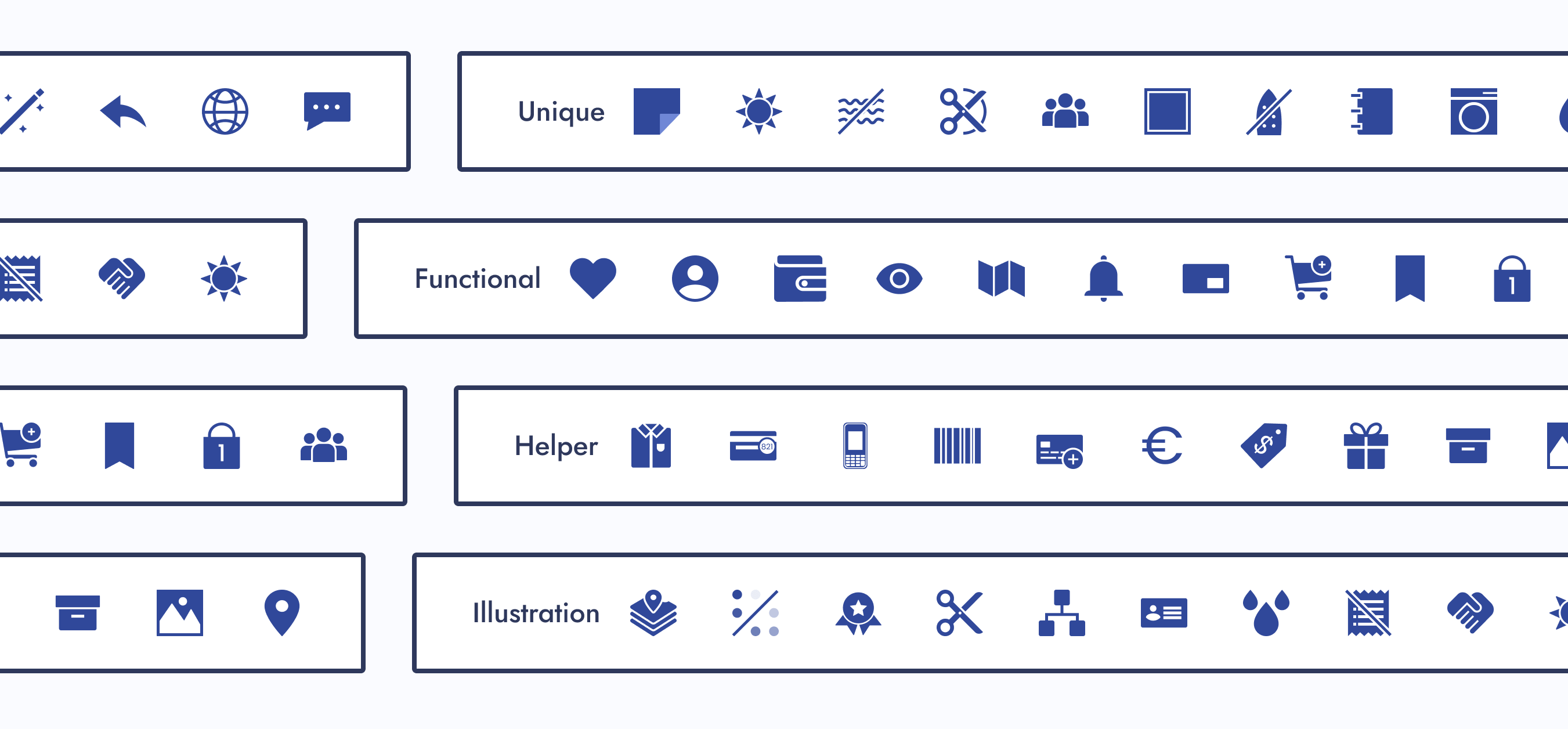
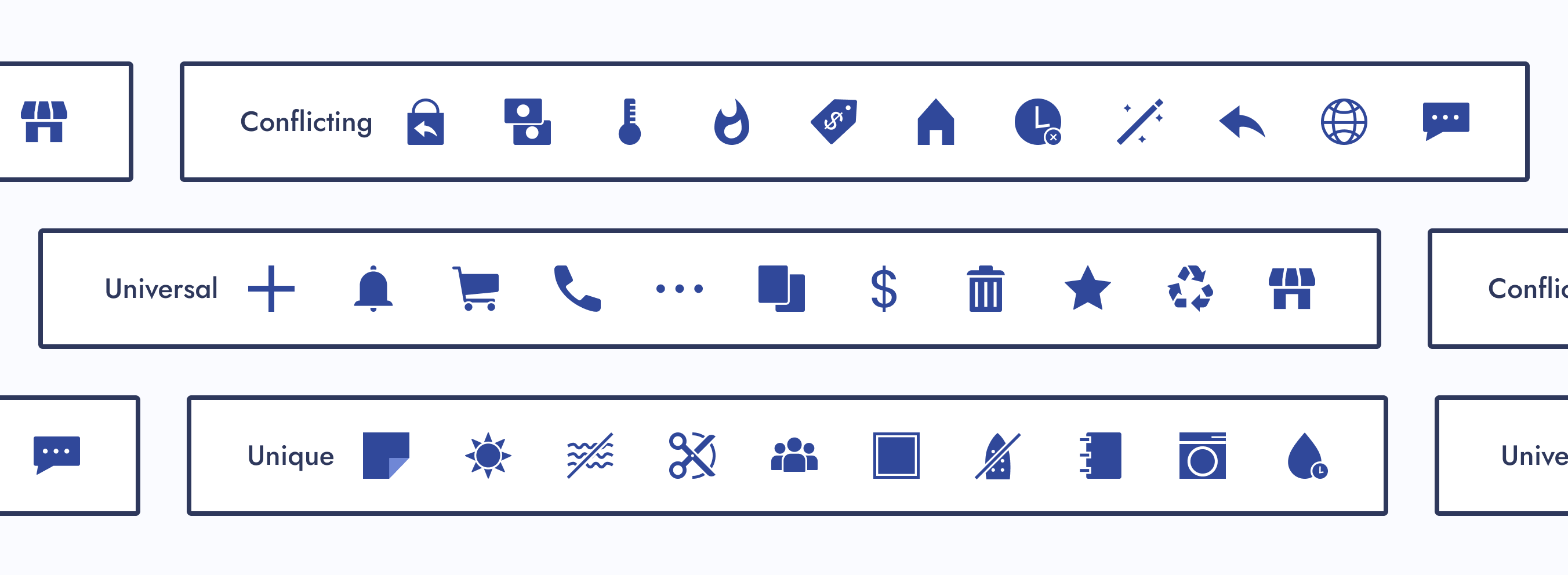
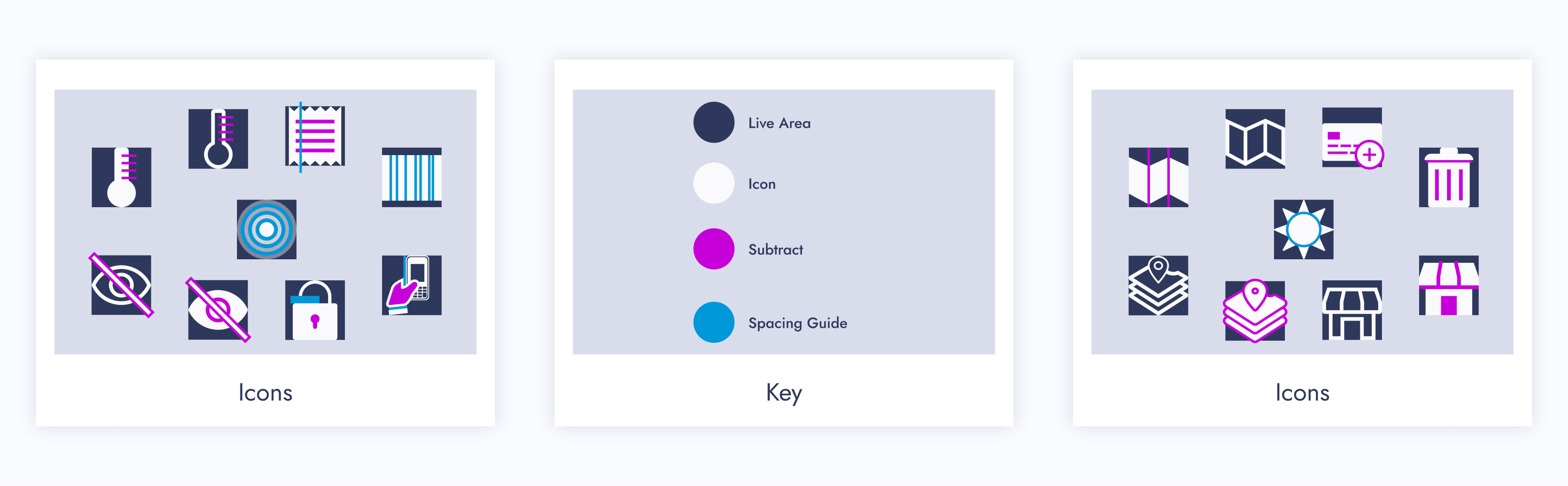
How recognizable an icon would be to users. Our three subcategories were conflicting, unique, and universal.
Conflicting Icons
Icons with common uses but company-specific designs
Unique Icons
Custom icons made for a specific purpose within a company
Universal Icons
Recognizable icons used consistently across other companies
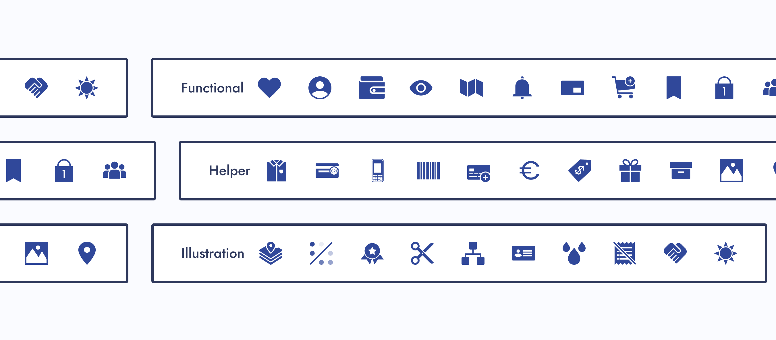
Category: Icon Function
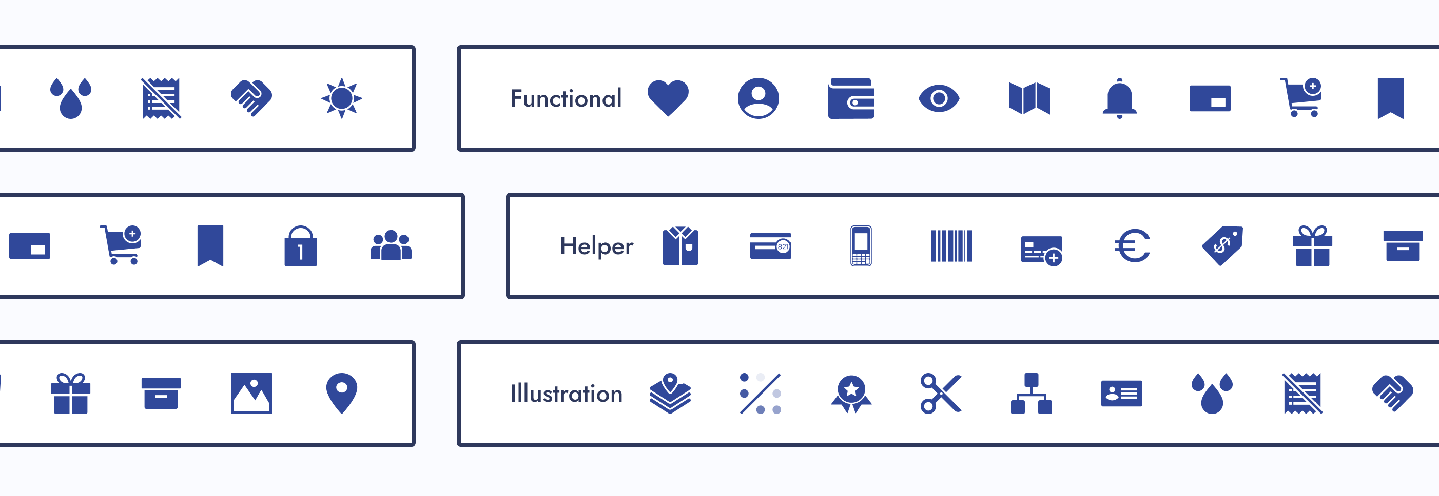
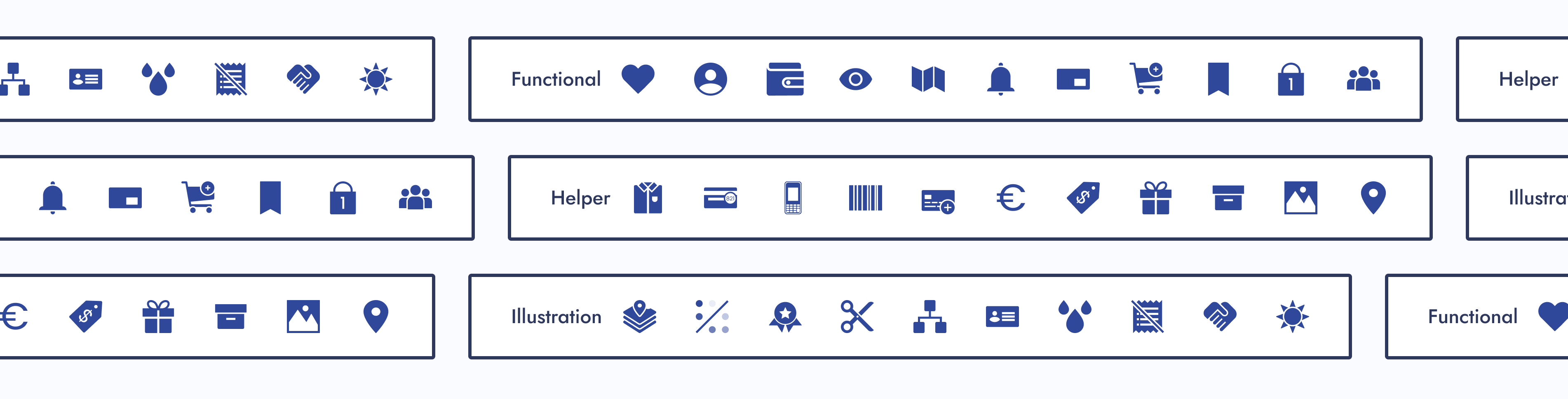
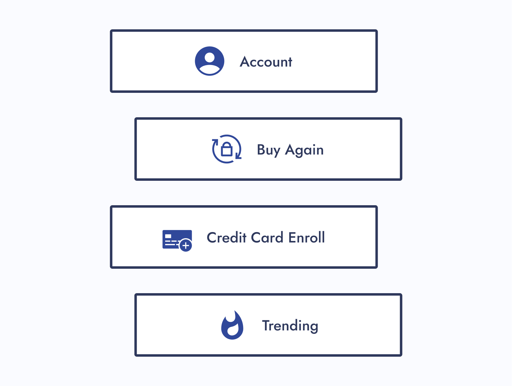
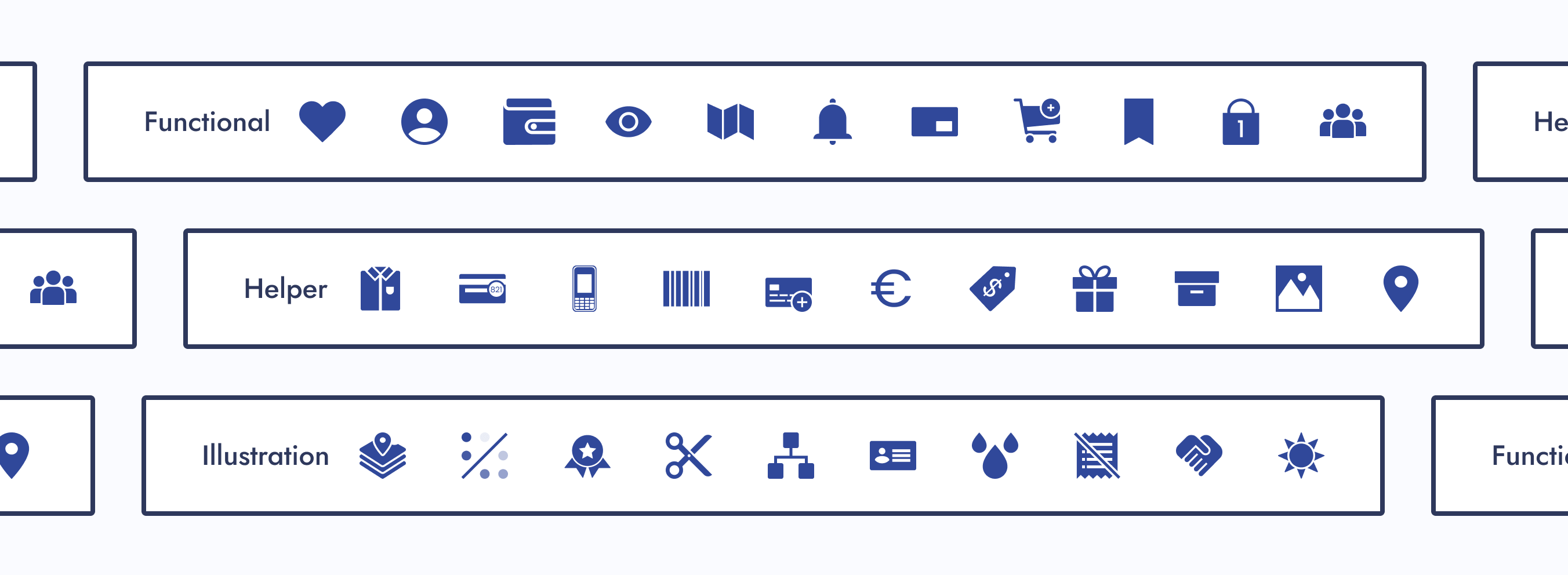
How icons should be used. Our three subcategories were functional, helper, and illustration.
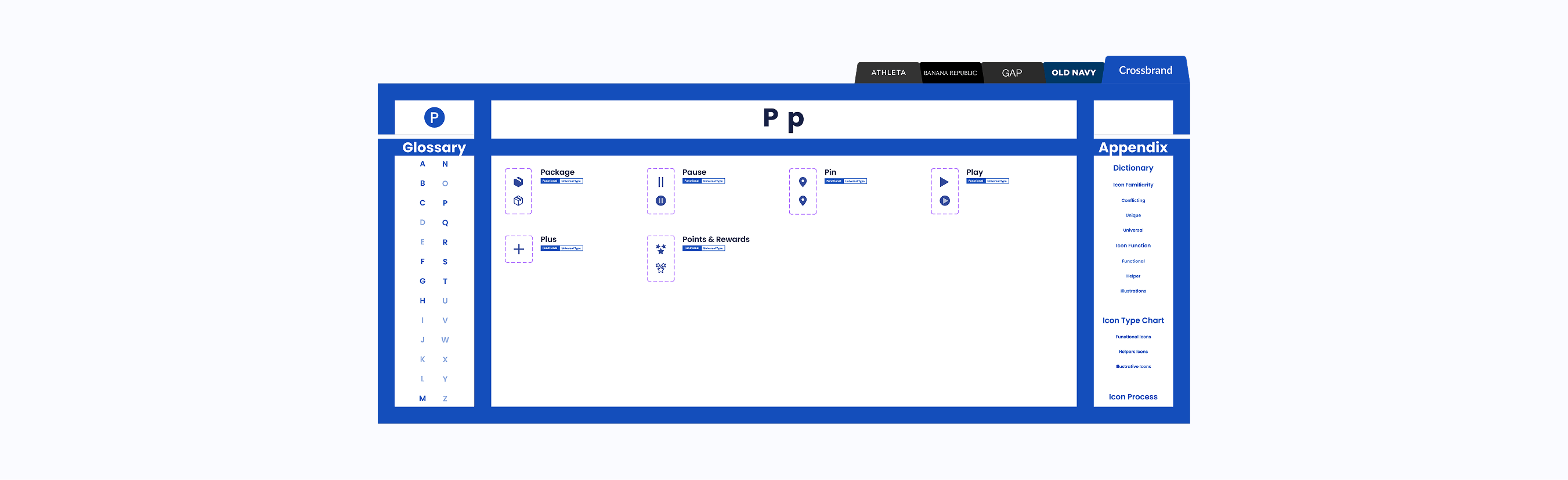
Functional Icons
Icons that perform actions and could be used as a standalone button.
If a designer wanted to update the design of a functional parent icon, they would have limited creative freedom.
Helper Icons
Icons that clarify the message and are usually paired with helper text.
If a designer wanted to update the design of a helper parent icon, they would have moderate creative freedom.
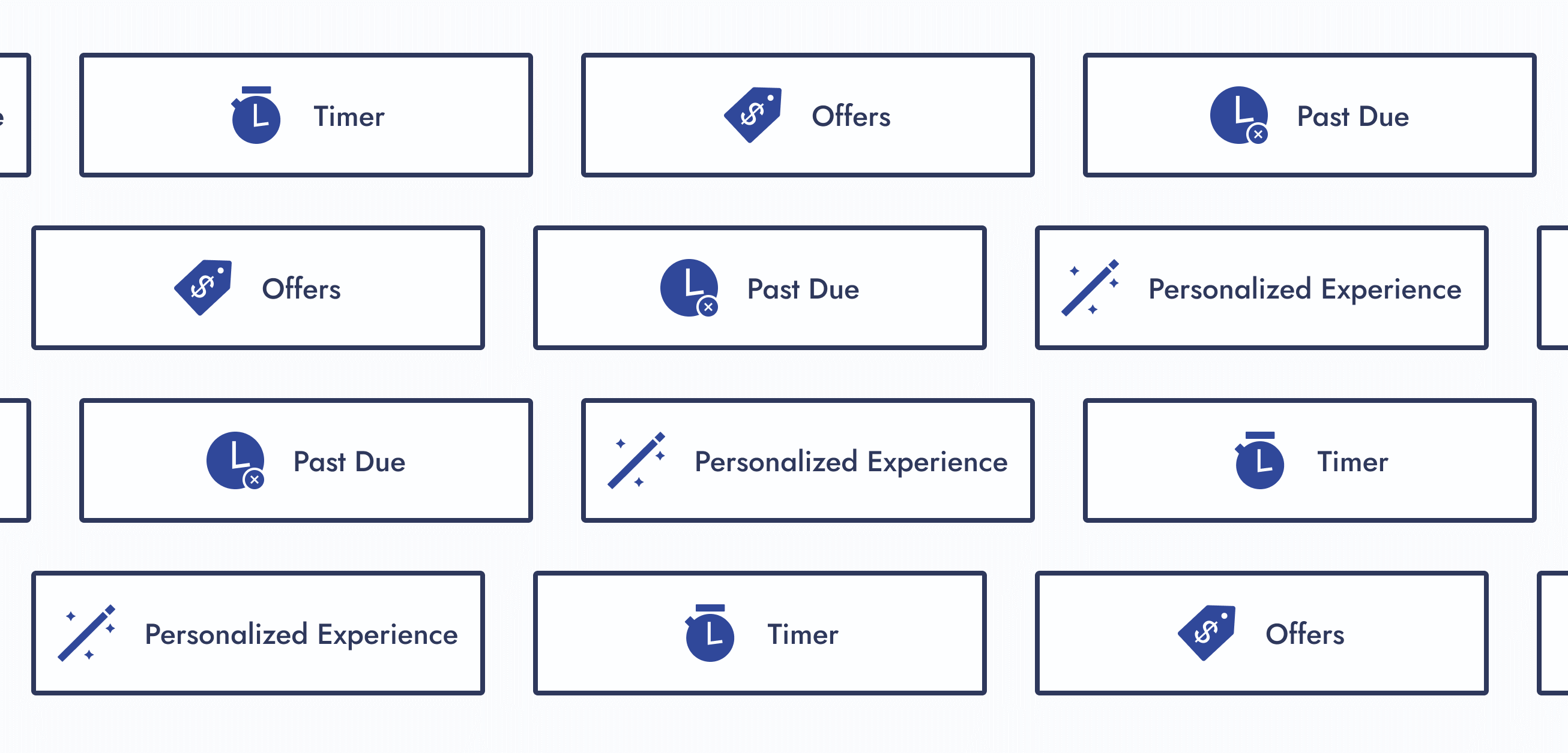
Illustration Icons
Icons that enhance branding and don’t usually follow the norm.
If a designer wanted to update the design of an illustrative parent icon, they would have maximum creative freedom.
Step 04: Design System UX
Now was the time to circle back to ideas I wanted to explore for this project:

Navigation Improvement
How do I improve navigation within a design system?
Solution:
For the icon design system, each section within a Figma page had menus. When clicked, you were brought to another part of the page.
Aesthetics
How can I make this design system more visually appealing?
Solution:
I gave the Figma file of the icon design system visual flair and character.
Step 05: Icon Request Process
01 - Create a Request Process
Create a request process that follows the journey of a designer looking for an icon.
02 - Present to Department
Present to the entire department and gather feedback. Iterate if needed.
View Icon Request Process

Step 06: Publish
After completing my checklist items, the new icon design system had met the minimal viable product (MVP) requirements. After I published the Figma file, the icons were ready for use.
I didn’t expect designers to automatically replace their existing icons (if necessary). There was a deadline set for that.
The Final Results
With the minimal viable product (MVP) published, there was still one unfinished task needing attention: organizing the icons within some product team pages. The MVP only required them to be in the design system Figma file and published.
Once that task was completed, I shifted to maintaining the living design system and serving as the point of contact for new icon requests.
Outcomes
So, how did we standardize company icons for a seamless user experience?
Icon Alignment
Aligned all icons stylistically and functionally

Source-of-Truth Location
Created a source-of-truth Figma file to house the icons
Categorization
Categorized icons
Icon Request Process
Created a new icon request process
Experiences
Note: The design of the icon design system has been updated to showcase another design idea.
Original Design
Interact with Original Design System

Updated Design
Interact with Updated Design System
Project Achievements
Over 370 parent icons componentized
Over 200 icons illustrated
10 themed component libraries created
1 Icon request process created
The Final Results
My Takeaways
Nesting components and adding menus within a Figma file are a Godsend. These features were extremely helpful in keeping the design system user-friendly and organized.
Credits
User Experience
Justine Luis
Senior UX Manager
Raven Caffey
UI/UX Designer
UX Engineers
Jason De Jesus
Senior UX Engineer
Johnee Evanofski
UX Engineering Manager
Sophie Wargo
UX Engineer
UI/UX Design Portfolio: Year 6 Edition
Case Study
Icons for an Icon
How might we standardize company icons for a seamless user experience?
0 to 1 Design
Enterprise Design System
Illustration
Multi-Brand Design Alignment
A Collaboration Between 2 Teams:
User Experience (Design System Team) & UX Engineering
At a Glance
Chapter 01
The Pain Points
- Company icons weren’t located in one place.
- There were barely any usage guidelines for icons.
- One icon would have many style variations.
- Other designers were either creating their own icons or externally sourcing them.
Solution: Let’s build a dedicated design system for company icons!
Chapter 02
The Discovery
Designers needed to work as efficiently as possible, easily find icons, and know how to use them. I had some thoughts on how to address these business and user needs while tackling the project challenges.
Chapter 03
The Minimal Viable Product (MVP)
The following steps were completed to publish the MVP of the living icon design system:
- Step 1: Alignment
- Step 2: New File
- Step 3: Categorization
- Step 4: Design System UX
- Step 5: Icon Request Process
- Step 6: Publish
Chapter 04
The Final Results
- 1 source-of-truth icon design system
- Over 370 parent icons componentized
- Over 200 icons illustrated
- 10 themed component libraries created
- 1 Icon request process created
My Takeaway: Nesting components and adding menus within a Figma file are a Godsend. These features were extremely helpful in keeping the design system user-friendly and organized.
Fine Print
Role
Lead UX Designer
Lead Visual Designer
Responsibilities
Design System Creation
Design System Maintenance
Icon Illustration
Duration
8 Months
Tools
Figma
Adobe Illustrator
Primary Deliverables
Icon Design System
10 Component Libraries
Icon Usage Guidelines
200+ Illustrated Icons
Icon Illustration Guidelines
Icon Request Process
Icon Category Dictionary
Company
Gap Inc.
Industry
Apparel Retail
Outline
Front Matter
Chapter 01
Chapter 02
Chapter 03
Chapter 04
Appendix
The Introduction
Imagine working on a project and realizing an icon is needed. While searching for one, you notice that icons are located in various Figma–and even Adobe XD—files. You also notice that one icon can have many style variations. What if the current variations don’t match the style you're looking for? Should you just create another one?
That was the experience of Gap Inc. UX designers. As the Design Systems team, my manager tasked me to solve this problem.
The Pain Points
Unorganized Icons
Company icons weren’t located in one place.
Thought
This would get annoying. Imagine seeing an icon housed somewhere, but you couldn’t remember where.
No Usage Guidelines
There were barely any usage guidelines for icons.
Thoughts
How were designers supposed to know how to use an icon? Should a heart be used for “favorites”, or should “favorites” be a star? Lack of usage guidelines could lead to an inconsistent user experience.
Many Style Variations
One icon would have many style variations.
Thoughts
What would happen if the current variations didn’t match the established icon styling within an experience? Would the designer create another variation, therefore, adding more to the mess?
No Source of Truth
Other designers were either creating their own icons or externally sourcing them.
Thought
This only deepened the ongoing issues.
How Might We...
How might we ensure icons are being used correctly and are found in one place?
How might we give users a consistent experience with our icons?
How might we standardize company icons for a seamless user experience?
The Pain Points
The Solution
Let’s build a dedicated design system for company icons!
The Discovery
Business Needs
Have designers work as efficiently as possible.
User Needs
Designers need to easily find icons and know how to use them.
Thoughts
What’s needed from this design system to help designers be as efficient as possible? The UX department had 8 different product teams that had their own set of stylized icons.
Component Library Quantity
Should I create component libraries for each of those 8 product teams? That way, the designers who work within them know exactly where to go when looking for an icon.
Action Item:
I created component libraries for each product team.
New Icon Requests
What if designers look within those individual component libraries, but couldn’t find the icon they need? Also, what if they want a specialty version of an icon, like for the holidays? Should there be a process for designers to request new icons?
Action Item:
I created an icon request process.
Icon Style Guides
As the icon point of contact, what happens if I’m unavailable and there’s an icon request? Should there be a style guide for each icon set?
Action Item:
Inspired by Material Design, I created icon style guides for each of the 8 product teams.
Icon Usage Guidelines
What stops designers from using an icon incorrectly? Should there be usage guidelines?
Action Item:
Icon function categories were created and paired with a dictionary. Each icon was assigned to 1 of 3 categories.
Explorations
Since I was building this design system from scratch, I had the opportunity to explore new ways of displaying components within a Figma file.
Navigation Improvement
How do I improve navigation within a design system?
Idea:
Add a menu that allows designers to navigate to other parts of the Figma page.
Aesthetics
How can I make this design system more visually appealing?
Idea:
Stylized component sections and product team pages.
Design Research
My manager found an article called “Icons as Part of a Great User Experience”, and it explains why icons are more important to a user’s experience than one may think. After reading this article, we walked away with a couple of action items:
Action Item: Icon Categorization
Let’s categorize our icons by familiarity and function. The article mentions universal, conflicting, and unique icons. We should categorize our icons similarly.
Action Item: Parent Library
We should have a parent component library that all icon designs and functions sourced from. If a designer wanted to deviate from the design or function of a parent icon, a discussion would be required.
Note:
Changing the style of a parent icon, such as line width or corner radius, wouldn’t require a discussion, unless it deviated from the established styling pattern of a designer’s product team.

The Minimal Viable Product (MVP)
Since design systems are living documents, what needed to be completed for this project to be considered “done”?
Step 01: Alignment
01 - Icon Audit
Do an icon audit to ensure all icons are accounted for and to see how far similar icons stray from one another.
02 - Recreate Icons
Recreate icons for the parent library, ensuring to save the “working” version. Ensure each icon has a filled and outlined version.
03 - Update or Recreate Misaligned Icons
Update or recreate misaligned icons from each product team and make a style guide for them. From corner radius to line width, each icon within a set needs to be consistent.
Step 02: New File
01 - Create New Figma File
Make a brand new Figma file that only the design system team can edit. Other designers can simply view and copy components from it.
02 - Separate Icons
Separate the icons for each product team and place them within their own page.
03 - Make Components
Make components out of every icon.
Step 03: Categorization
Based on the “Icons as Part of a Great User Experience” article, my manager said we were going to categorize icons by user familiarity and function.
Categorize Icons
Give each icon from the parent library a familiarity and functional category. Then give any children the same categorizations.
Category: Icon Familiarity
How recognizable an icon would be to users. Our three subcategories were conflicting, unique, and universal.
Conflicting Icons
Icons with common uses but company-specific designs
Unique Icons
Custom icons made for a specific purpose within a company
Universal Icons
Recognizable icons used consistently across other companies
Category: Icon Function
How icons should be used. Our three subcategories were functional, helper, and illustration.
Functional Icons
Icons that perform actions and could be used as a standalone button.
If a designer wanted to update the design of a functional parent icon, they would have limited creative freedom.
Helper Icons
Icons that clarify the message and are usually paired with helper text.
If a designer wanted to update the design of a helper parent icon, they would have moderate creative freedom.
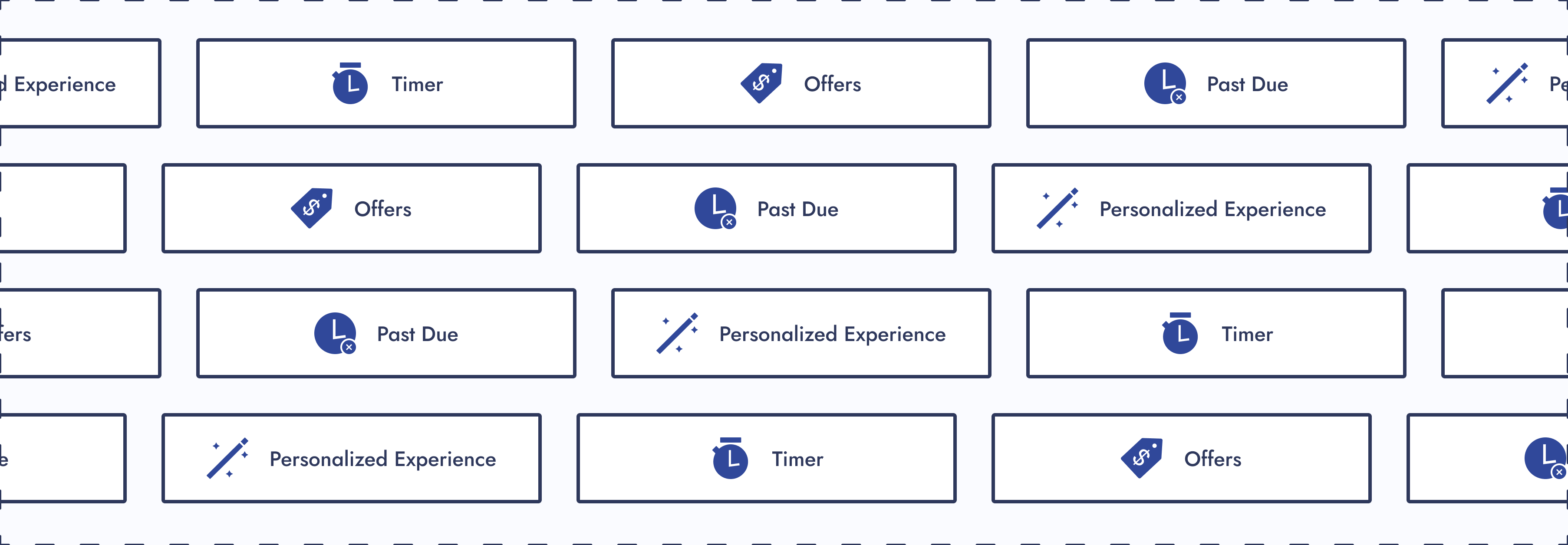
Illustration Icons
Icons that enhance branding and don’t usually follow the norm.
If a designer wanted to update the design of an illustrative parent icon, they would have maximum creative freedom.
Step 04: Design System UX
Now was the time to circle back to ideas I wanted to explore for this project:
Navigation Improvement
How do I improve navigation within a design system?
Solution:
For the icon design system, each section within a Figma page had menus. When clicked, you were brought to another part of the page.
Aesthetics
How can I make this design system more visually appealing?
Solution:
I gave the Figma file of the icon design system visual flair and character.
Step 05: Icon Request Process
01 - Create a Request Process
Create a request process that follows the journey of a designer looking for an icon.
02 - Present to Department
Present to the entire department and gather feedback. Iterate if needed.

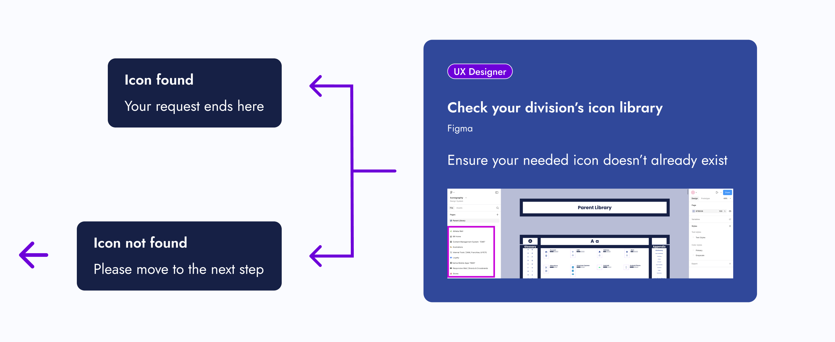
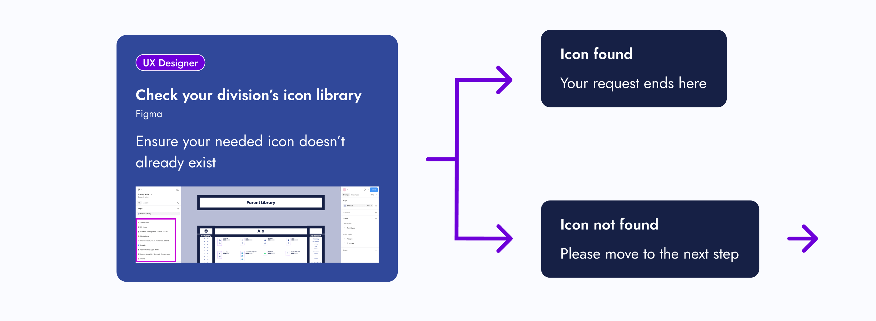
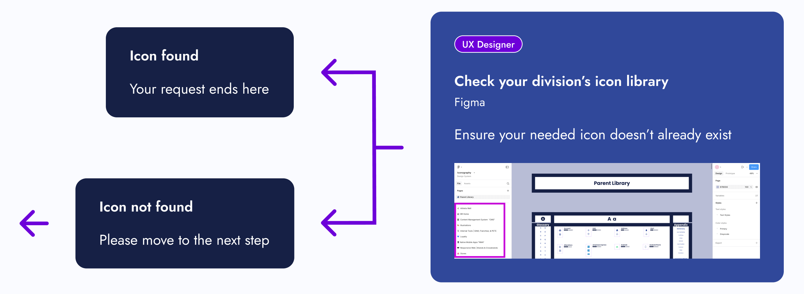
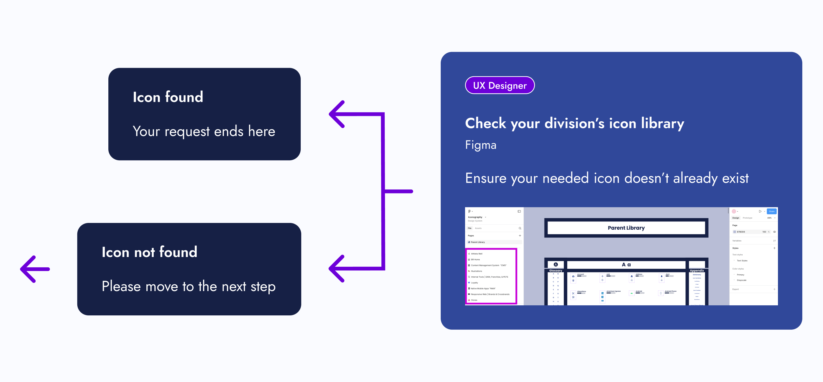
Hover over the below image and scroll to view the icon request process
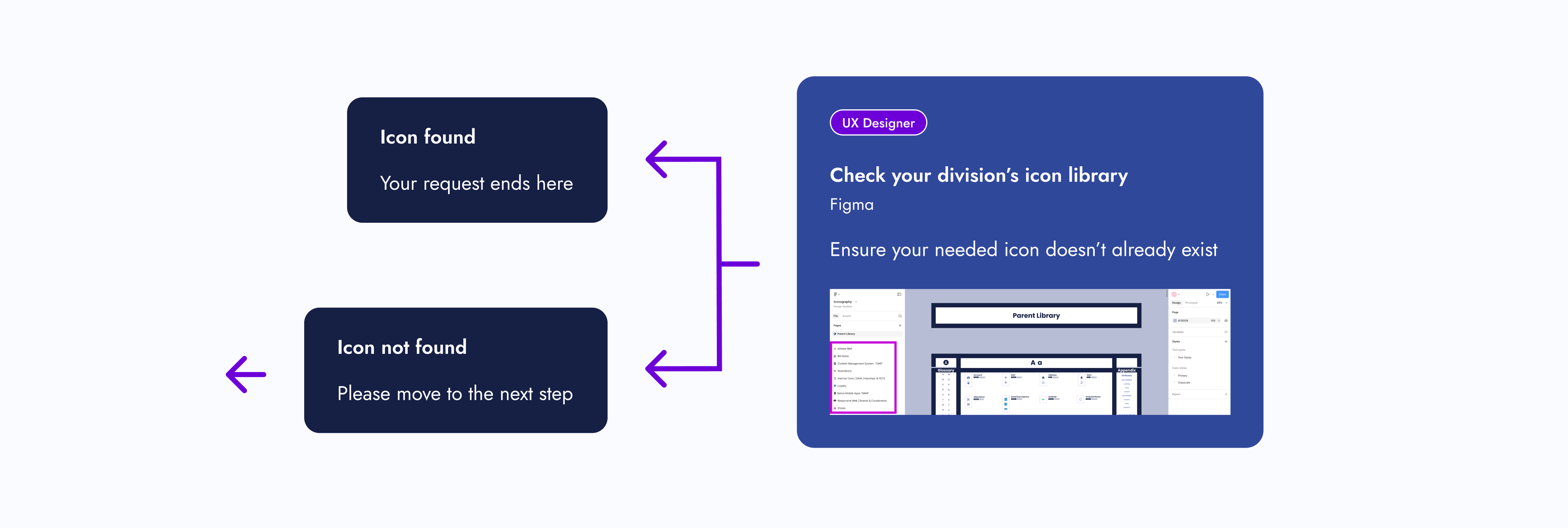
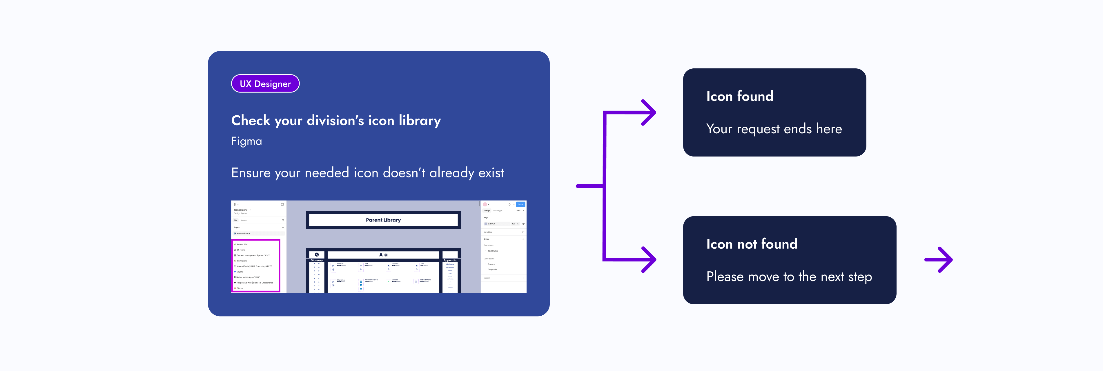
UX Designer
Check your division’s icon library
Figma
Ensure your needed icon doesn’t already exist


Icon found
Your request ends here
Icon not found
Please move to the next step

UX Designer
Check the Parent Icon Library
Figma
See if your needed icon exists here

UX Designer

Icon found
Please move to the next step
Icon found...
but its function doesn’t meet your requirements — please move to the next step


UX Designer
UX Systems Designer
Edit icon
Microsoft Teams, Zoom, Figma, or All Three
Contact Raven and work together on your icon requirements. If she’s unavailable, contact and work with your design system partner.
Icon edits include the following:
- Adding a touch target
- Creating a seasonal version
- Matching your division’s icon style

OR

Icon not found
Please move to the next step


UX Designer
UX Systems Designer
New icon
Microsoft Teams, Zoom, Figma, or All Three
Contact Raven and work together on your icon requirements. If she’s unavailable, contact and work with your design system partner.


UX Systems Designer
Icon is edited or created
Figma
The UX System Designer edits or creates the icon based off your requirements
UX Designer
UX Systems Designer
Review icon
Microsoft Teams, Zoom, Figma, or All Three
The UX Systems Designer reviews the icon with you to ensure the requirements are met
UX Designer
Review icon with stakeholders
Figma
You review the icon with the appropriate people for approval


Icon edits needed
Icon approved
Approval was received by you and your stakeholders
UX Designer
Icon is added to project
Figma
UX Systems Designer
Icon is added to the design system and announced to team(s)
Microsoft Teams, Zoom, Figma, or All Three
The UX Systems Designer adds the new or edited icon to the appropriate icon library, or libraries, and announces it to the appropriate team(s)
UX Systems Designer
UX Developer
Icon is added to Core-UI
Microsoft Teams, Zoom, Figma, or All Three
If needed, the UX Systems Designer meets with a UX Developer to add the icon to Core-UI
Step 06: Publish
After completing my checklist items, the new icon design system had met the minimal viable product (MVP) requirements. After I published the Figma file, the icons were ready for use.
I didn’t expect designers to automatically replace their existing icons (if necessary). There was a deadline set for that.
The Final Results
With the minimal viable product (MVP) published, there was still one unfinished task needing attention: organizing the icons within some product team pages. The MVP only required them to be in the design system Figma file and published.
Once that task was completed, I shifted to maintaining the living design system and serving as the point of contact for new icon requests.
Outcomes
So, how did we standardize company icons for a seamless user experience?
Icon Alignment
Aligned all icons stylistically and functionally

Source-of-Truth Location
Created a source-of-truth Figma file to house the icons
Categorization
Categorized icons
Icon Request Process
Created a new icon request process
Experiences
Note: The design of the icon design system has been updated to showcase another design idea.
Original Design
Interact with Original Design System
Updated Design
Interact with Updated Design System
Project Achievements
Over 370 parent icons componentized
Over 200 icons illustrated
10 themed component libraries created
1 Icon request process created
The Final Results
My Takeaways
Nesting components and adding menus within a Figma file are a Godsend. These features were extremely helpful in keeping the design system user-friendly and organized.
Credits
User Experience
Justine Luis
Senior UX Manager
Raven Caffey
UI/UX Designer
UX Engineers
Jason De Jesus
Senior UX Engineer
Johnee Evanofski
UX Engineering Manager
Sophie Wargo
UX Engineer
UI/UX Design Portfolio: Year 6 Edition
Case Study
Icons for an Icon
How might we standardize company icons for a seamless user experience?
0 to 1 Design
Enterprise Design System
Illustration
Multi-Brand Design Alignment
A Collaboration Between 2 Teams:
User Experience (Design System Team) & UX Engineering
At a Glance
Chapter 01
The Pain Points
- Company icons weren’t located in one place.
- There were barely any usage guidelines for icons.
- One icon would have many style variations.
- Other designers were either creating their own icons or externally sourcing them.
Solution: Let’s build a dedicated design system for company icons!
Chapter 02
The Discovery
Designers needed to work as efficiently as possible, easily find icons, and know how to use them. I had some thoughts on how to address these business and user needs while tackling the project challenges.
Chapter 03
The Minimal Viable Product (MVP)
The following steps were completed to publish the MVP of the living icon design system:
- Step 1: Alignment
- Step 2: New File
- Step 3: Categorization
- Step 4: Design System UX
- Step 5: Icon Request Process
- Step 6: Publish
Chapter 04
The Final Results
- 1 source-of-truth icon design system
- Over 370 parent icons componentized
- Over 200 icons illustrated
- 10 themed component libraries created
- 1 Icon request process created
My Takeaway: Nesting components and adding menus within a Figma file are a Godsend. These features were extremely helpful in keeping the design system user-friendly and organized.
Fine Print
Role
Lead UX Designer
Lead Visual Designer
Responsibilities
Design System Creation
Design System Maintenance
Icon Illustration
Duration
8 Months
Tools
Figma
Adobe Illustrator
Primary Deliverables
Icon Design System
10 Component Libraries
Icon Usage Guidelines
200+ Illustrated Icons
Icon Illustration Guidelines
Icon Request Process
Icon Category Dictionary
Company
Gap Inc.
Industry
Apparel Retail
Outline
Front Matter
Chapter 01
Chapter 02
Chapter 03
Chapter 04
Appendix
The Introduction
Imagine working on a project and realizing an icon is needed. While searching for one, you notice that icons are located in various Figma–and even Adobe XD—files. You also notice that one icon can have many style variations. What if the current variations don’t match the style you're looking for? Should you just create another one?
That was the experience of Gap Inc. UX designers. As the Design Systems team, my manager tasked me to solve this problem.
The Pain Points
Unorganized Icons
Company icons weren’t located in one place.
Thought
This would get annoying. Imagine seeing an icon housed somewhere, but you couldn’t remember where.
No Usage Guidelines
There were barely any usage guidelines for icons.
Thoughts
How were designers supposed to know how to use an icon? Should a heart be used for “favorites”, or should “favorites” be a star? Lack of usage guidelines could lead to an inconsistent user experience.
Many Style Variations
One icon would have many style variations. UI balancing text (please ignore) UI...
Thoughts
What would happen if the current variations didn’t match the established icon styling within an experience? Would the designer create another variation, therefore, adding more to the mess?
No Source of Truth
Other designers were either creating their own icons or externally sourcing them.
Thought
This only deepened the ongoing issues.
How Might We...
How might we ensure icons are being used correctly and are found in one place?
How might we give users a consistent experience with our icons?
How might we standardize company icons for a seamless user experience?
The Pain Points
The Solution
Let’s build a dedicated design system for company icons!
The Discovery
Business Needs
Have designers work as efficiently as possible.
User Needs
Designers need to easily find icons and know how to use them.
Thoughts
What’s needed from this design system to help designers be as efficient as possible? The UX department had 8 different product teams that had their own set of stylized icons.
Component Library Quantity
Should I create component libraries for each of those 8 product teams? That way, the designers who work within them know exactly where to go when looking for an icon.
Action Item:
I created component libraries for each product team.
New Icon Requests
What if designers look within those individual component libraries, but couldn’t find the icon they need? Also, what if they want a specialty version of an icon, like for the holidays? Should there be a process for designers to request new icons?
Action Item:
I created an icon request process.
Icon Style Guides
As the icon point of contact, what happens if I’m unavailable and there’s an icon request? Should there be a style guide for each icon set?
Action Item:
Inspired by Material Design, I created icon style guides for each of the 8 product teams.
Icon Usage Guidelines
What stops designers from using an icon incorrectly? Should there be usage guidelines?
Action Item:
Icon function categories were created and paired with a dictionary. Each icon was assigned to 1 of 3 categories.
Explorations
Since I was building this design system from scratch, I had the opportunity to explore new ways of displaying components within a Figma file.
Navigation Improvement
How do I improve navigation within a design system?
Idea:
Add a menu that allows designers to navigate to other parts of the Figma page.
Aesthetics
How can I make this design system more visually appealing?
Idea:
Stylized component sections and product team pages.
Design Research
My manager found an article called “Icons as Part of a Great User Experience”, and it explains why icons are more important to a user’s experience than one may think. After reading this article, we walked away with a couple of action items:
Action Item: Icon Categorization
Let’s categorize our icons by familiarity and function. The article mentions universal, conflicting, and unique icons. We should categorize our icons similarly.
Action Item: Parent Library
We should have a parent component library that all icon designs and functions sourced from. If a designer wanted to deviate from the design or function of a parent icon, a discussion would be required.
Note:
Changing the style of a parent icon, such as line width or corner radius, wouldn’t require a discussion, unless it deviated from the established styling pattern of a designer’s product team.

The Minimal Viable Product (MVP)
Since design systems are living documents, what needed to be completed for this project to be considered “done”?
Step 01: Alignment
01 - Icon Audit
Do an icon audit to ensure all icons are accounted for and to see how far similar icons stray from one another.
02 - Recreate Icons
Recreate icons for the parent library, ensuring to save the “working” version. Ensure each icon has a filled and outlined version.
03 - Update or Recreate Misaligned Icons
Update or recreate misaligned icons from each product team and make a style guide for them. From corner radius to line width, each icon within a set needs to be consistent.
Step 02: New File
01 - Create New Figma File
Make a brand new Figma file that only the design system team can edit. Other designers can simply view and copy components from it.
02 - Separate Icons
Separate the icons for each product team and place them within their own page.
03 - Make Components
Make components out of every icon.
Step 03: Categorization
Based on the “Icons as Part of a Great User Experience” article, my manager said we were going to categorize icons by user familiarity and function.
Categorize Icons
Give each icon from the parent library a familiarity and functional category. Then give any children the same categorizations.
Category: Icon Familiarity
How recognizable an icon would be to users. Our three subcategories were conflicting, unique, and universal.
Conflicting Icons
Icons with common uses but company-specific designs
Unique Icons
Custom icons made for a specific purpose within a company
Universal Icons
Recognizable icons used consistently across other companies
Category: Icon Function
How icons should be used. Our three subcategories were functional, helper, and illustration.
Functional Icons
Icons that perform actions and could be used as a standalone button.
If a designer wanted to update the design of a functional parent icon, they would have limited creative freedom.
Helper Icons
Icons that clarify the message and are usually paired with helper text.
If a designer wanted to update the design of a helper parent icon, they would have moderate creative freedom.
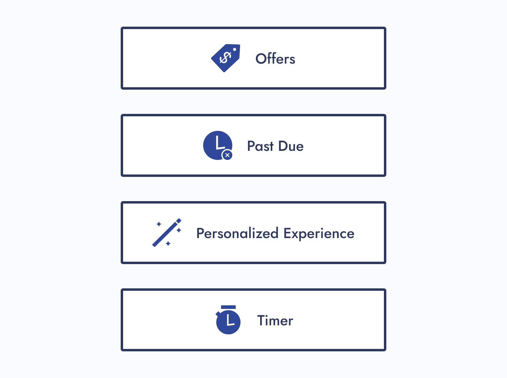
Illustration Icons
Icons that enhance branding and don’t usually follow the norm.
If a designer wanted to update the design of an illustrative parent icon, they would have maximum creative freedom.
Step 04: Design System UX
Now was the time to circle back to ideas I wanted to explore for this project:
Navigation Improvement
How do I improve navigation within a design system?
Solution:
For the icon design system, each section within a Figma page had menus. When clicked, you were brought to another part of the page.
Aesthetics
How can I make this design system more visually appealing?
Solution:
I gave the Figma file of the icon design system visual flair and character.
Step 05: Icon Request Process
01 - Create a Request Process
Create a request process that follows the journey of a designer looking for an icon.
02 - Present to Department
Present to the entire department and gather feedback. Iterate if needed.
Step 06: Publish
After completing my checklist items, the new icon design system had met the minimal viable product (MVP) requirements. After I published the Figma file, the icons were ready for use.
I didn’t expect designers to automatically replace their existing icons (if necessary). There was a deadline set for that.
Hover over the below image and scroll to view the icon request process
UX Designer
Check the icon library for your specific track
Figma
Ensure your needed icon doesn’t already exist


Icon found
Your request ends here
Icon not found
Please move to the next step

UX Designer
Check the Parent Icon Library
Figma
See if your needed icon exists here
Icon found
Please move to the next step
Icon found...
but its function doesn’t meet your requirements — please move to the next step


UX Designer
UX Systems Designer
Edit icon
Microsoft Teams, Zoom, Figma, or All Three
Contact Raven and work together on your icon requirements. If she’s unavailable, contact and work with your design system partner.
Icon edits include the following:
- Adding a touch target
- Creating a seasonal version
- Matching your division’s icon style


Icon not found
Please move to the next step


UX Designer
UX Systems Designer
New icon
Microsoft Teams, Zoom, Figma, or All Three
Contact Raven and work together on your icon requirements. If she’s unavailable, contact and work with your design system partner.


UX Systems Designer
Icon is edited or created
Figma
The UX System Designer edits or creates the icon based off your requirements
UX Designer
UX Systems Designer
Review icon
Microsoft Teams, Zoom, Figma, or All Three
The UX Systems Designer reviews the icon with you to ensure the requirements are met
UX Designer
Review icon with stakeholders
Figma
You review the icon with the appropriate people for approval


UX Systems Designer

Icon edits needed
Icon approved
Approval was received by you and your stakeholders
UX Designer
Icon is added to project
Figma
UX Systems Designer
Icon is added to the design system and announced to team(s)
Microsoft Teams, Zoom, Figma, or All Three
The UX Systems Designer adds the new or edited icon to the appropriate icon library, or libraries, and announces it to the appropriate team(s)
UX Systems Designer
UX Developer
Icon is added to Core-UI
Microsoft Teams, Zoom, Figma, or All Three
If needed, the UX Systems Designer meets with a UX Developer to add the icon to Core-UI
The Final Results
With the minimal viable product (MVP) published, there was still one unfinished task needing attention: organizing the icons within some product team pages. The MVP only required them to be in the design system Figma file and published.
Once that task was completed, I shifted to maintaining the living design system and serving as the point of contact for new icon requests.
Outcomes
So, how did we standardize company icons for a seamless user experience?
Icon Alignment
Aligned all icons stylistically and functionally
Source-of-Truth Location
Created a source-of-truth Figma file to house the icons
Categorization
Categorized icons
Icon Request Process
Created a new icon request process
Experiences
Note: The design of the icon design system has been updated to showcase another design idea.
Original Design
Interact with Original Design System
Updated Design
Interact with Updated Design System
Project Achievements
Over 370 parent icons componentized
Over 200 icons illustrated
10 themed component libraries created
1 Icon request process created
The Final Results
My Takeaways
Nesting components and adding menus within a Figma file are a Godsend. These features were extremely helpful in keeping the design system user-friendly and organized.
Credits
User Experience
Justine Luis
Senior UX Manager
Raven Caffey
UI/UX Designer
UX Engineers
Jason De Jesus
Senior UX Engineer
Johnee Evanofski
UX Engineering Manager
Sophie Wargo
UX Engineer
UI/UX Design Portfolio: Year 6 Edition
Case Study
Icons for an Icon
How might we standardize company icons for a seamless user experience?
0 to 1 Design
Enterprise Design System
Illustration
Multi-Brand Design Alignment
A Collaboration Between 2 Teams:
User Experience (Design System Team) & UX Engineering
At a Glance
Chapter 01
The Pain Points
- Company icons weren’t located in one place.
- There were barely any usage guidelines for icons.
- One icon would have many style variations.
- Other designers were either creating their own icons or externally sourcing them.
Solution: Let’s build a dedicated design system for company icons!
Chapter 02
The Discovery
Designers needed to work as efficiently as possible, easily find icons, and know how to use them. I had some thoughts on how to address these business and user needs while tackling the project challenges.
Chapter 03
The Minimal Viable Product (MVP)
The following steps were completed to publish the MVP of the living icon design system:
- Step 1: Alignment
- Step 2: New File
- Step 3: Categorization
- Step 4: Design System UX
- Step 5: Icon Request Process
- Step 6: Publish
Chapter 04
The Final Results
- 1 source-of-truth icon design system
- Over 370 parent icons componentized
- Over 200 icons illustrated
- 10 themed component libraries created
- 1 Icon request process created
My Takeaway: Nesting components and adding menus within a Figma file are a Godsend. These features were extremely helpful in keeping the design system user-friendly and organized.
Fine Print
Role
Lead UX Designer
Lead Visual Designer
Responsibilities
Design System Creation
Design System Maintenance
Icon Illustration
Duration
8 Months
Tools
Figma
Adobe Illustrator
Primary Deliverables
Icon Design System
10 Component Libraries
Icon Usage Guidelines
200+ Illustrated Icons
Icon Illustration Guidelines
Icon Request Process
Icon Category Dictionary
Company
Gap Inc.
Industry
Apparel Retail
Outline
Front Matter
Chapter 01
Chapter 02
Chapter 03
Chapter 04
Appendix
The Introduction
Imagine working on a project and realizing an icon is needed. While searching for one, you notice that icons are located in various Figma–and even Adobe XD—files. You also notice that one icon can have many style variations. What if the current variations don’t match the style you're looking for? Should you just create another one?
That was the experience of Gap Inc. UX designers. As the Design Systems team, my manager tasked me to solve this problem.
The Pain Points
Unorganized Icons
Company icons weren’t located in one place.
Thought
This would get annoying. Imagine seeing an icon housed somewhere, but you couldn’t remember where.
No Usage Guidelines
There were barely any usage guidelines for icons.
Thoughts
How were designers supposed to know how to use an icon? Should a heart be used for “favorites”, or should “favorites” be a star? Lack of usage guidelines could lead to an inconsistent user experience.
Many Style Variations
One icon would have many style variations.
Thoughts
What would happen if the current variations didn’t match the established icon styling within an experience? Would the designer create another variation, therefore, adding more to the mess?
No Source of Truth
Other designers were either creating their own icons or externally sourcing them.
Thought
This only deepened the ongoing issues.
How Might We...
How might we ensure icons are being used correctly and are found in one place?
How might we give users a consistent experience with our icons?
How might we standardize company icons for a seamless user experience?
The Pain Points
The Solution
Let’s build a dedicated design system for company icons!
The Discovery
Business Needs
Have designers work as efficiently as possible.
User Needs
Designers need to easily find icons and know how to use them.
Thoughts
What’s needed from this design system to help designers be as efficient as possible? The UX department had 8 different product teams that had their own set of stylized icons.
Component Library Quantity
Should I create component libraries for each of those 8 product teams? That way, the designers who work within them know exactly where to go when looking for an icon.
Action Item:
I created component libraries for each product team.
New Icon Requests
What if designers look within those individual component libraries, but couldn’t find the icon they need? Also, what if they want a specialty version of an icon, like for the holidays? Should there be a process for designers to request new icons?
Action Item:
I created an icon request process.
Icon Style Guides
As the icon point of contact, what happens if I’m unavailable and there’s an icon request? Should there be a style guide for each icon set?
Action Item:
Inspired by Material Design, I created icon style guides for each of the 8 product teams.
Icon Usage Guidelines
What stops designers from using an icon incorrectly? Should there be usage guidelines?
Action Item:
Icon function categories were created and paired with a dictionary. Each icon was assigned to 1 of 3 categories.
Explorations
Since I was building this design system from scratch, I had the opportunity to explore new ways of displaying components within a Figma file.
Navigation Improvement
How do I improve navigation within a design system?
Idea:
Add a menu that allows designers to navigate to other parts of the Figma page.
Aesthetics
How can I make this design system more visually appealing?
Idea:
Stylized component sections and product team pages.
Design Research
My manager found an article called “Icons as Part of a Great User Experience”, and it explains why icons are more important to a user’s experience than one may think. After reading this article, we walked away with a couple of action items:
Action Item: Icon Categorization
Let’s categorize our icons by familiarity and function. The article mentions universal, conflicting, and unique icons. We should categorize our icons similarly.
Action Item: Parent Library
We should have a parent component library that all icon designs and functions sourced from. If a designer wanted to deviate from the design or function of a parent icon, a discussion would be required.
Note:
Changing the style of a parent icon, such as line width or corner radius, wouldn’t require a discussion, unless it deviated from the established styling pattern of a designer’s product team.

The Minimal Viable Product (MVP)
Since design systems are living documents, what needed to be completed for this project to be considered “done”?
Step 01: Alignment
01 - Icon Audit
Do an icon audit to ensure all icons are accounted for and to see how far similar icons stray from one another.
02 - Recreate Icons
Recreate icons for the parent library, ensuring to save the “working” version. Ensure each icon has a filled and outlined version.
03 - Update or Recreate Misaligned Icons
Update or recreate misaligned icons from each product team and make a style guide for them. From corner radius to line width, each icon within a set needs to be consistent.
Step 02: New File
01 - Create New Figma File
Make a brand new Figma file that only the design system team can edit. Other designers can simply view and copy components from it.
02 - Separate Icons
Separate the icons for each product team and place them within their own page.
03 - Make Components
Make components out of every icon.
Step 03: Categorization
Based on the “Icons as Part of a Great User Experience” article, my manager said we were going to categorize icons by user familiarity and function.
Categorize Icons
Give each icon from the parent library a familiarity and functional category. Then give any children the same categorizations.
Category: Icon Familiarity
How recognizable an icon would be to users. Our three subcategories were conflicting, unique, and universal.
Conflicting Icons
Icons with common uses but company-specific designs
Unique Icons
Custom icons made for a specific purpose within a company
Universal Icons
Recognizable icons used consistently across other companies
Category: Icon Function
How icons should be used. Our three subcategories were functional, helper, and illustration.
Functional Icons
Icons that perform actions and could be used as a standalone button.
If a designer wanted to update the design of a functional parent icon, they would have limited creative freedom.
Helper Icons
Icons that clarify the message and are usually paired with helper text.
If a designer wanted to update the design of a helper parent icon, they would have moderate creative freedom.
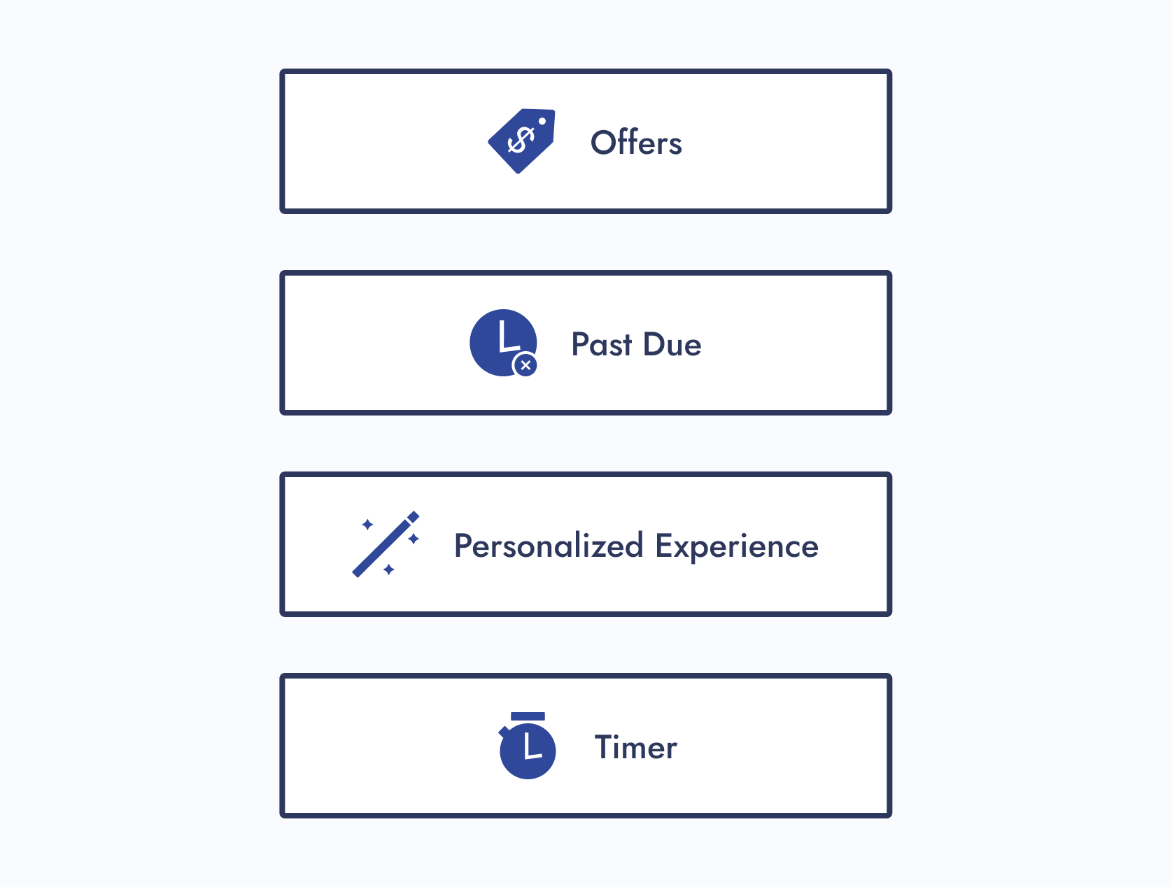
Illustration Icons
Icons that enhance branding and don’t usually follow the norm.
If a designer wanted to update the design of an illustrative parent icon, they would have maximum creative freedom.
Step 04: Design System UX
Now was the time to circle back to ideas I wanted to explore for this project:
Navigation Improvement
How do I improve navigation within a design system?
Solution:
For the icon design system, each section within a Figma page had menus. When clicked, you were brought to another part of the page.
Aesthetics
How can I make this design system more visually appealing?
Solution:
I gave the Figma file of the icon design system visual flair and character.
Step 05: Icon Request Process
01 - Create a Request Process
Create a request process that follows the journey of a designer looking for an icon.
02 - Present to Department
Present to the entire department and gather feedback. Iterate if needed.
Hover over the image on the right and scroll to view the icon request process
Step 06: Publish
After completing my checklist items, the new icon design system had met the minimal viable product (MVP) requirements. After I published the Figma file, the icons were ready for use.
I didn’t expect designers to automatically replace their existing icons (if necessary). There was a deadline set for that.
UX Designer
Check the icon library for your specific track
Figma
Ensure your needed icon doesn’t already exist
Icon found
Your request ends here
Icon not found
Please move to the next step
UX Designer
Check the Parent Icon Library
Figma
See if your needed icon exists here
Icon found
Please move to the next step
Icon found...
but its function doesn’t meet your requirements — please move to the next step
UX Designer
UX Systems Designer
Edit icon
Microsoft Teams, Zoom, Figma, or All Three
Contact Raven and work together on your icon requirements. If she’s unavailable, contact and work with your design system partner.
Icon edits include the following:
- Adding a touch target
- Creating a seasonal version
- Matching your division’s icon style
Icon not found
Please move to the next step
UX Designer
UX Systems Designer
New icon
Microsoft Teams, Zoom, Figma, or All Three
Contact Raven and work together on your icon requirements. If she’s unavailable, contact and work with your design system partner.
UX Systems Designer
Icon is edited or created
Figma
The UX System Designer edits or creates the icon based off your requirements
UX Designer
UX Systems Designer
Review icon
Microsoft Teams, Zoom, Figma, or All Three
The UX Systems Designer reviews the icon with you to ensure the requirements are met
UX Designer
Review icon with stakeholders
Figma
You review the icon with the appropriate people for approval
UX Systems Designer
Icon edits needed
Icon approved
Approval was received by you and your stakeholders
UX Designer
Icon is added to project
Figma
UX Systems Designer
Icon is added to the design system and announced to team(s)
Microsoft Teams, Zoom, Figma, or All Three
The UX Systems Designer adds the new or edited icon to the appropriate icon library, or libraries, and announces it to the appropriate team(s)
UX Systems Designer
UX Developer
Icon is added to Core-UI
Microsoft Teams, Zoom, Figma, or All Three
If needed, the UX Systems Designer meets with a UX Developer to add the icon to Core-UI
The Final Results
With the minimal viable product (MVP) published, there was still one unfinished task needing attention: organizing the icons within some product team pages. The MVP only required them to be in the design system Figma file and published.
Once that task was completed, I shifted to maintaining the living design system and serving as the point of contact for new icon requests.
Outcomes
So, how did we standardize company icons for a seamless user experience?
Icon Alignment
Aligned all icons stylistically and functionally
Source-of-Truth Location
Created a source-of-truth Figma file to house the icons
Categorization
Categorized icons
Icon Request Process
Created a new icon request process
Experiences
Note: The design of the icon design system has been updated to showcase another design idea.
Original Design
Interact with Original Design System
Updated Design
Interact with Updated Design System
Project Achievements
Over 370 parent icons componentized
Over 200 icons illustrated
10 themed component libraries created
1 Icon request process created

The Final Results
My Takeaways
Nesting components and adding menus within a Figma file are a Godsend. These features were extremely helpful in keeping the design system user-friendly and organized.
Credits
User Experience
Justine Luis
Senior UX Manager
Raven Caffey
UI/UX Designer
UX Engineers
Jason De Jesus
Senior UX Engineer
Johnee Evanofski
UX Engineering Manager
Sophie Wargo
UX Engineer