UI/UX Design Portfolio: Year 6 Edition
HELLO RAVEN
Concept
Cart to Comfort: Crafting a Chic Checkout
How might we offer a checkout experience that captures the essence of a high-end brand?
0 to 1 Design
E-commerce
Luxury Brand
Responsive Web
Fine Print
Role
UI/UX Designer
Responsibilities
Cart Experience
Checkout Experience
Tools
Figma
Adobe Photoshop
Primary Deliverables
Cart Experience
Checkout Experience
Secondary Deliverables
High-Fidelity Wireframes
Prototypes
Company
Gap Inc.
Brand
BR Home
Industry
Home Furnishings
Luxury Retail
At a Glance
Chapter 01
The Challenges
- There were no user stories and barely any acceptance criteria.
- The brand was to be externally hosted. What were the limitations of the external host?
Solution: Let’s adopt established design patterns from other big companies and apply them to the cart and checkout experience.
Chapter 02
The Discovery
Gap Inc. wanted a website fit for a luxury brand, shoppers needed basic functionality, and stakeholders requested a unique cart and checkout experience. Before designing, I browsed around to gain design inspiration from others.
Chapter 03
The Design
When I view the websites of luxury brands, I think of “clean” and “polished”. There’s not much visual noise occurring on the page to distract you from the main attraction (from what I’ve seen, at least). So, that’s the approach I made to both the cart and checkout flow: clean and polished.
Chapter 04
The Final Results
Due to company restructuring, I wasn’t able to gain much peer feedback or see if this design was technically feasible. So in my personal time, I fleshed out my idea and made responsive screens.
My Takeaway: Taking unconventional design approaches doesn’t mean you have to reinvent the wheel.


The Introduction
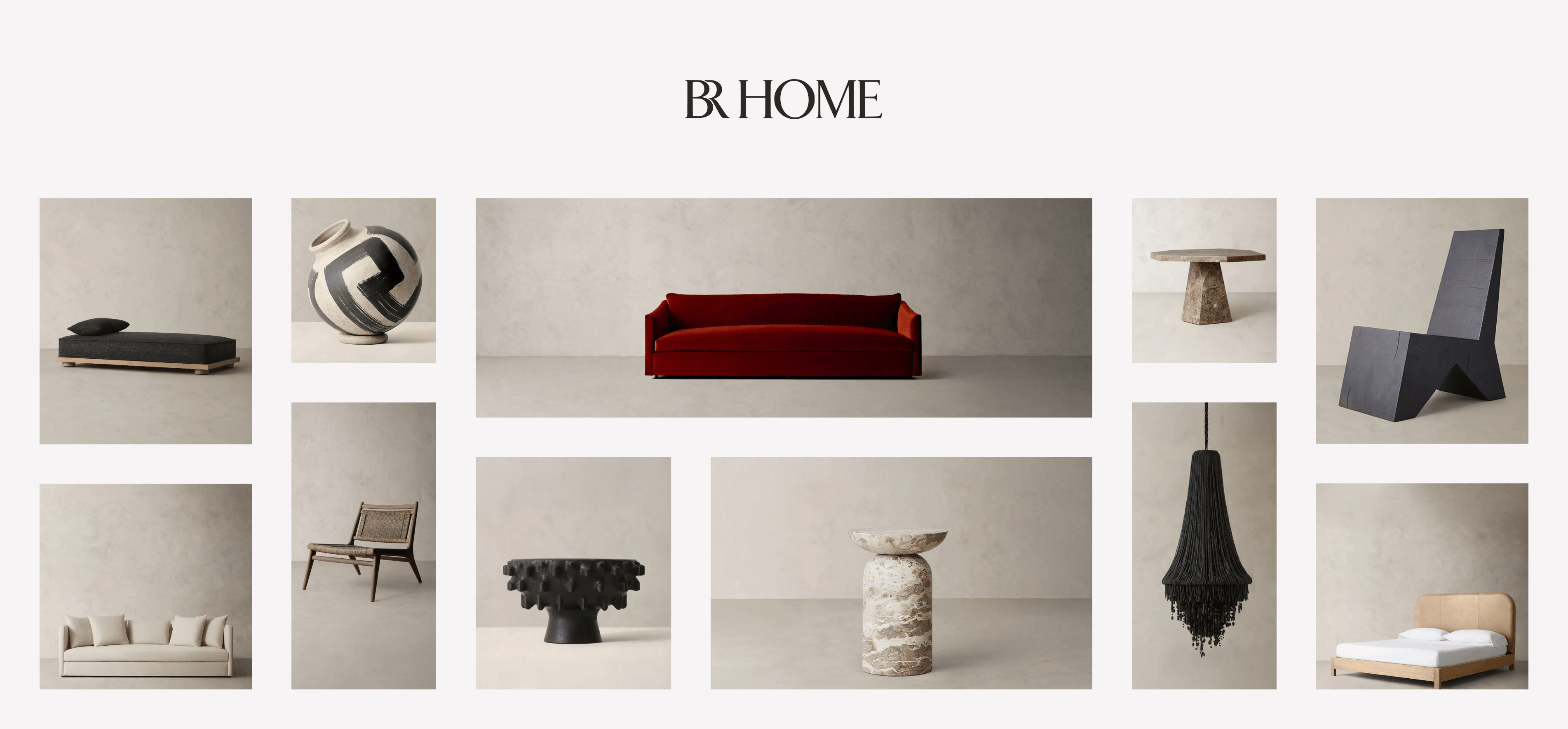
Imagine your company is creating a new brand, and you’re selected to be one of the few internal designers to work on it. That was my reality when the concept of Banana Republic Home, or BR Home, was ready to come to life.
BR Home
BR Home is currently a “home” category within Banana Republic, the iconic fashion brand; however, it was once a standalone luxury label with its own website.
External Partnership
An external design agency was hired to create the majority of the web experience, but Gap Inc. wanted some internal designers assisting, and that’s where I came in. I was tasked with creating the cart and checkout experience.
The Challenges
Project Ambiguity
There were no user stories and barely any acceptance criteria.

Thought
Let’s focus on ensuring I meet the current acceptance criteria. If they change, I can always adjust the design.
Design Limitations
The brand was to be externally hosted. What were the limitations of the external host?
Thoughts
Let’s design drafts and constantly ask for feedback. After receiving feedback, I can iterate and create a technically feasible design.
Opportunity
Since BR Home was going to be a luxury brand, I was encouraged to explore unconventional design approaches.
Thoughts
- How unique can I make this design before it becomes not user-friendly?
- I was told to push beyond traditional solutions, but I don’t want to stray far from well-known design patterns. So, let’s not reinvent the wheel to maintain a great user experience throughout the website.
How Might We...
How might we create a unique cart and checkout experience that has a good user experience?
How might we make the checkout experience unique yet luxury?
How might we offer a cart and checkout experience that captures the essence of a luxury brand?
The Challenges
The Solution
Let’s adopt established design patterns from other big companies and apply them to the cart and checkout experience.
The Discovery
Business Needs
We need a luxury website for the new home furniture and décor brand, BR Home.
User Needs
Shoppers need to edit items in their cart, remove items from their cart, and check out.
Design Research
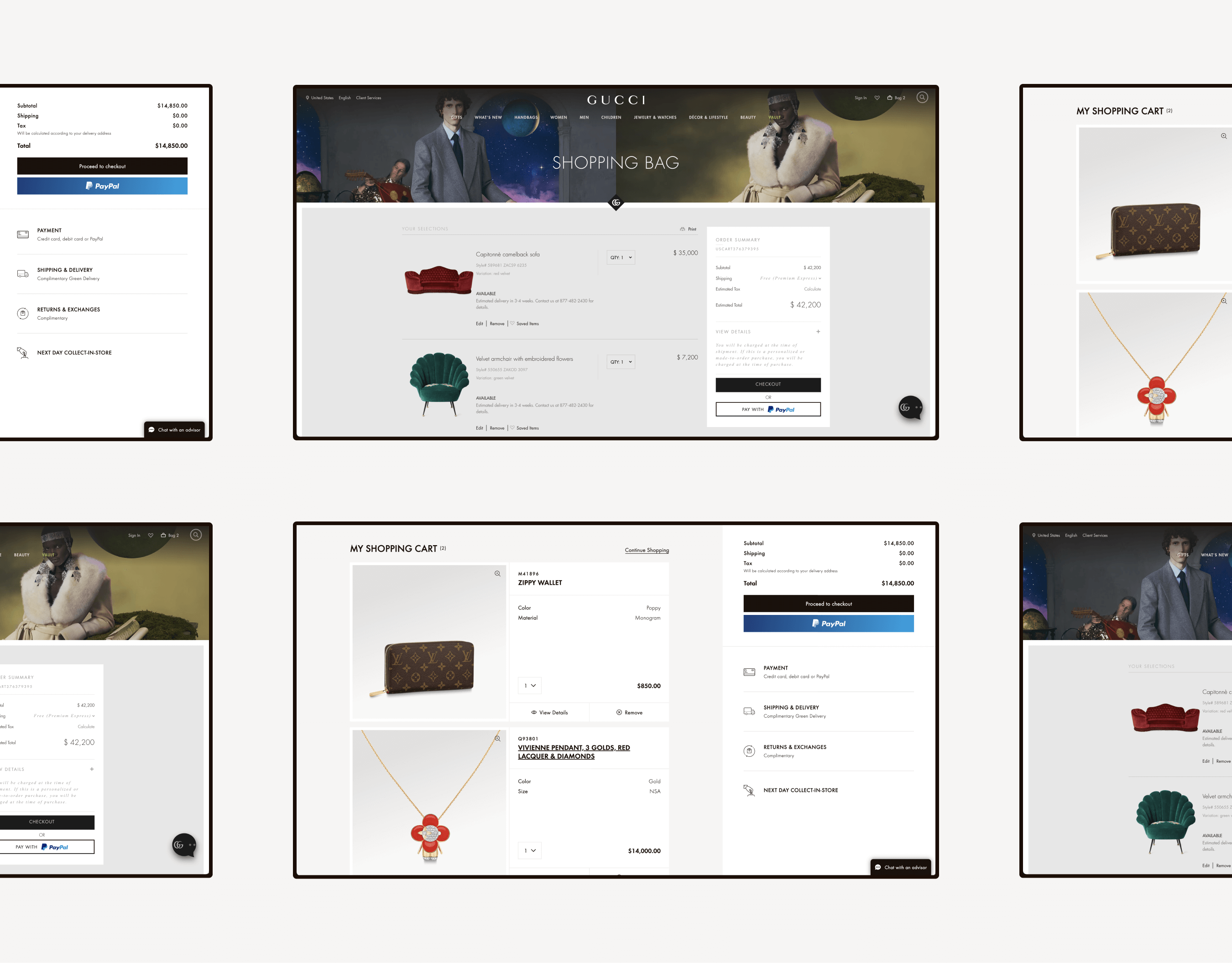
Before designing, I browsed around to gain design inspiration from others:
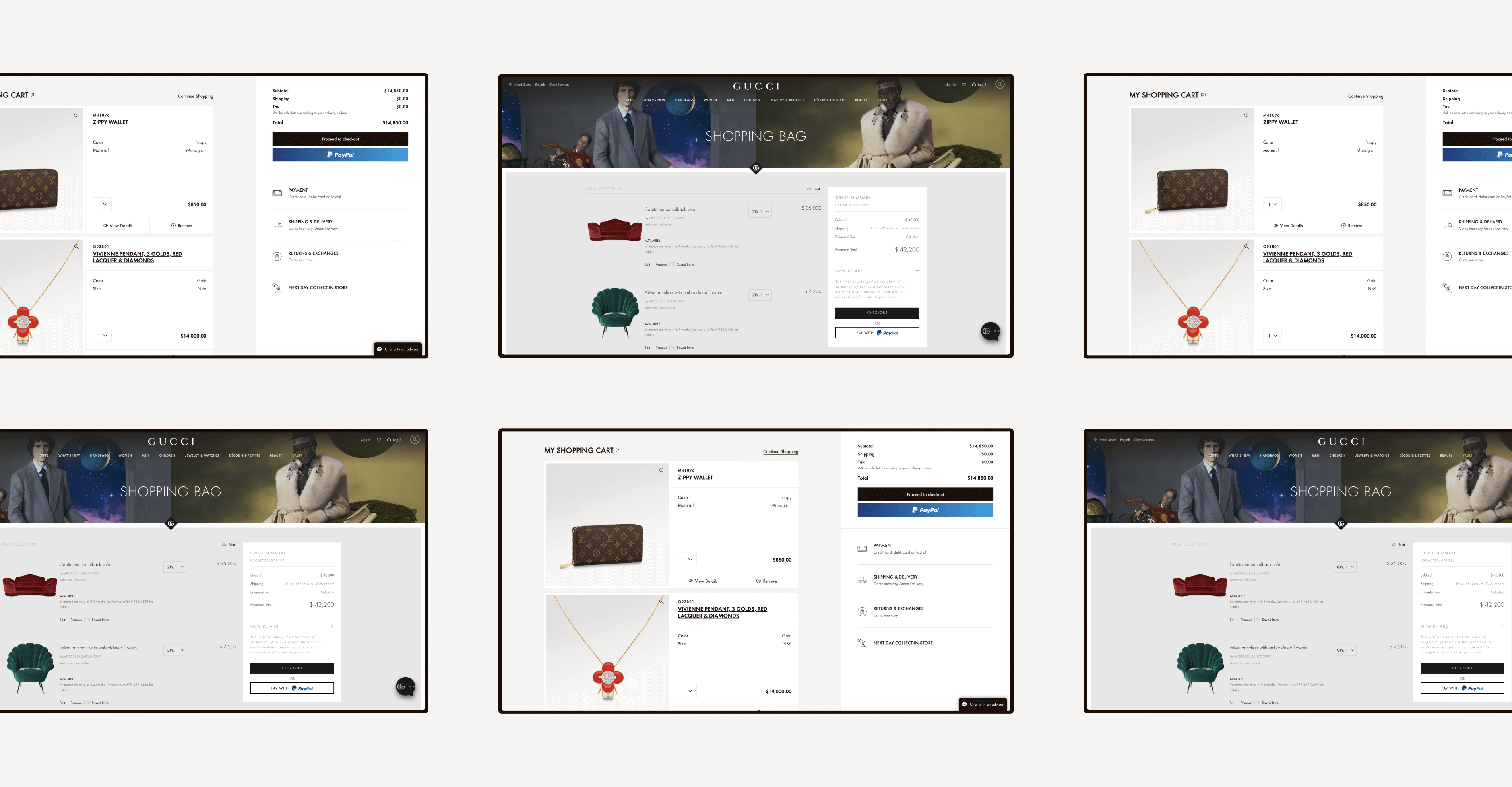
Luxury Brands
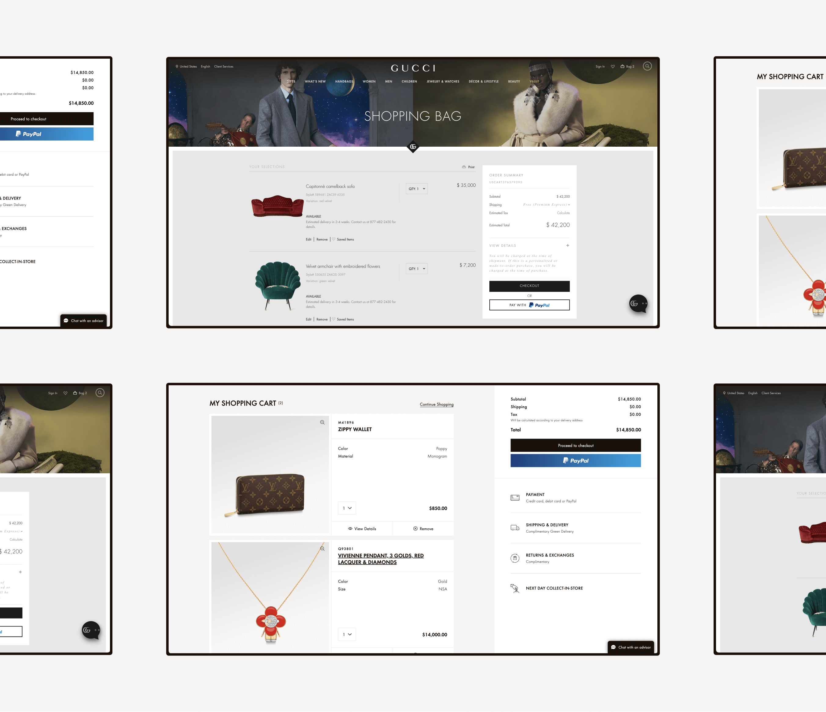
- Gucci
- Louis Vuitton
- And more
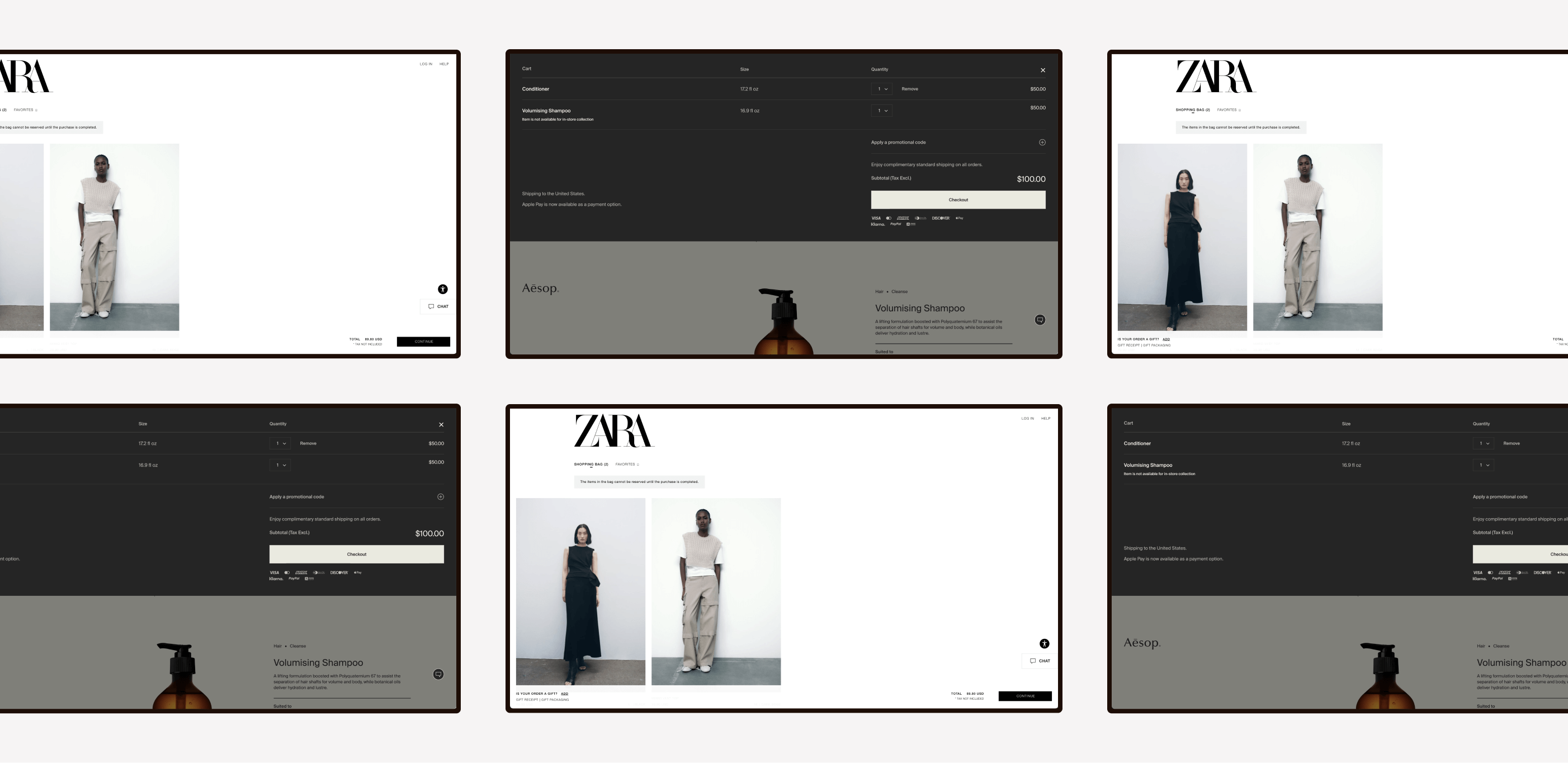
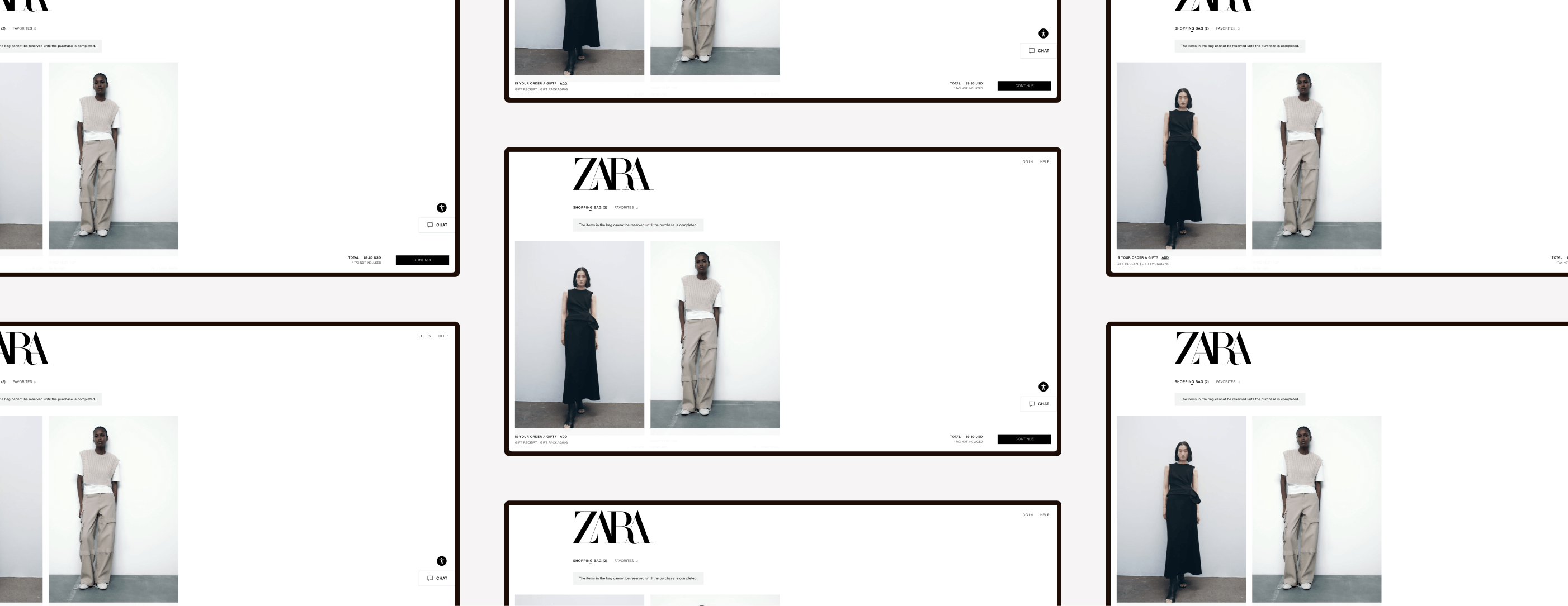
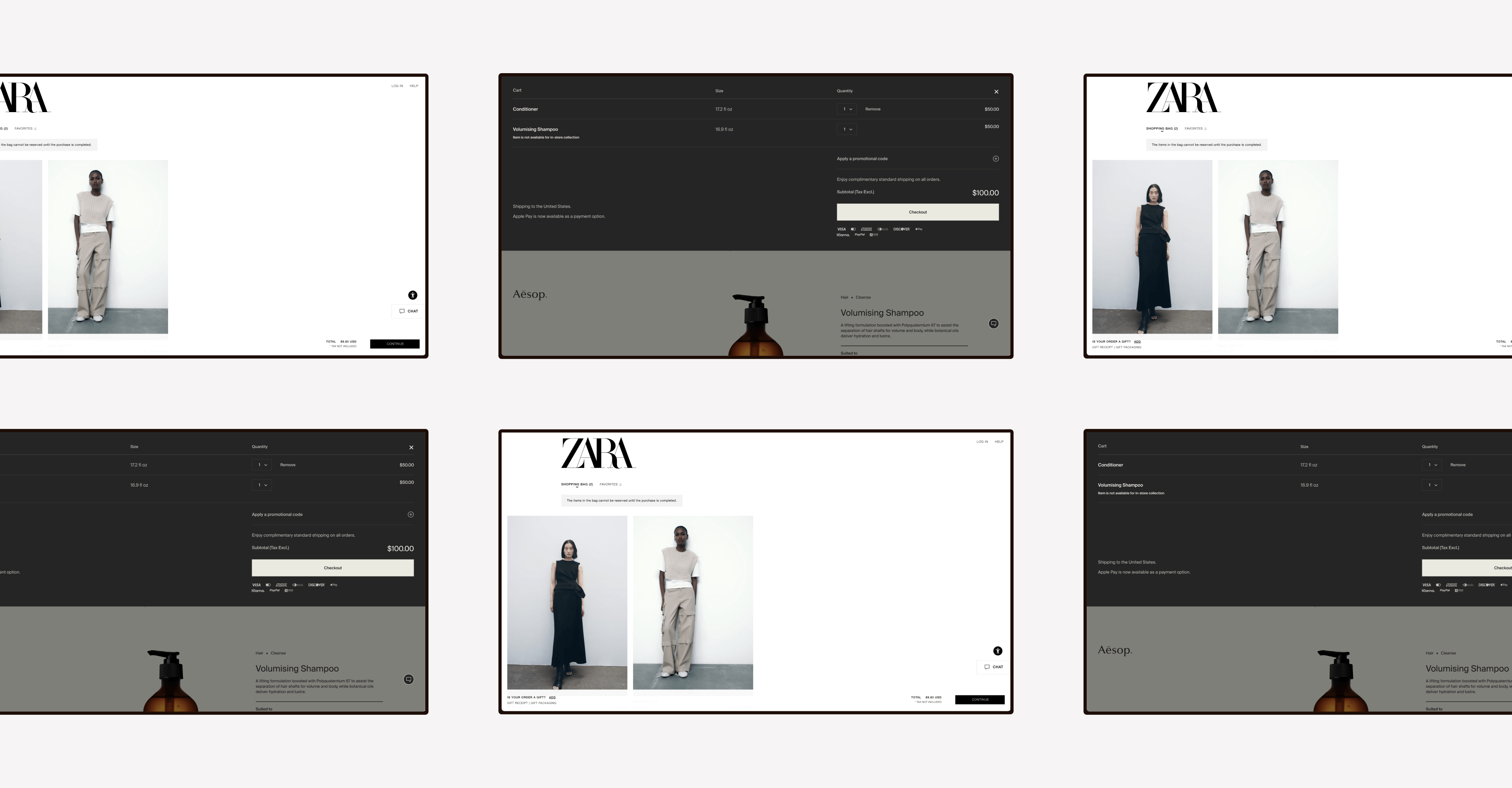
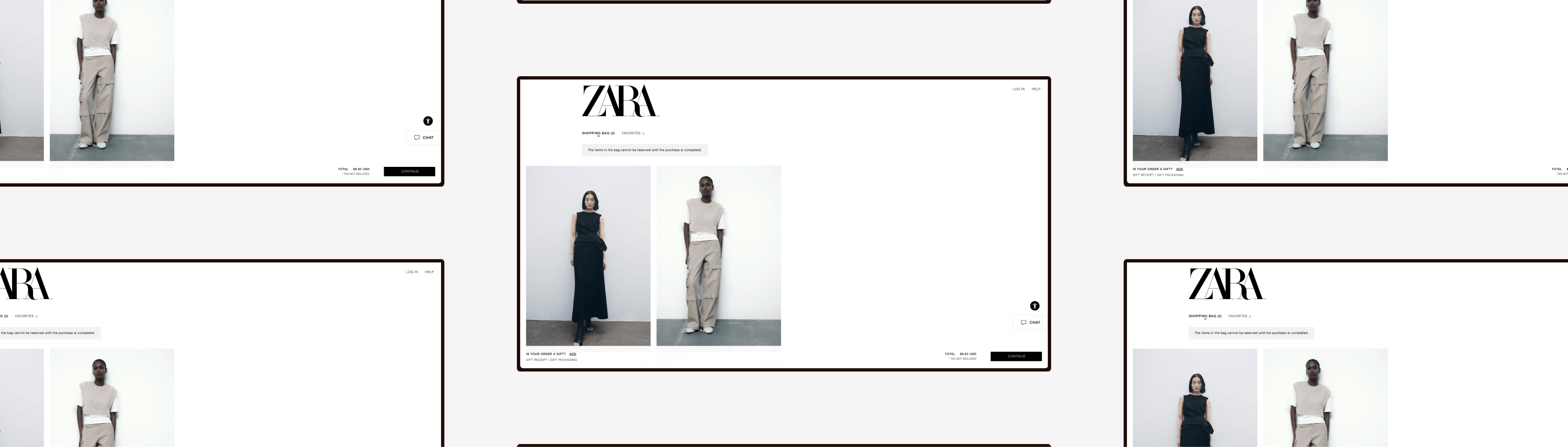
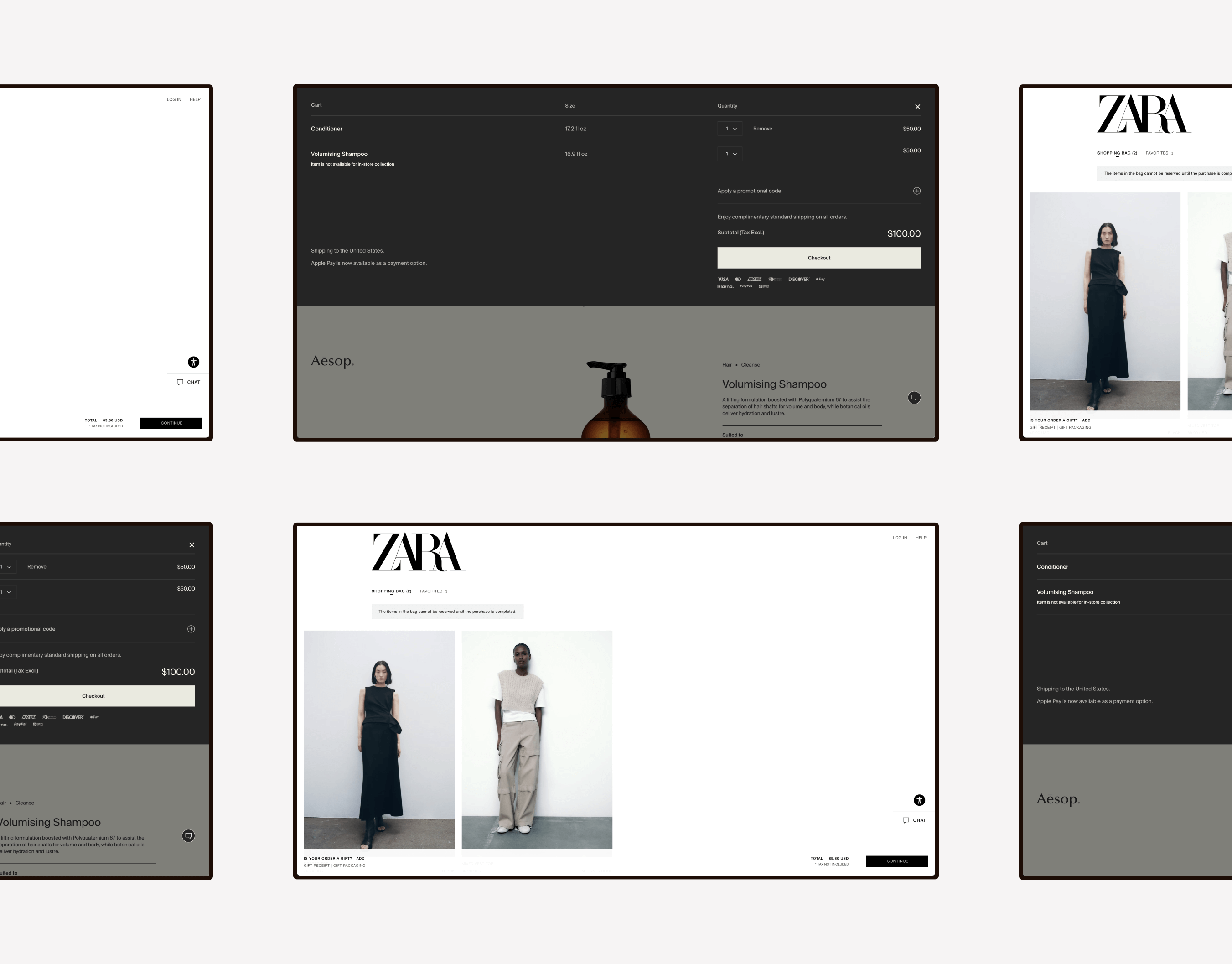
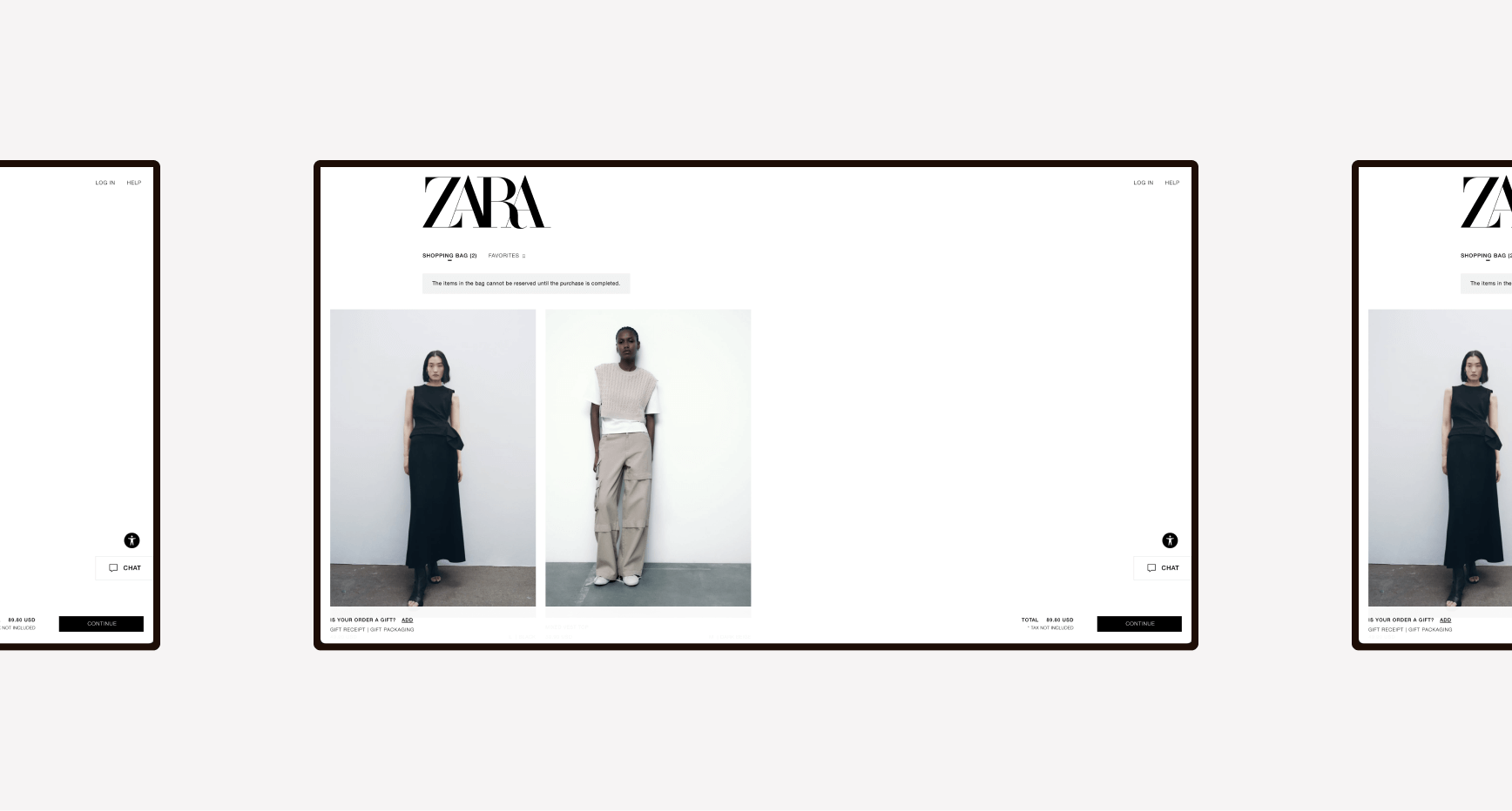
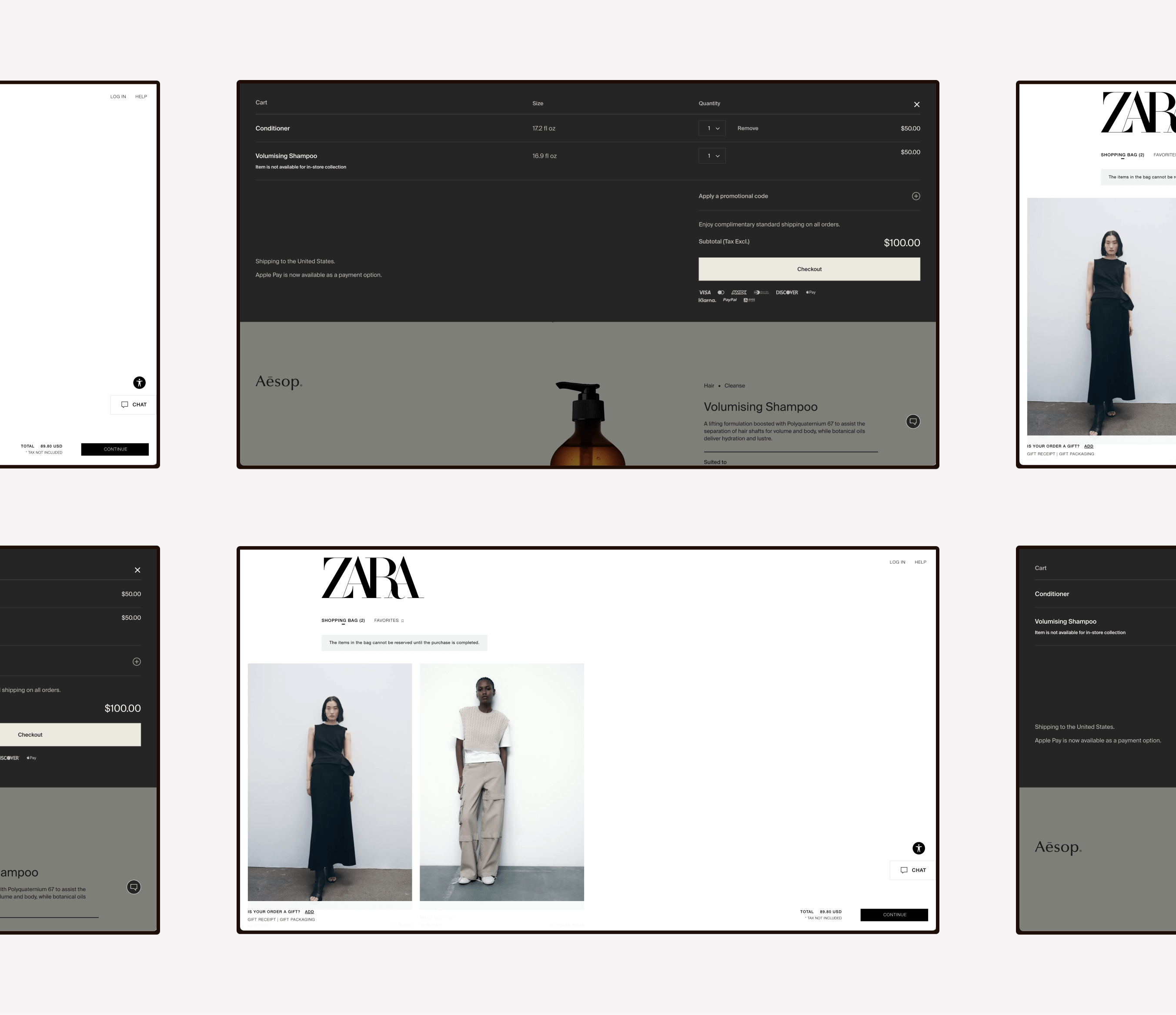
Brands with Unique Carts
- Aēsop
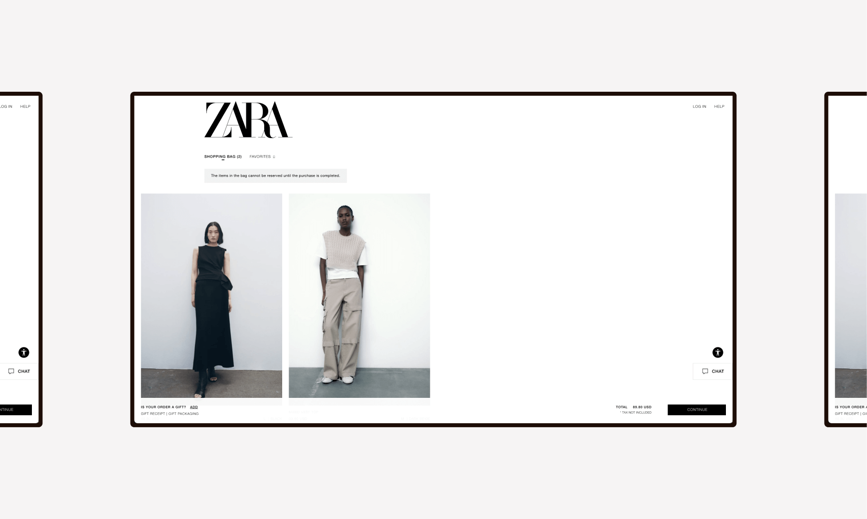
- Zara
Internal Designs
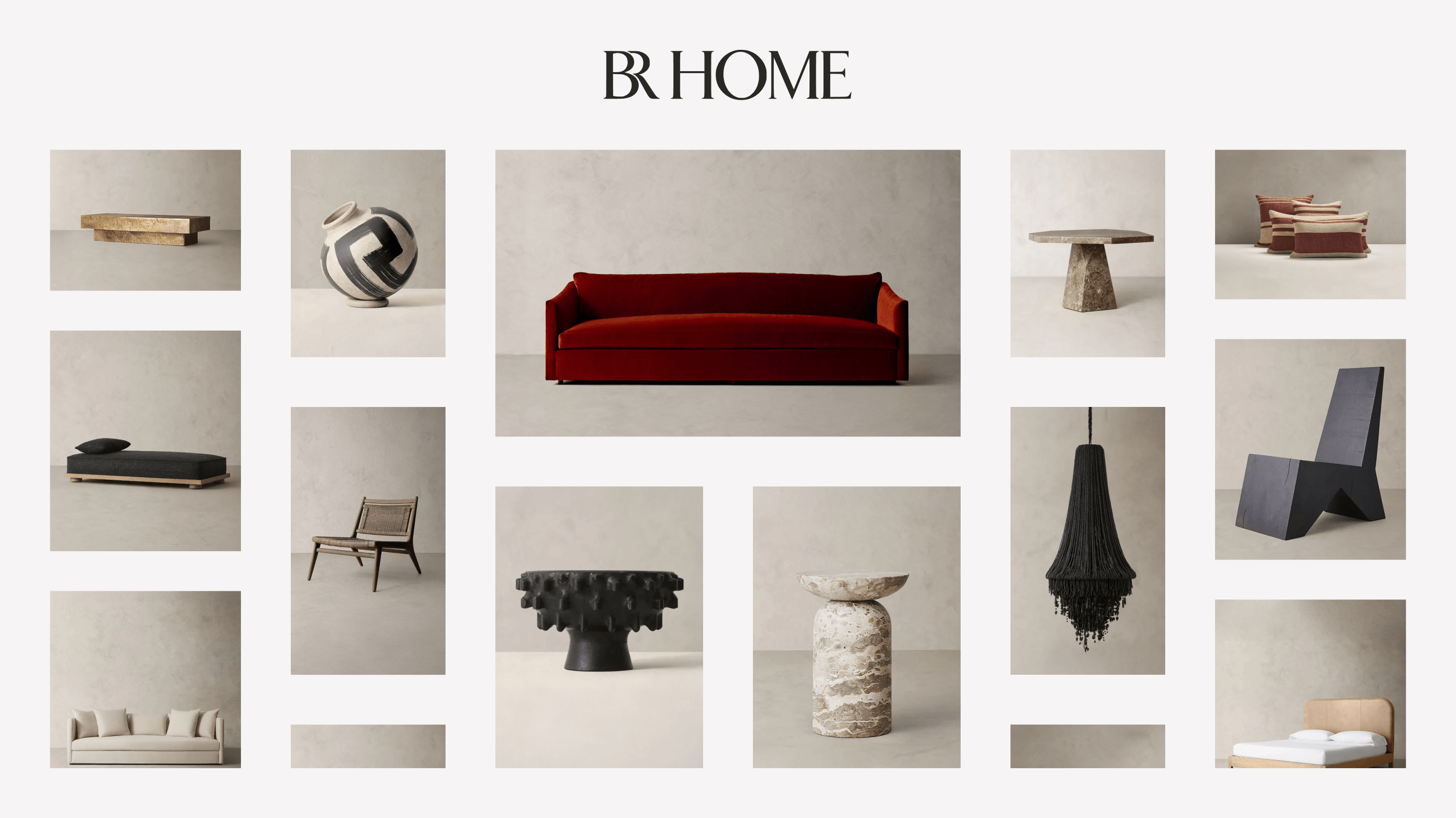
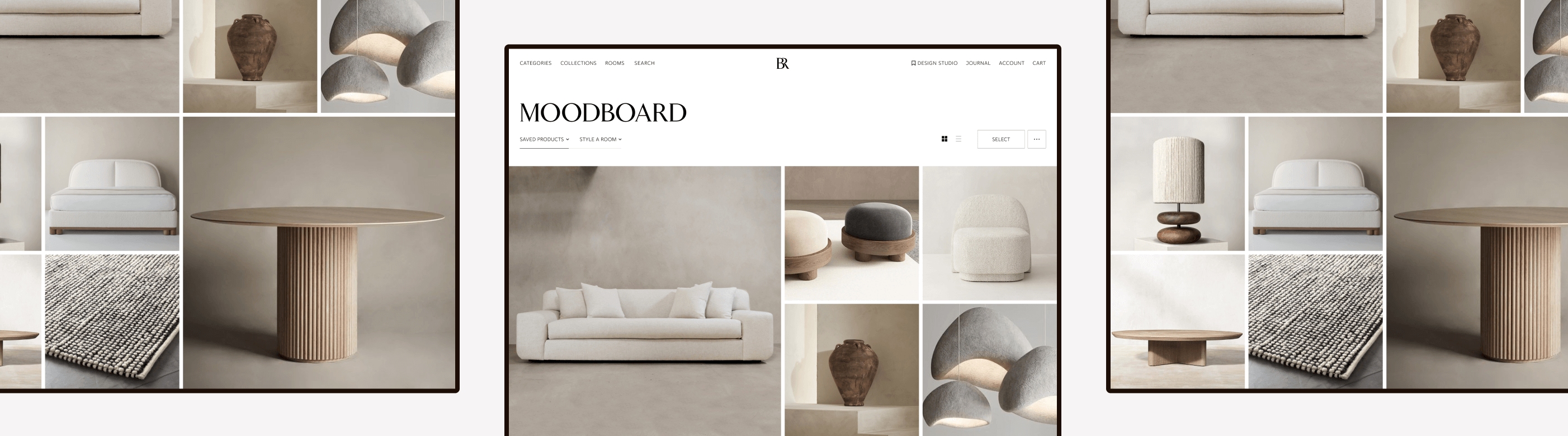
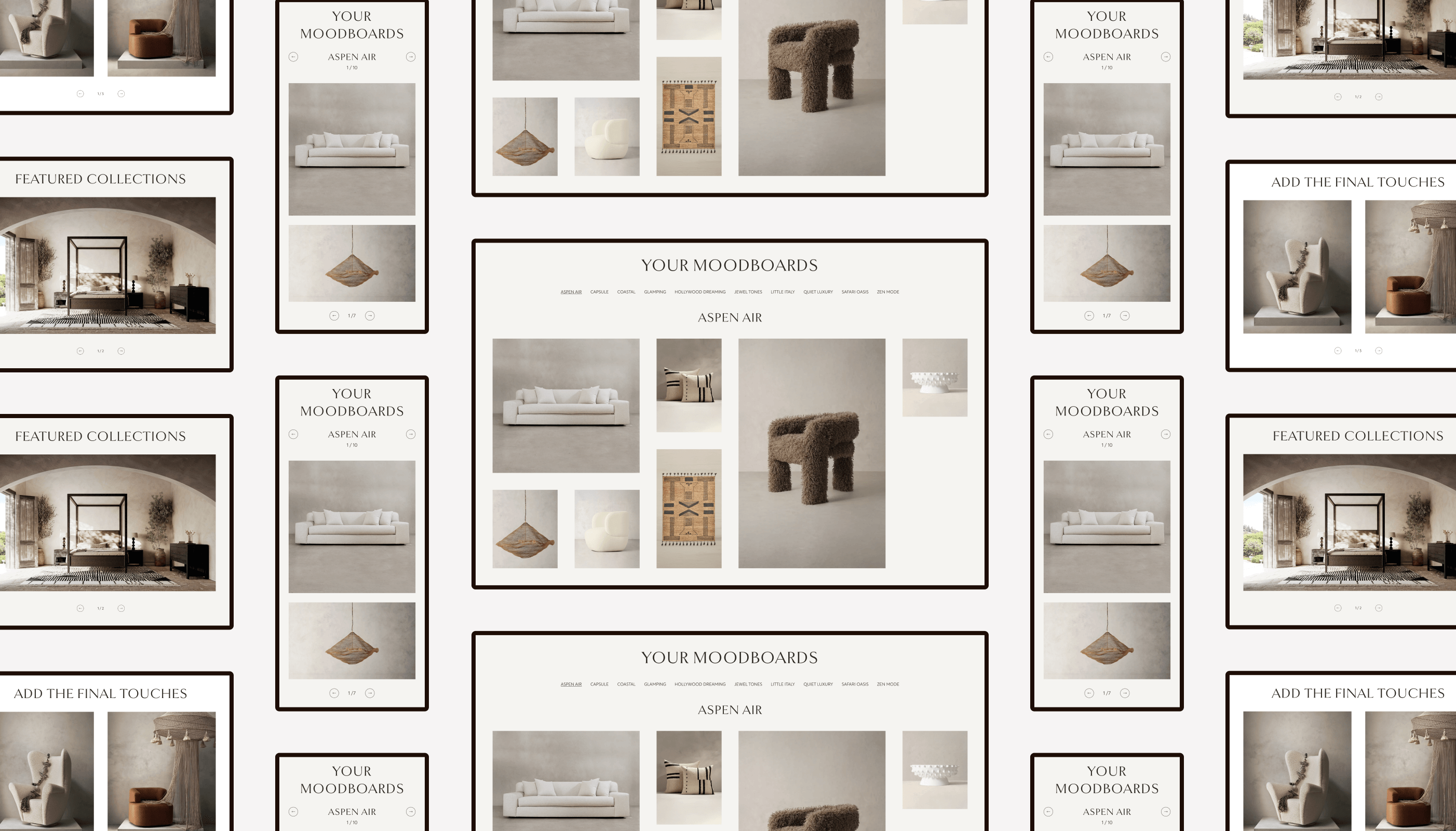
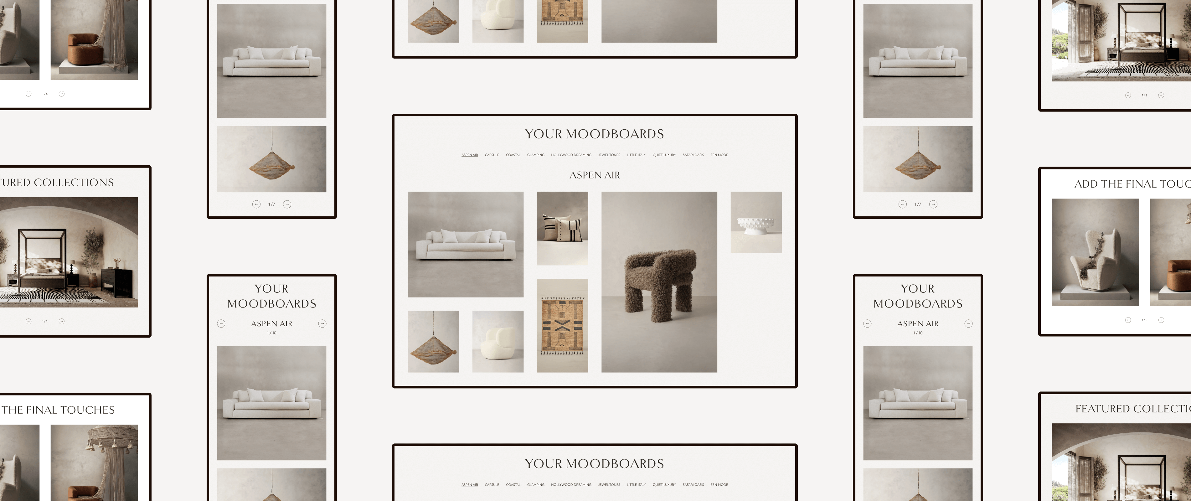
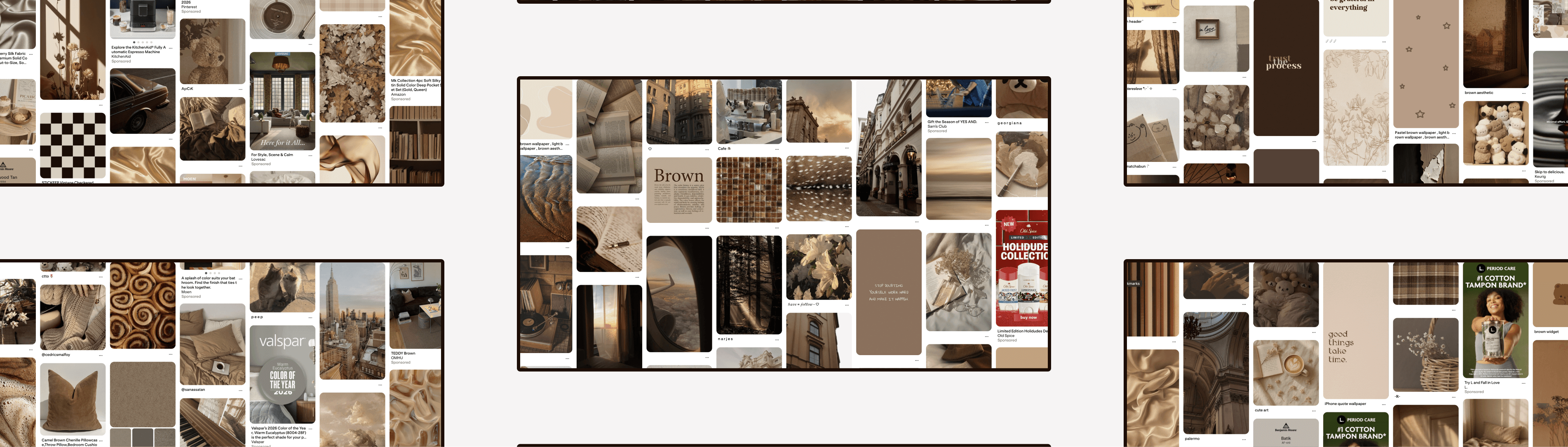
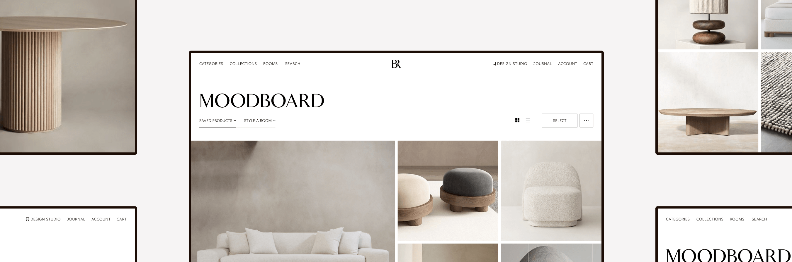
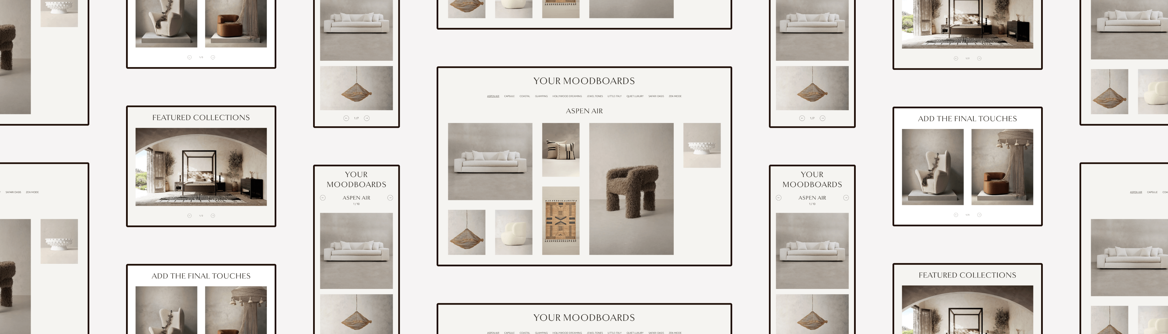
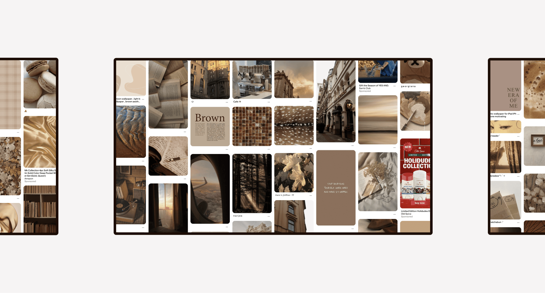
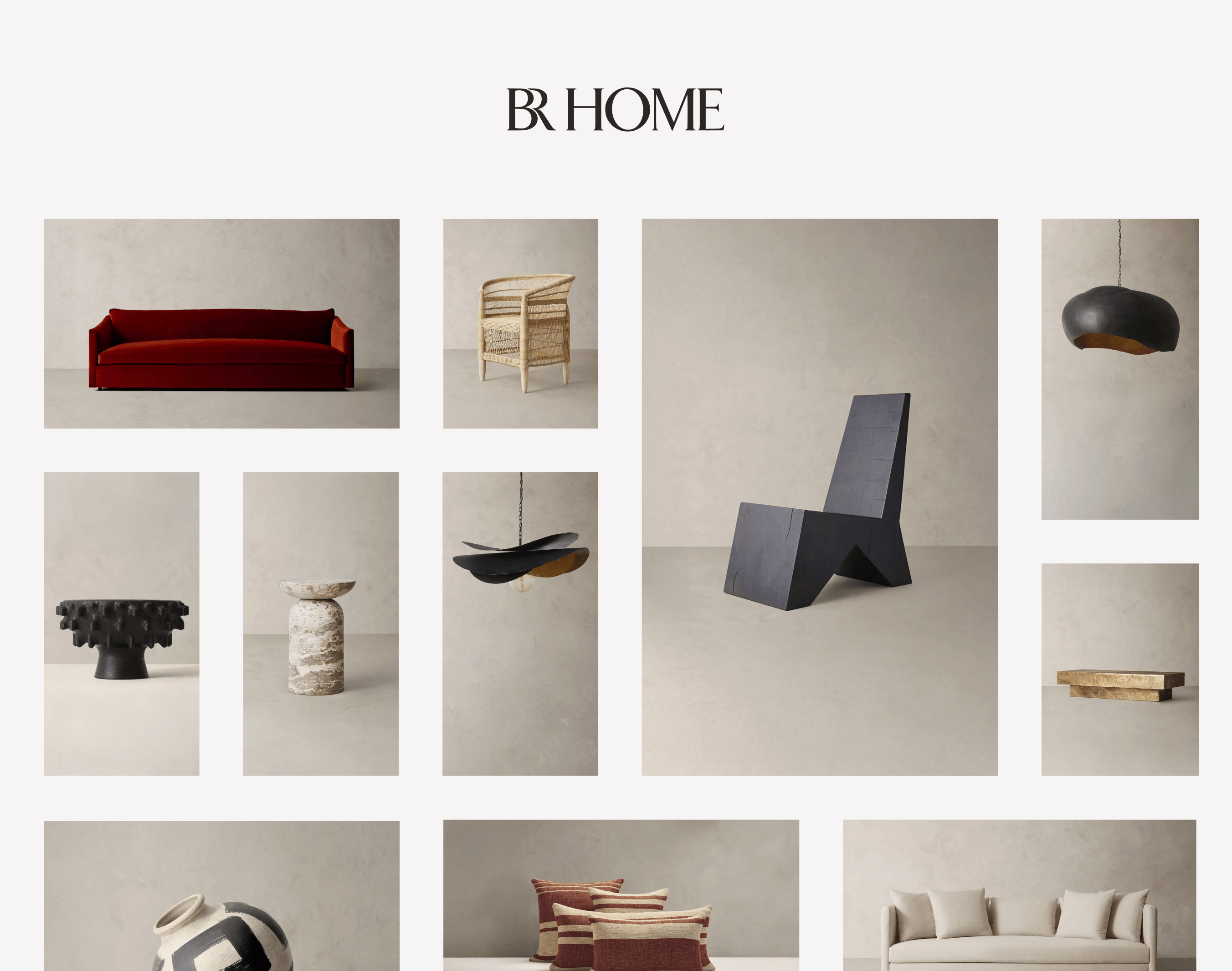
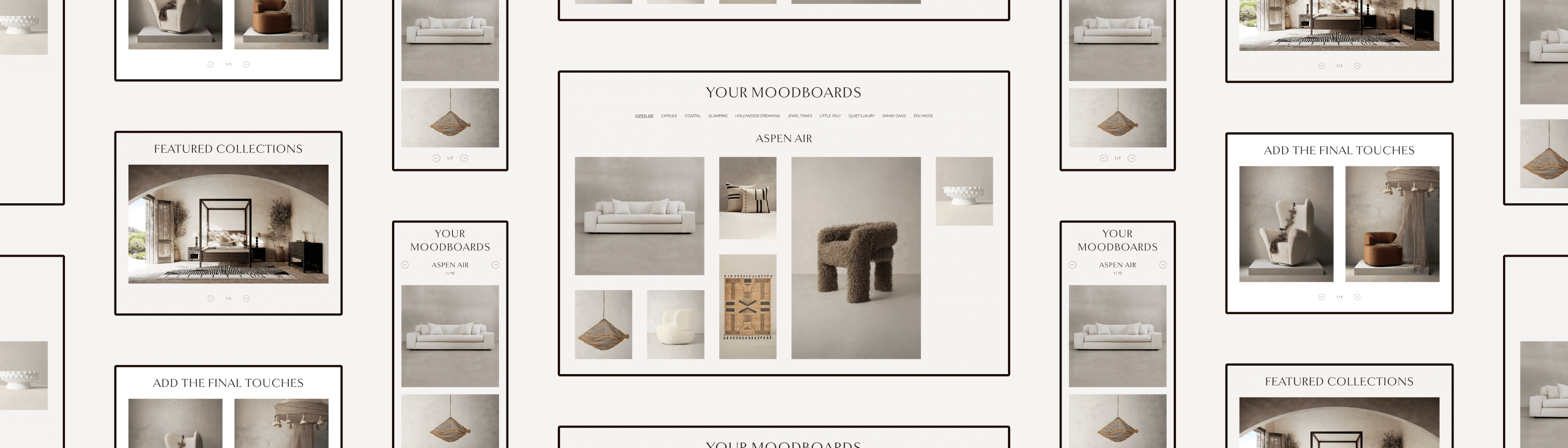
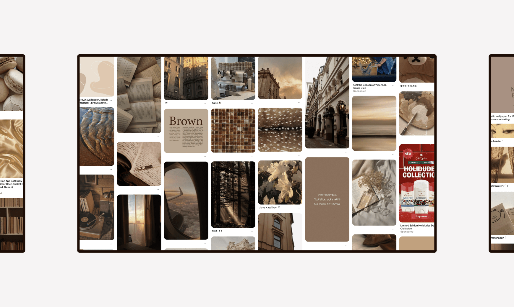
Lastly, I peeked at other parts of the BR Home experience for design inspiration, and I really liked the concept of a moodboard grid.
Moodboard grids are an established design pattern on many digital experiences, like Pinterest and Instagram; however, they tend to only show images. If I were to go this route, how can I ensure that important text is shown to users?
The Discovery
Final Thoughts
A cart is like a moodboard, because you see all your selections in one place. So, I’m going to use this idea while incorporating other ideas from other websites.
The Design
When I view the websites of luxury brands, I think of “clean” and “polished”. There’s not much visual noise occurring on the page to distract you from the main attraction (from what I’ve seen, at least). So, that’s the approach I made to both the cart and checkout flow: clean and polished.
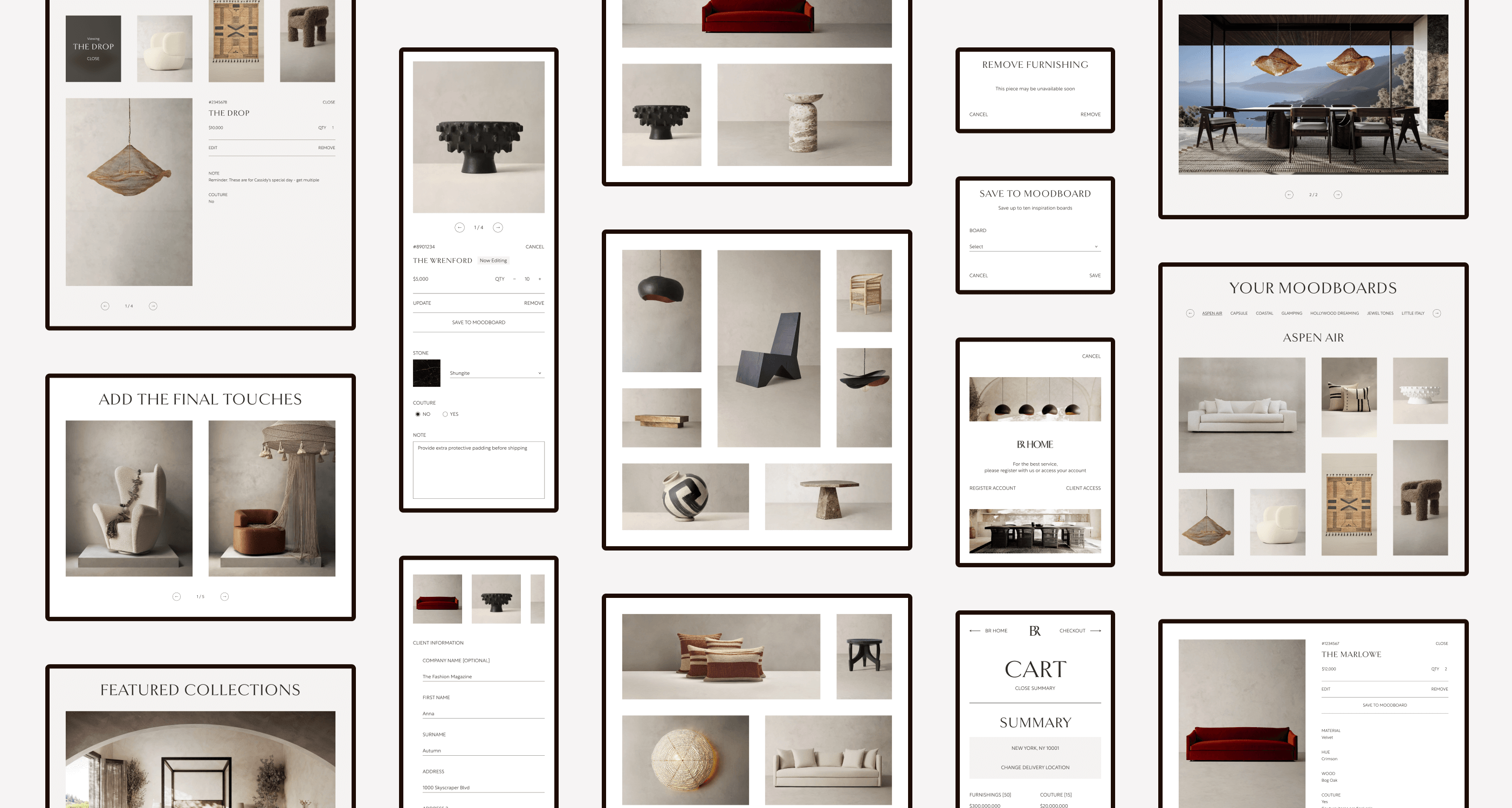
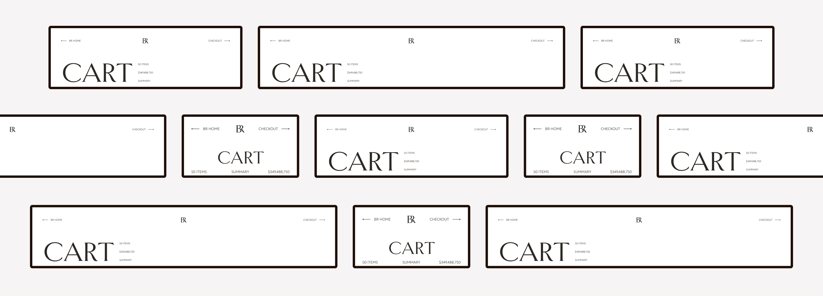
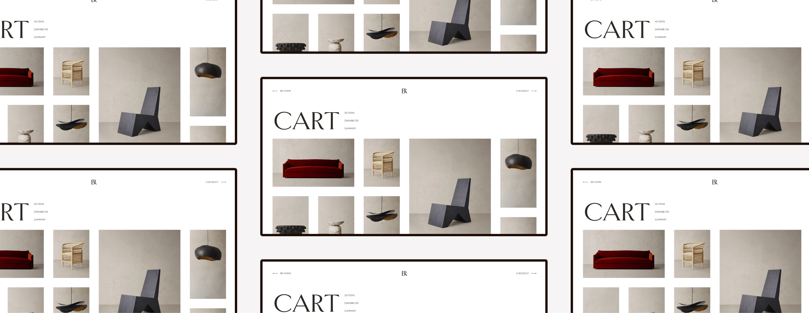
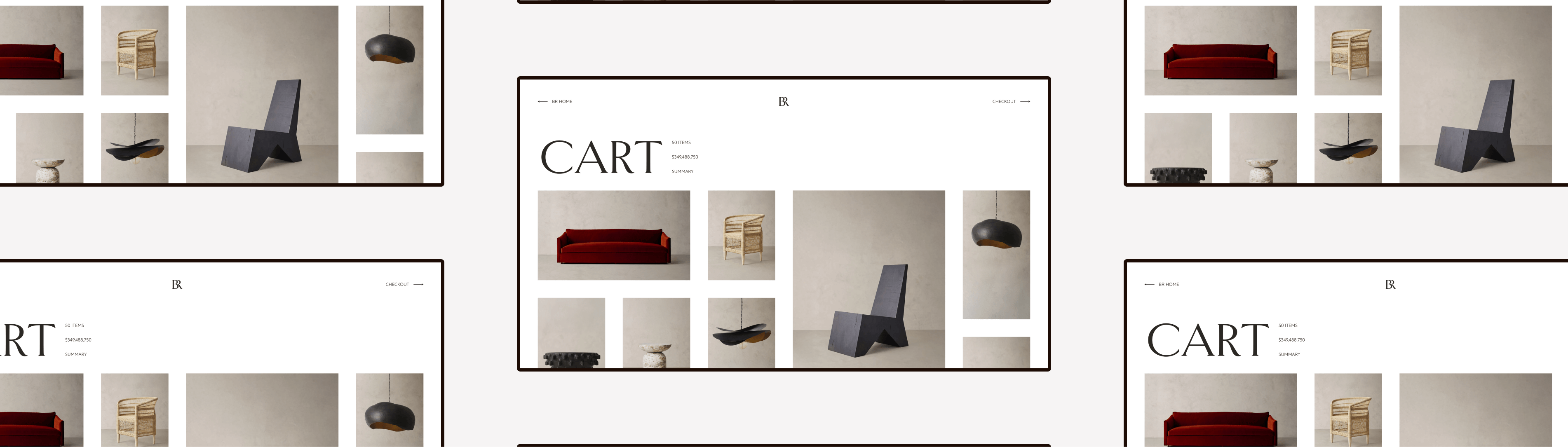
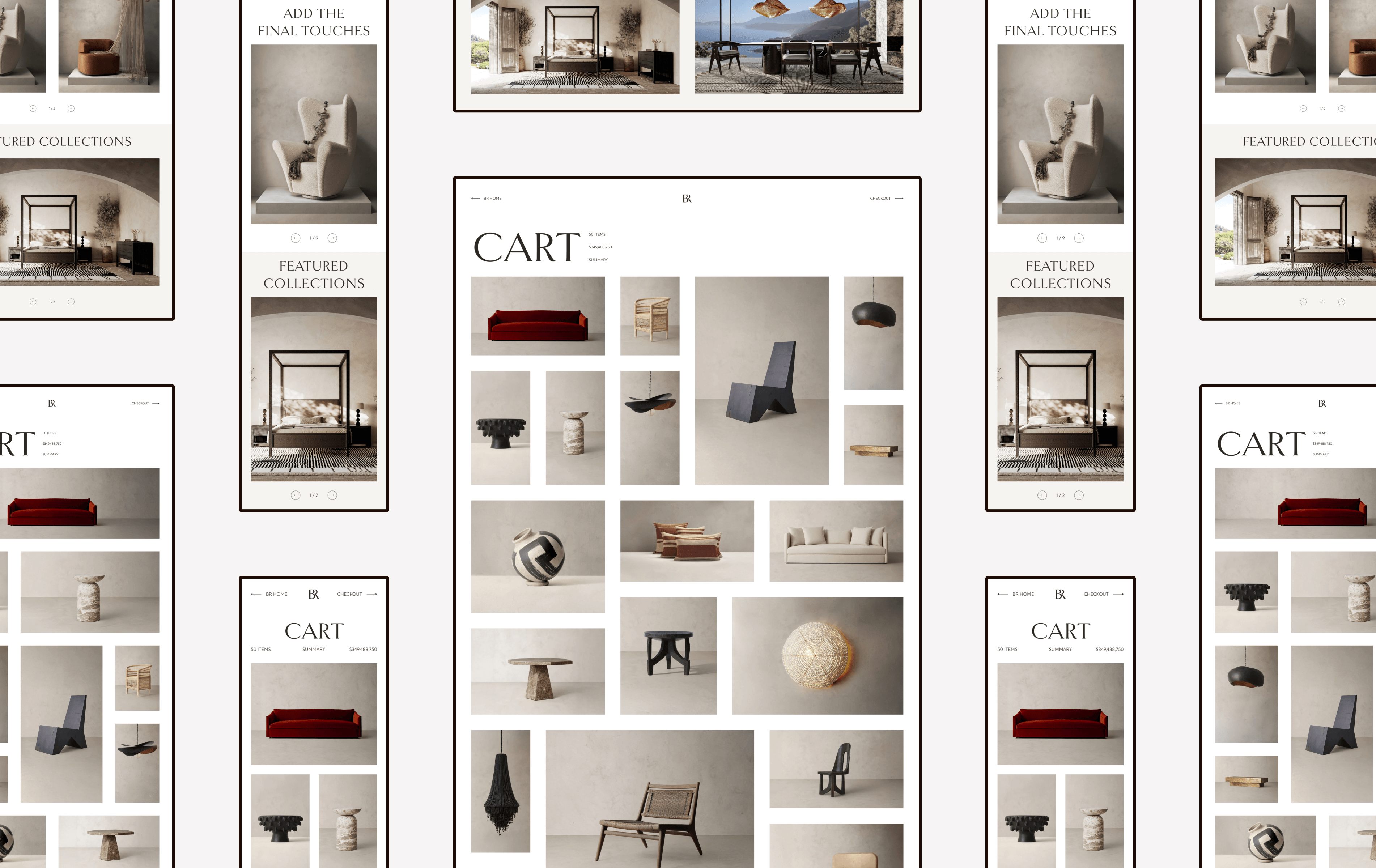
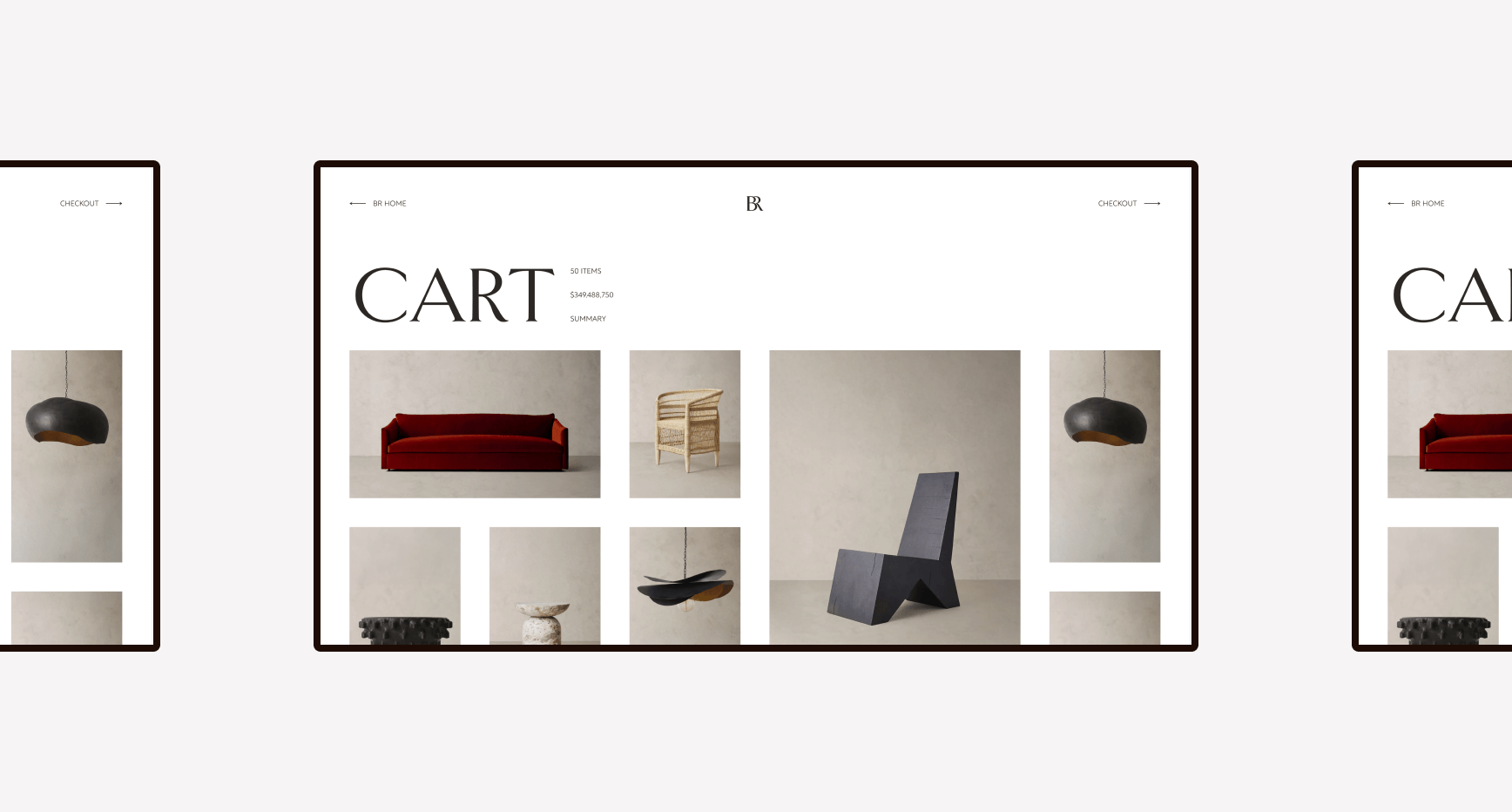
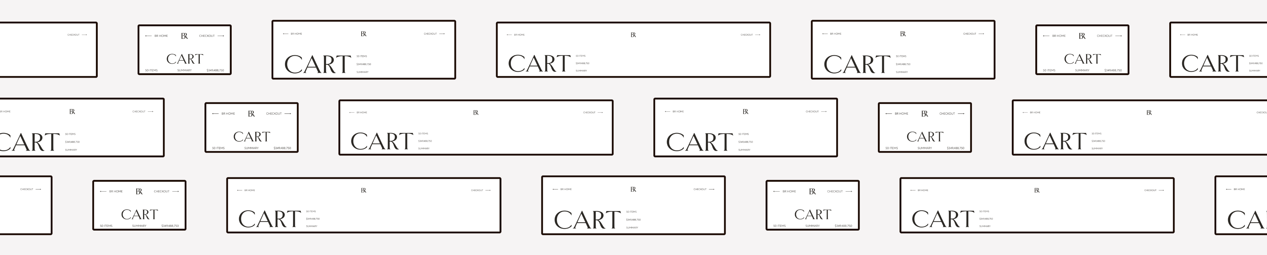
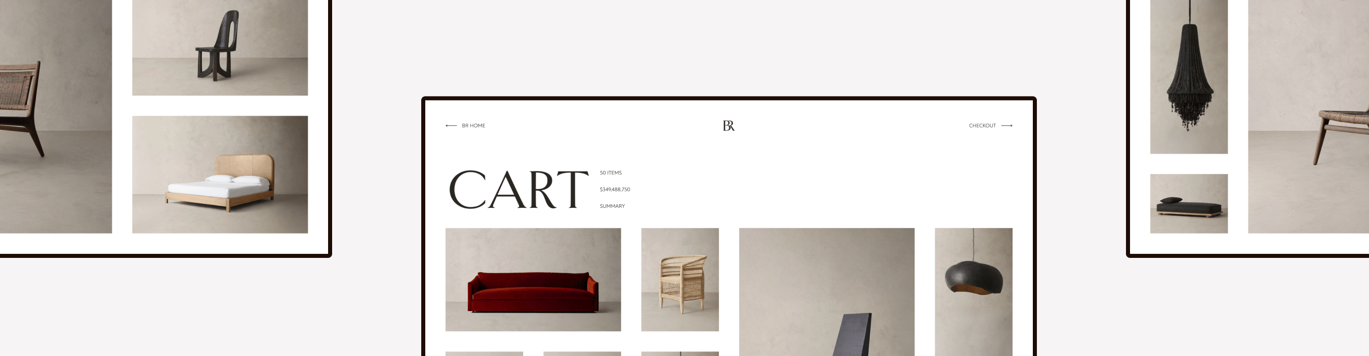
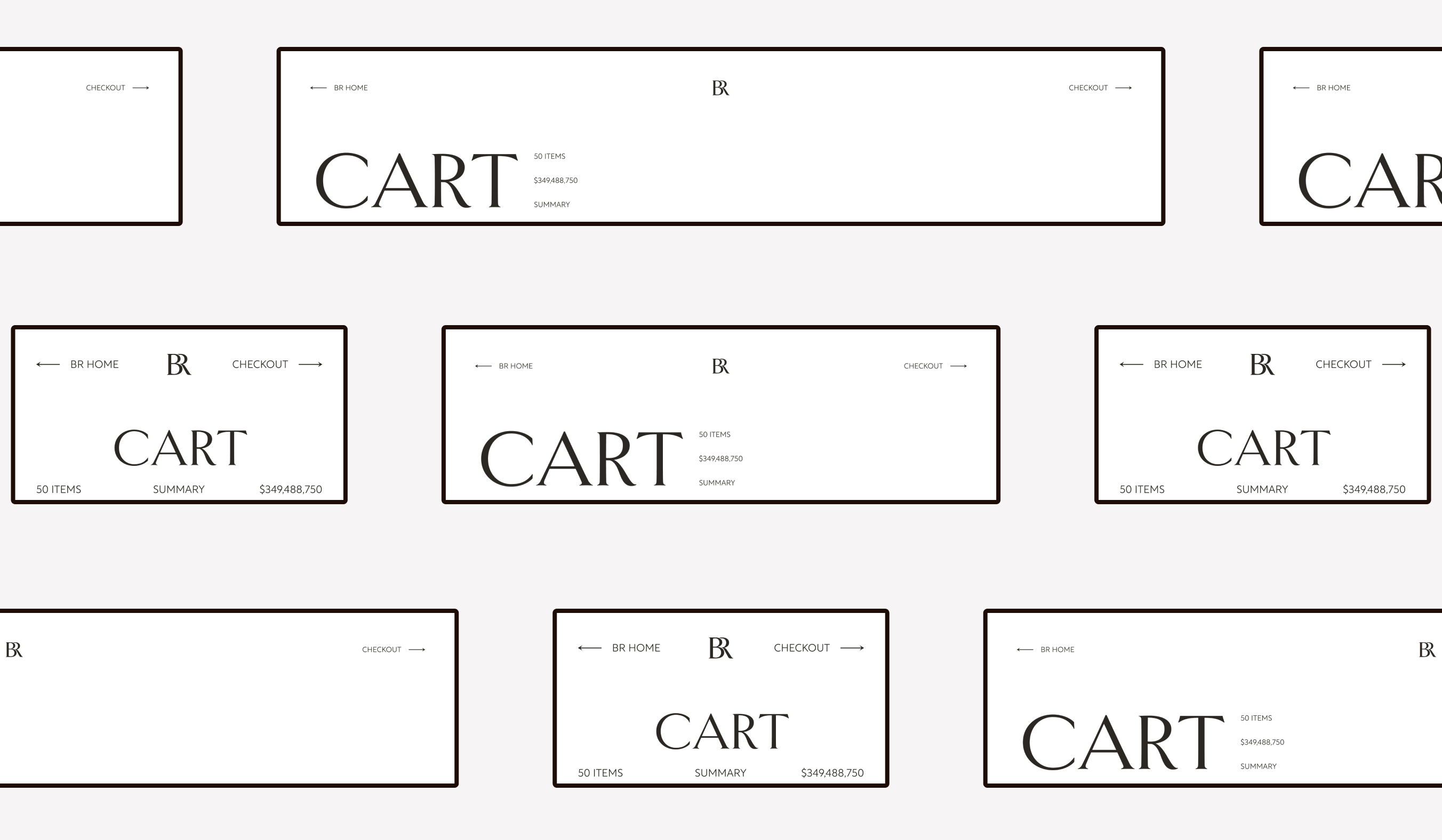
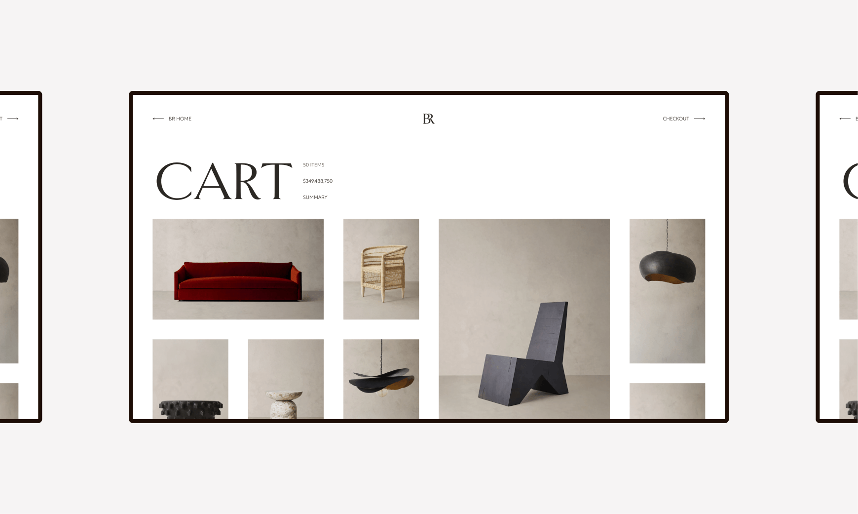
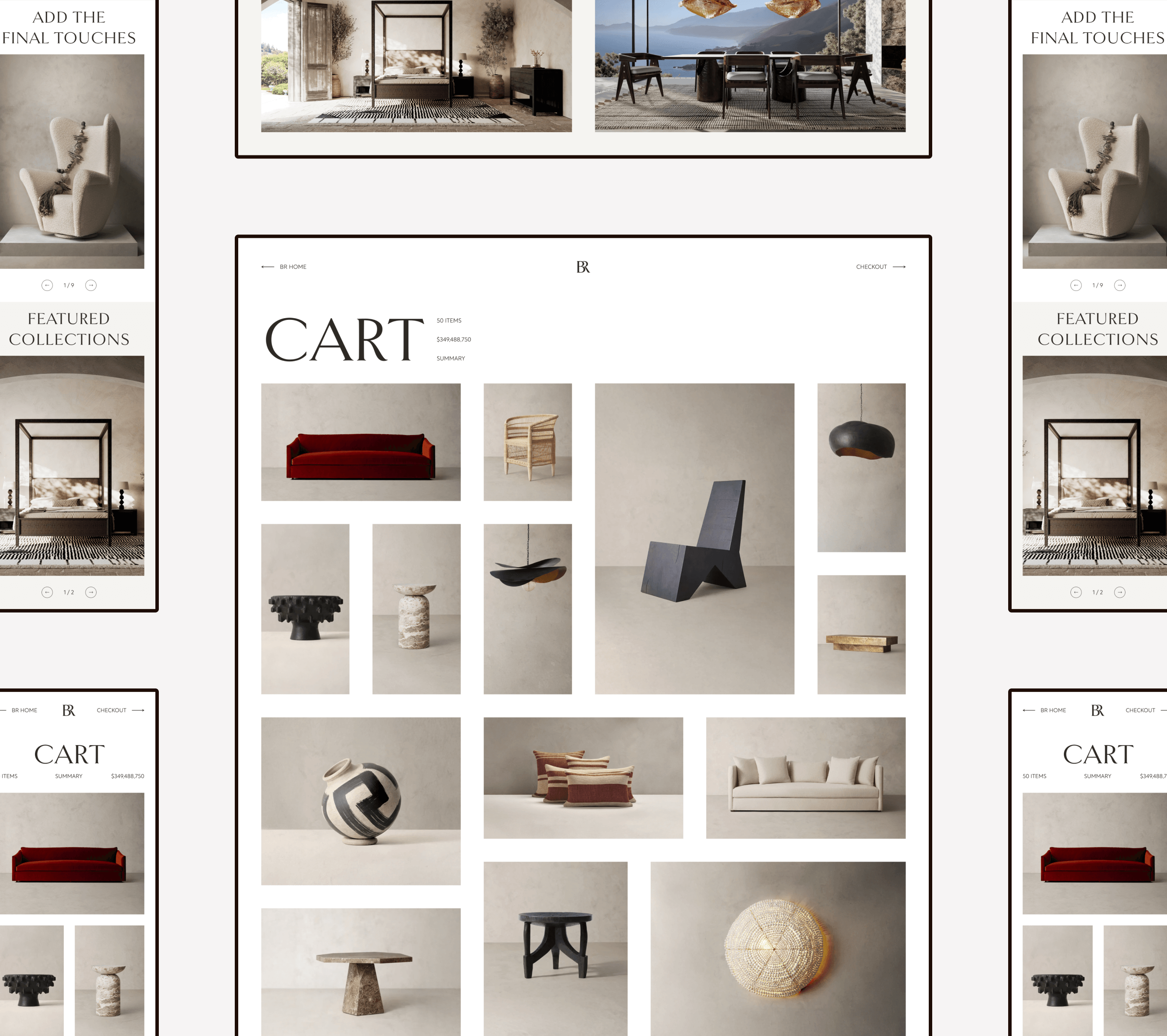
Cart Experience
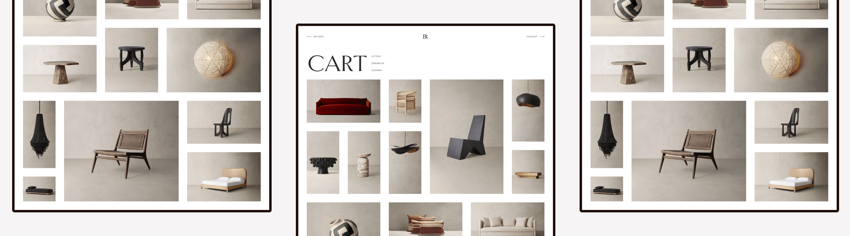
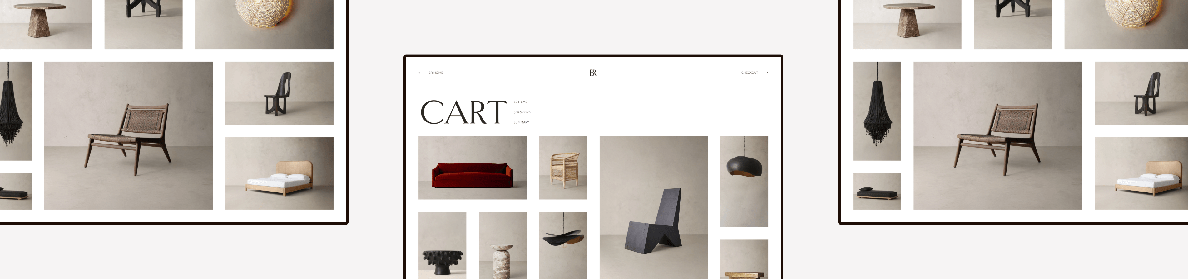
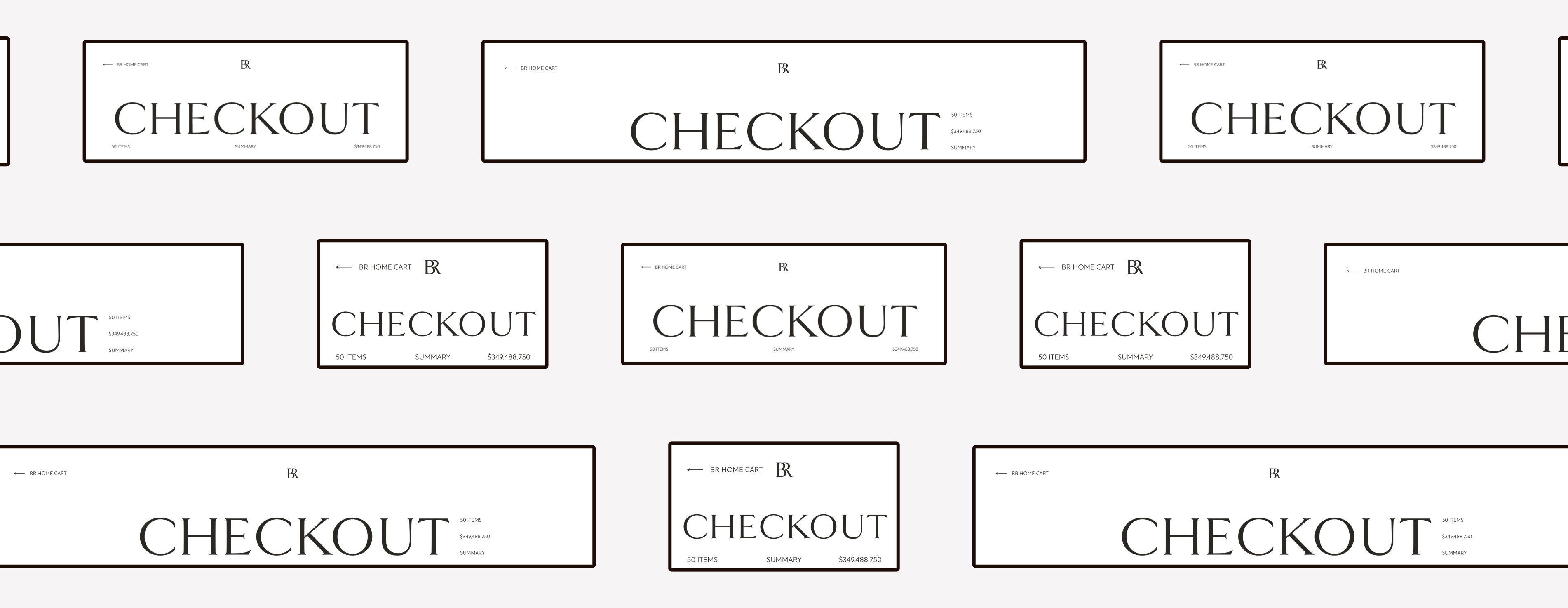
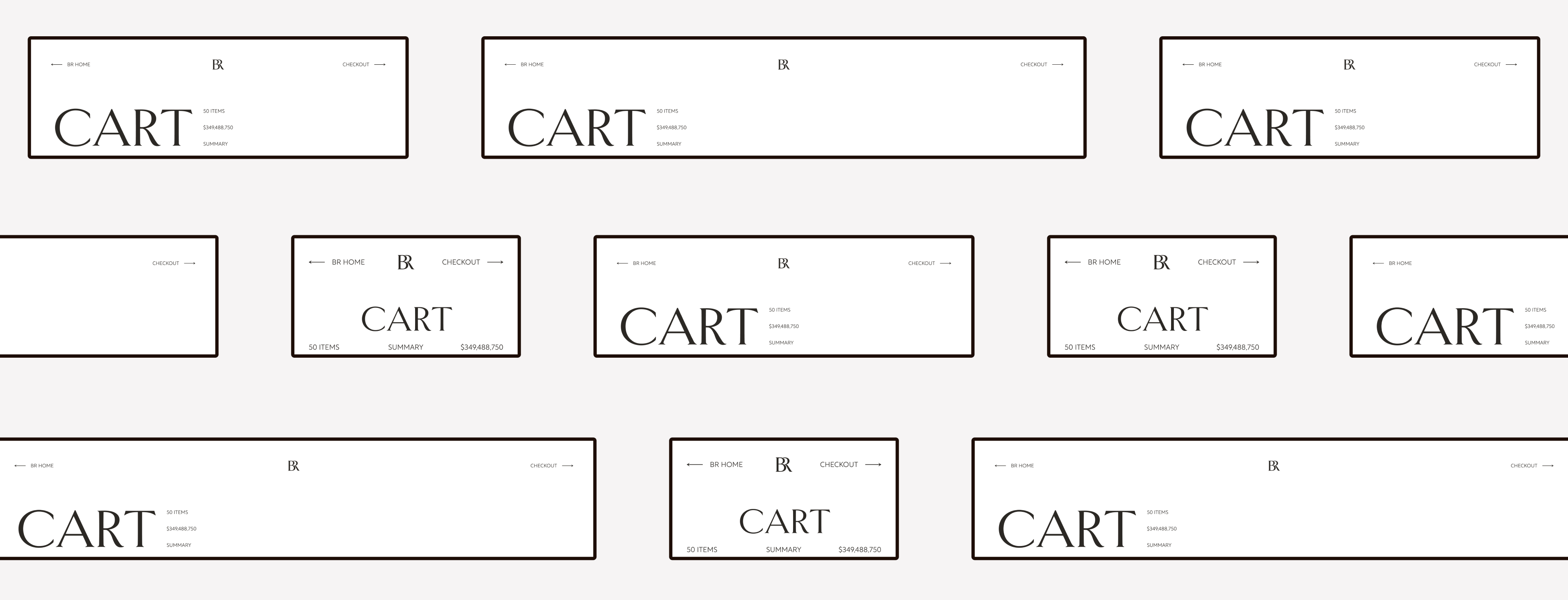
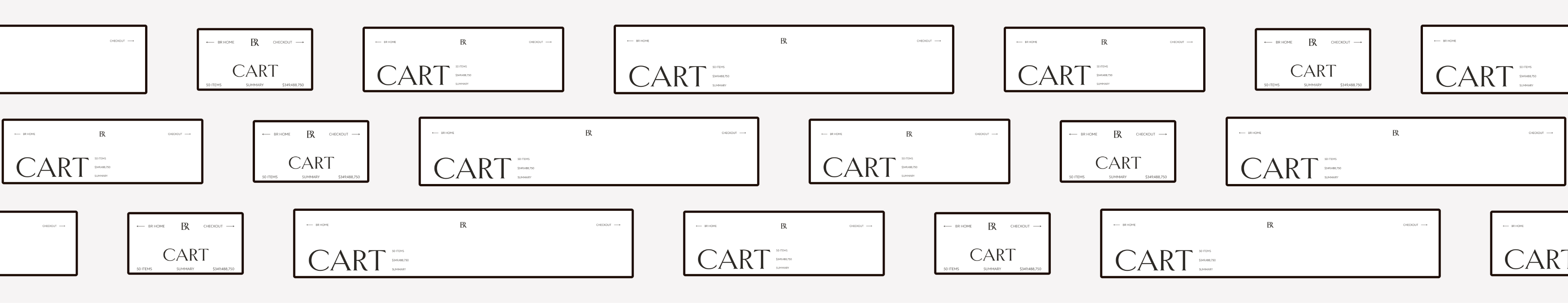
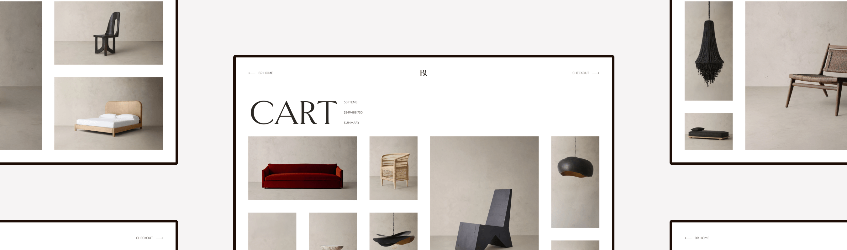
Header
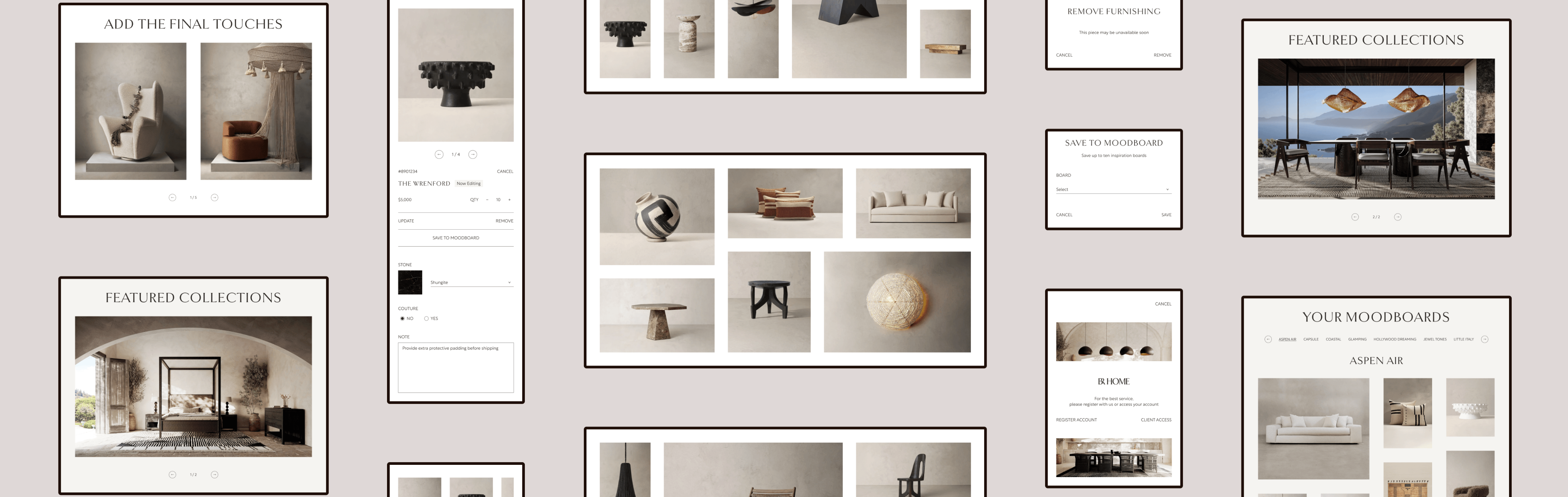
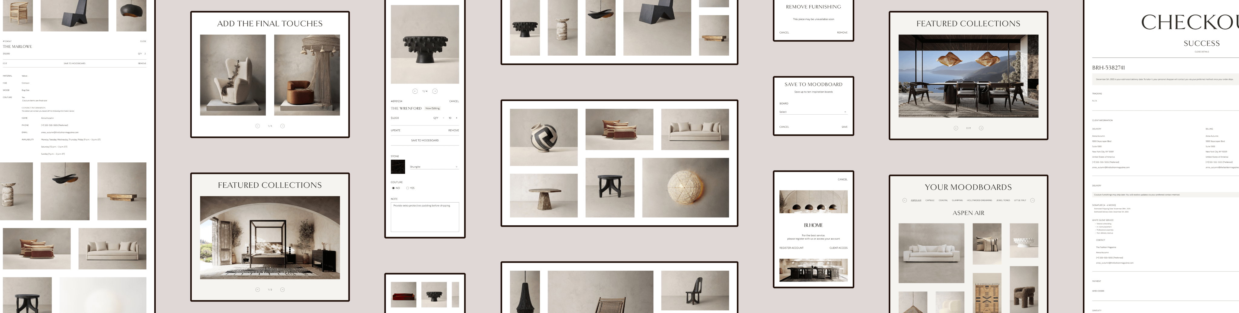
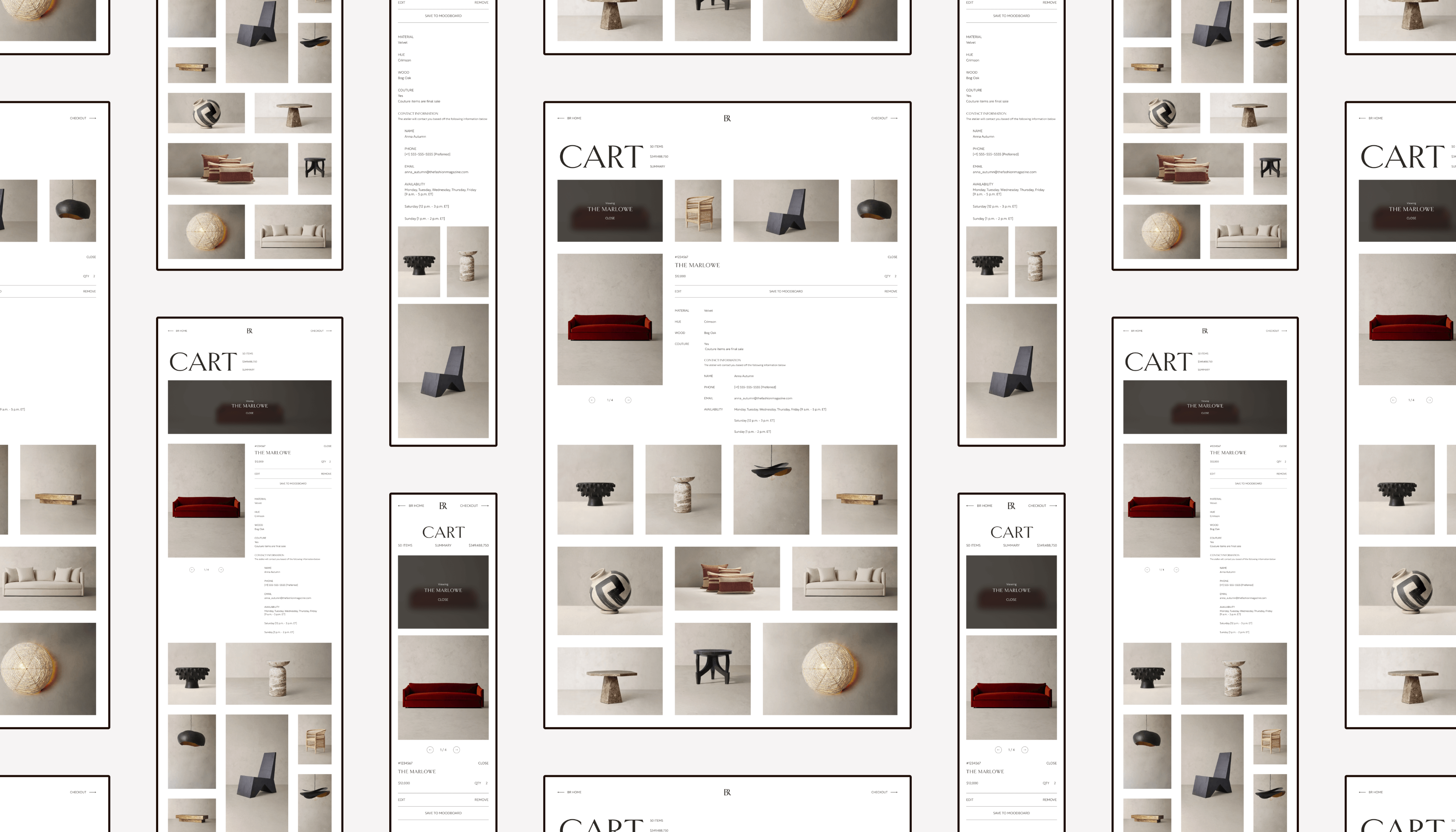
The header lists the essentials. If you want to know more about your cart, click “Summary” and the additional cart information appears (inspired by Aēsop).
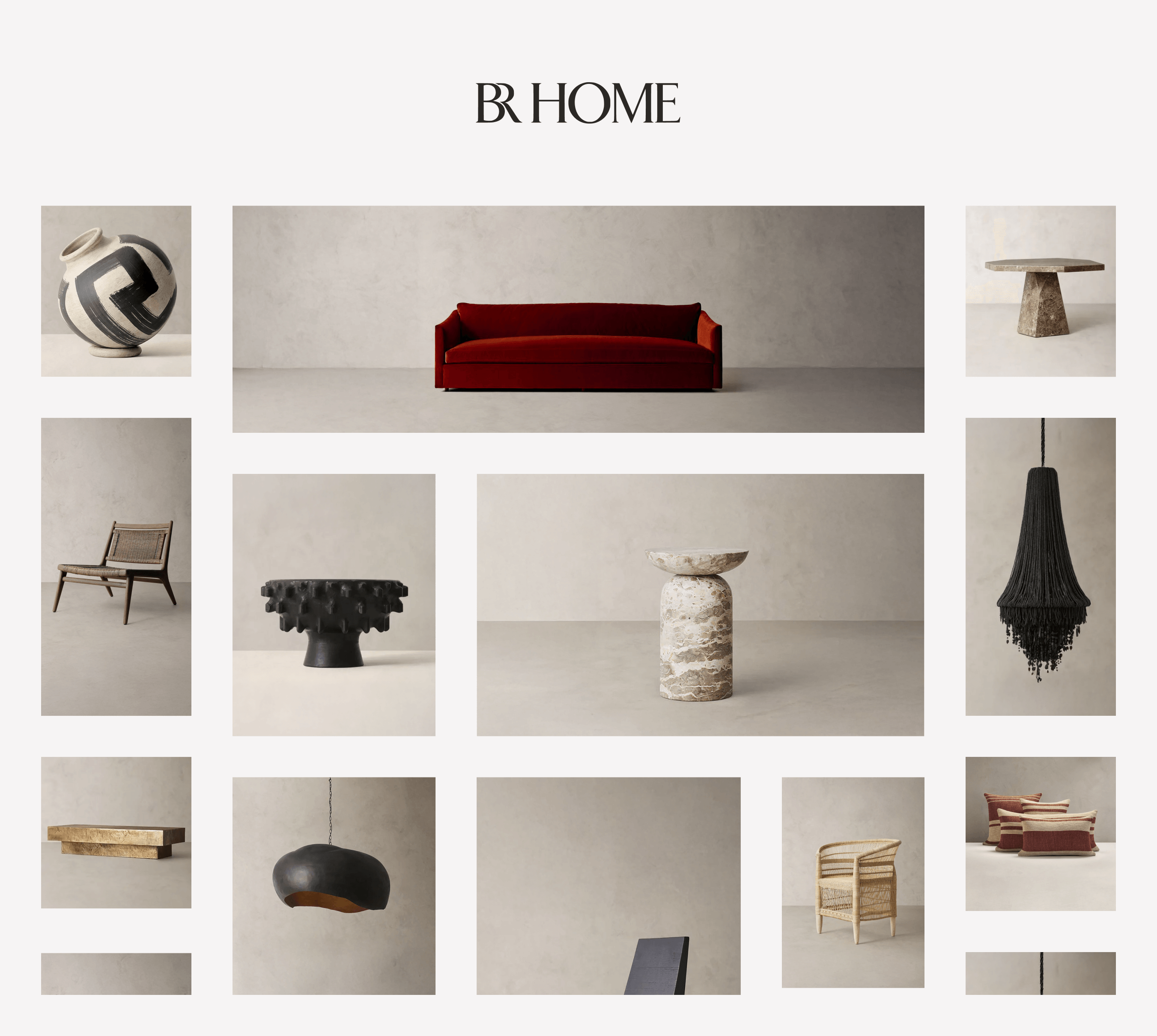
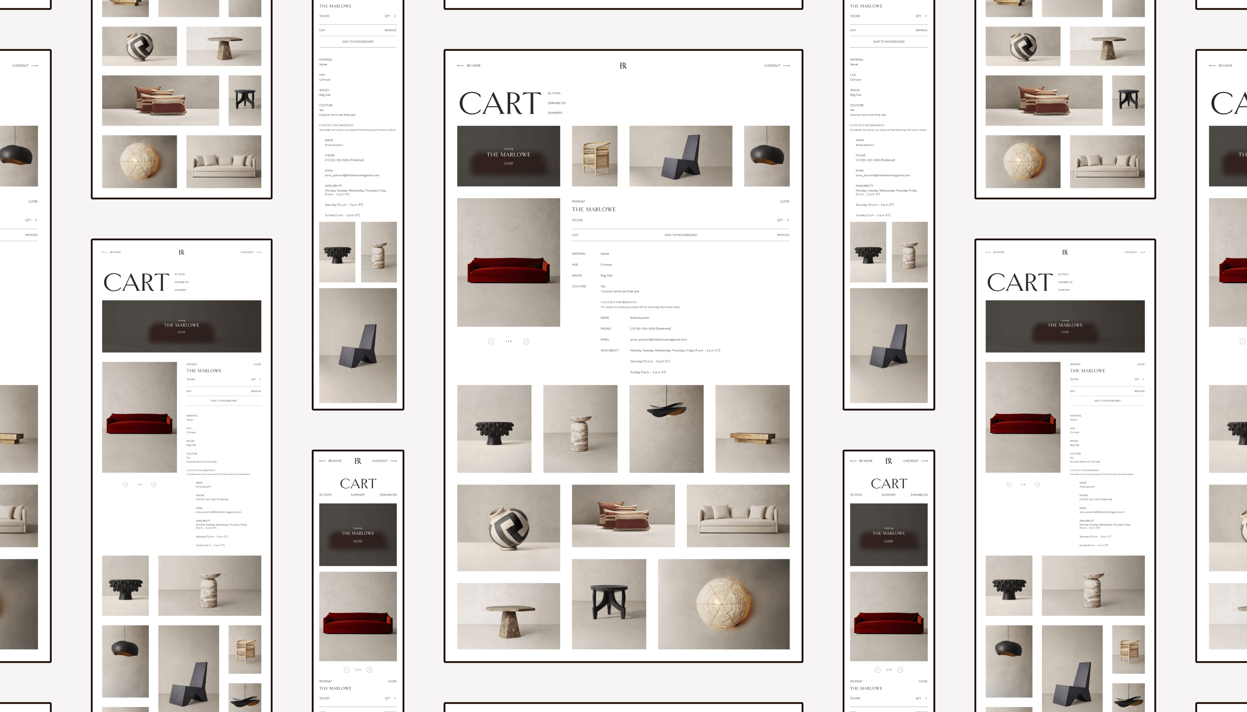
Products
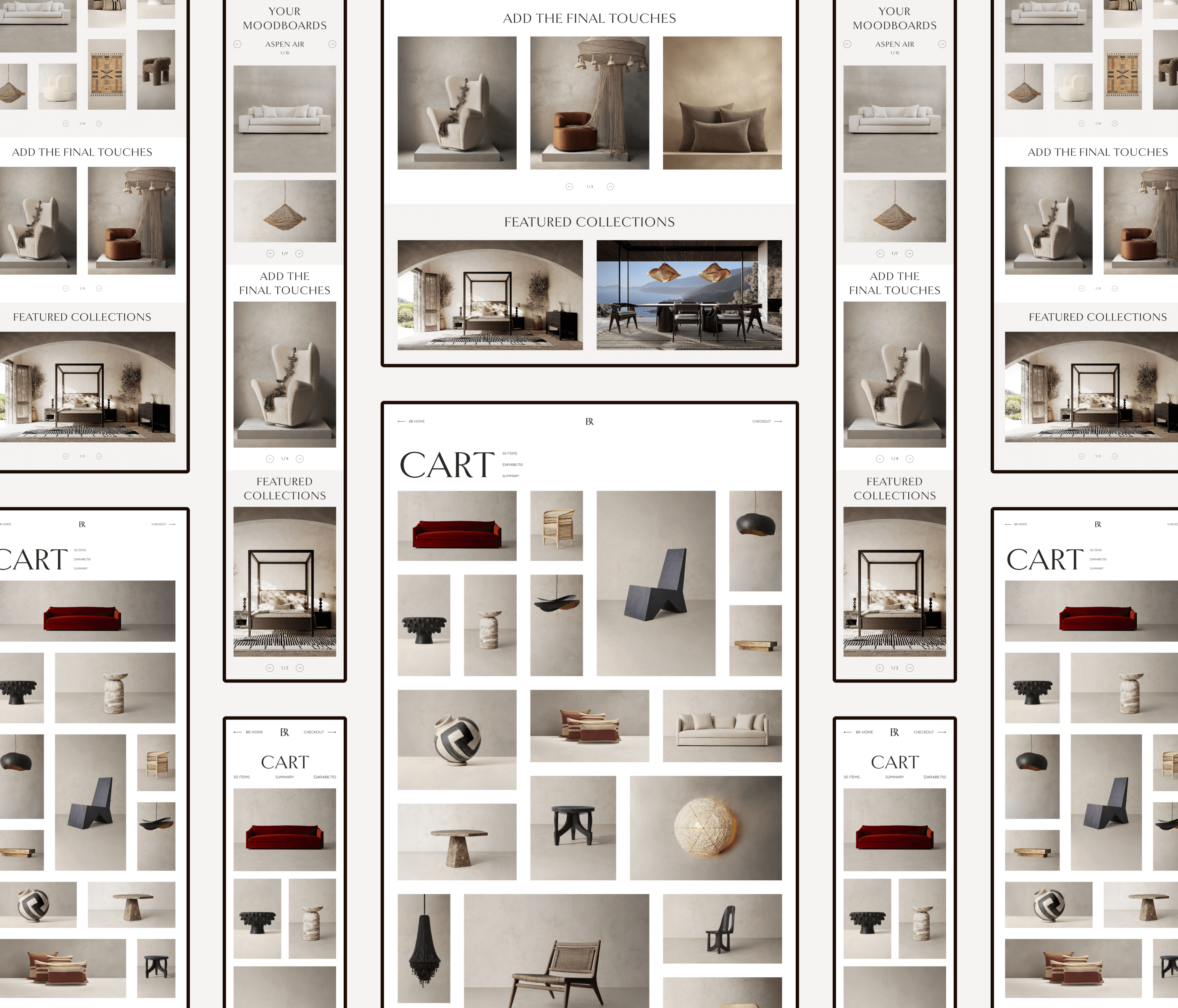
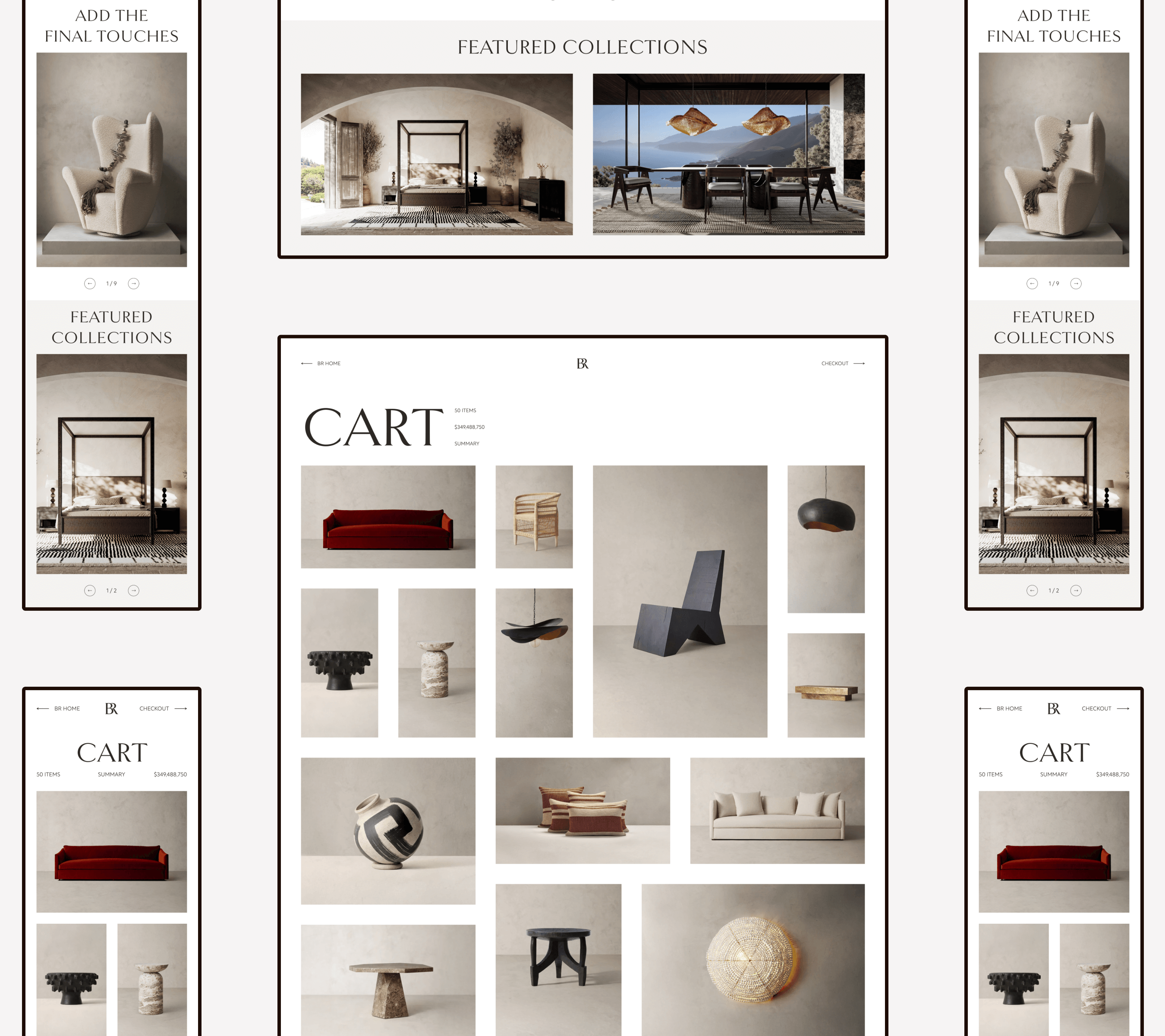
This is where the moodboard idea comes in. As mentioned before, a cart is like a moodboard, because you see all your selections in one place. For the product area of the cart, I only displayed their images and arranged them in a grid.
Stakeholders told me that our intended consumer wouldn’t add much to their carts, but I still designed for the outliers.
Design Quirks
To view the details of a product, users would need to click its image, and the product grid would adjust itself.
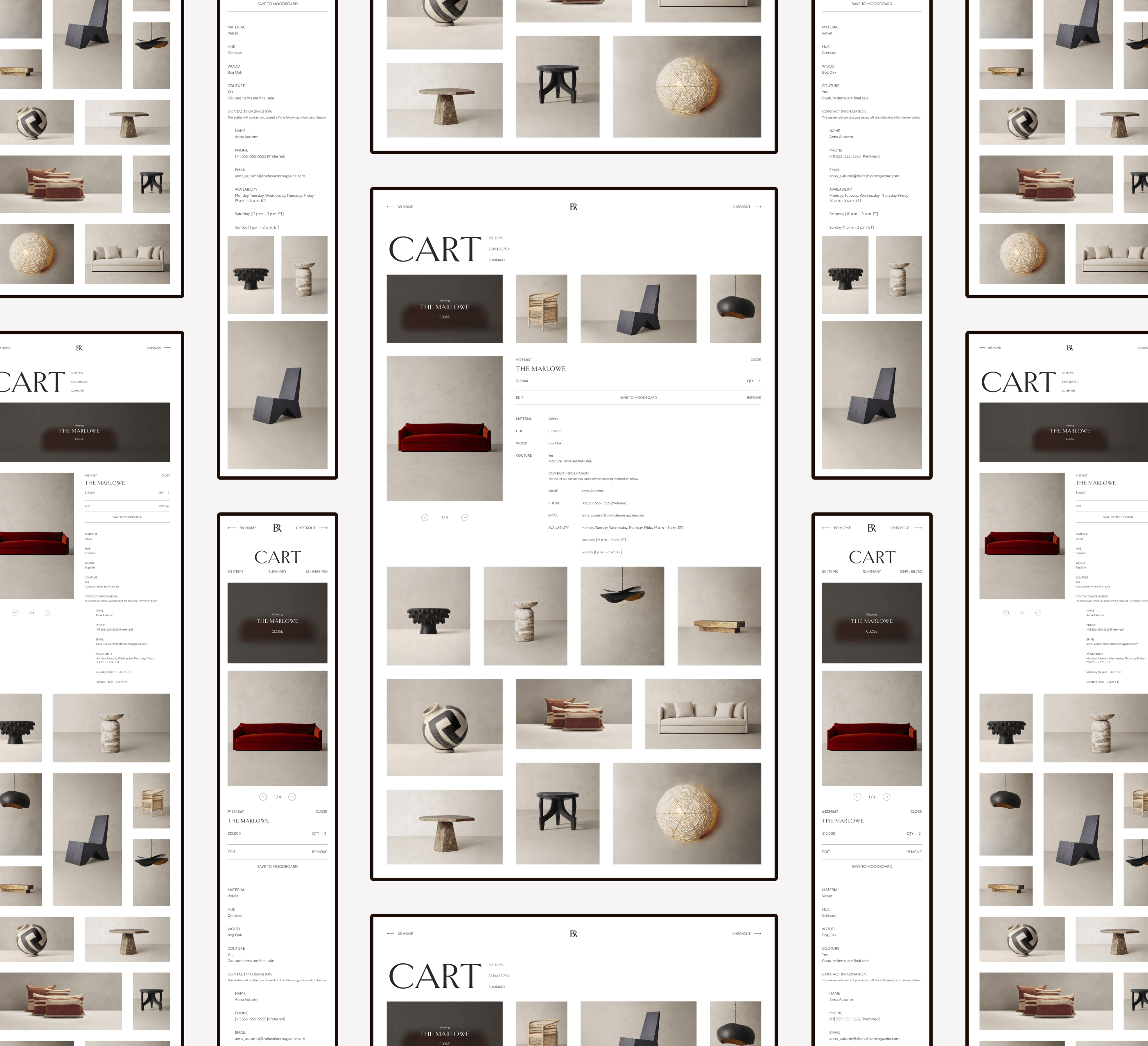
Additional Features
For the bottom portion of the cart, I enticed users to purchase more by displaying their moodboards (if they created any), adding a “final touches” section, and showing the current BR Home collections.
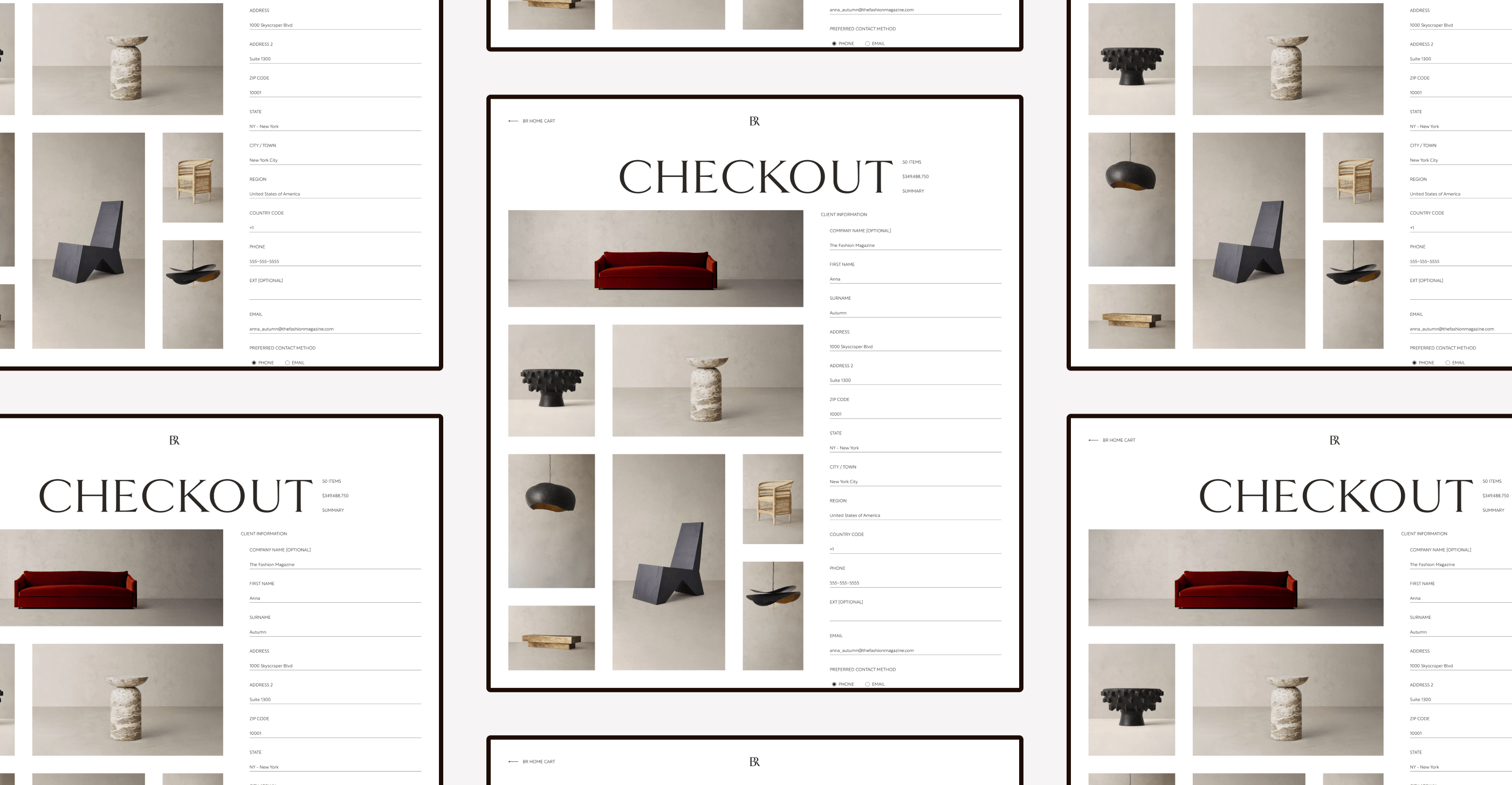
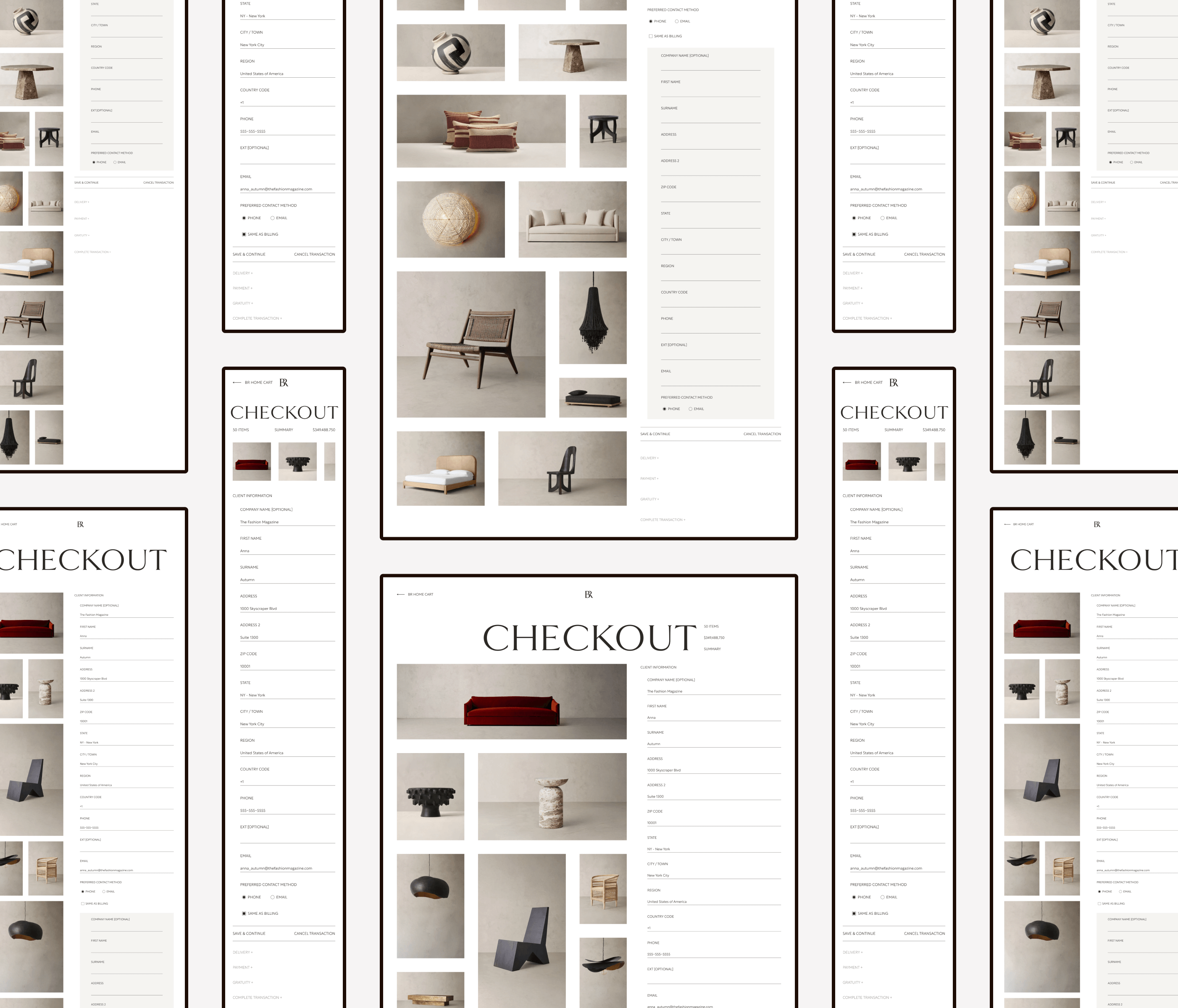
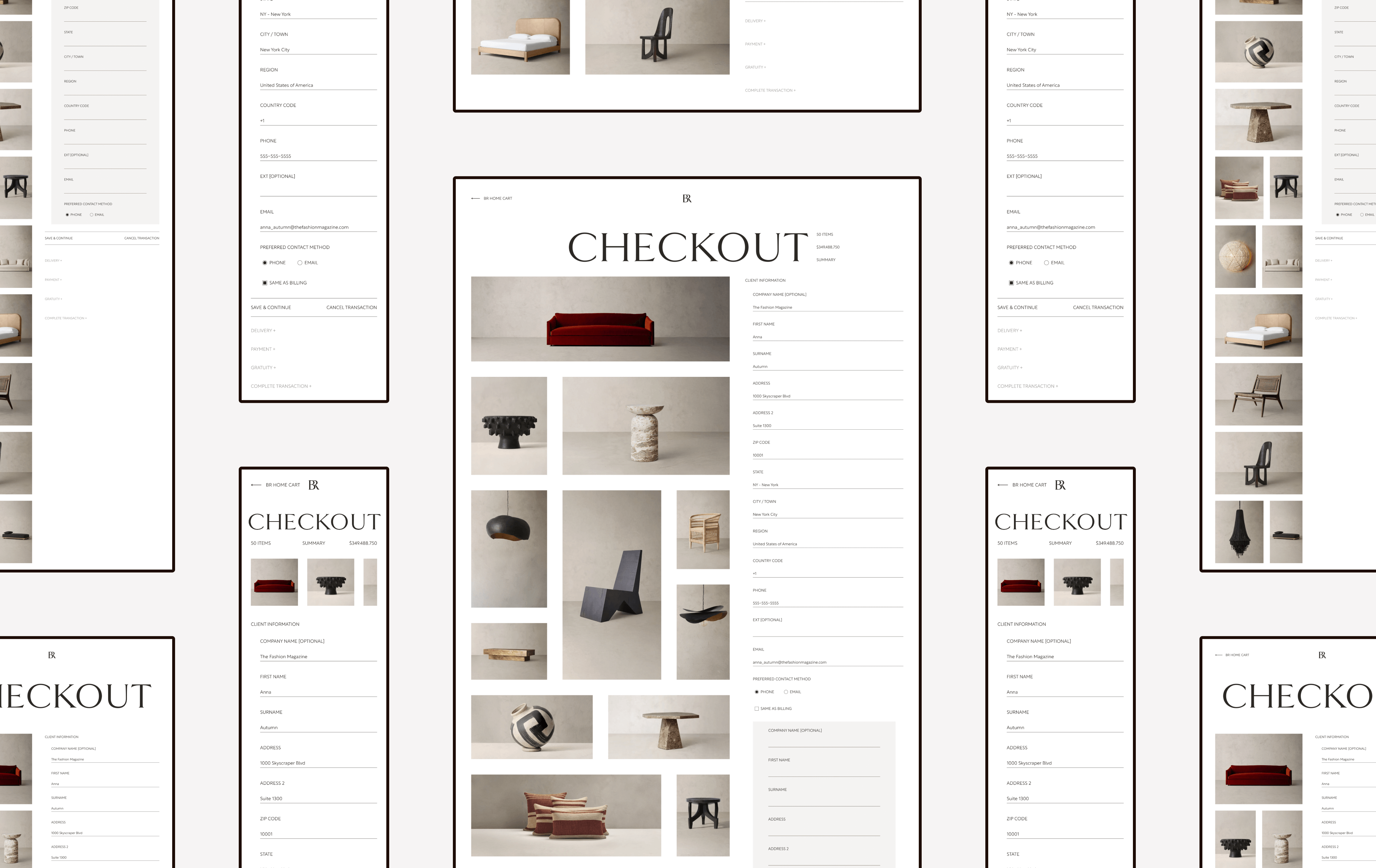
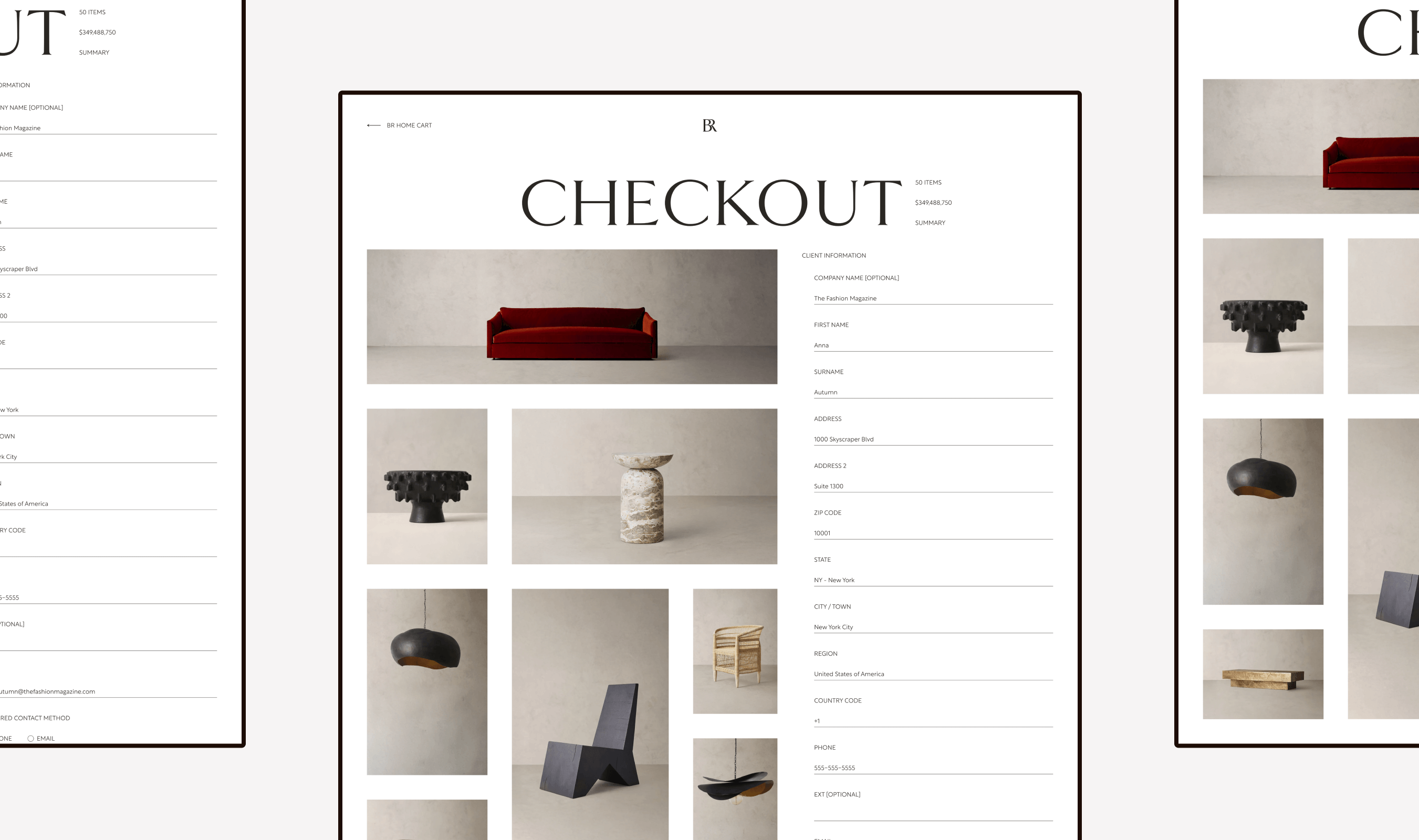
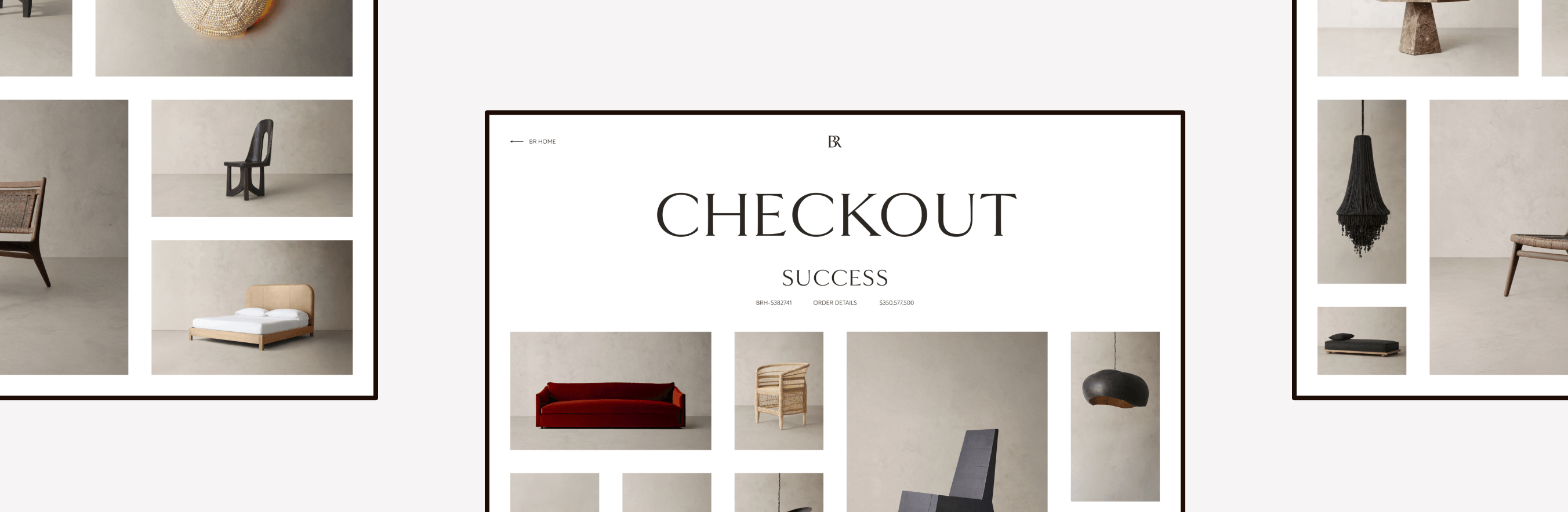
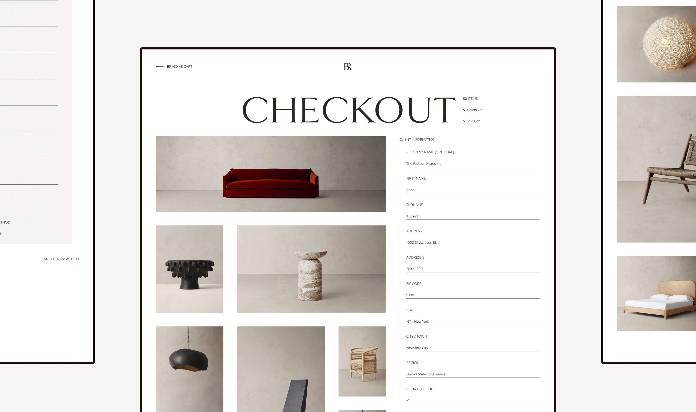
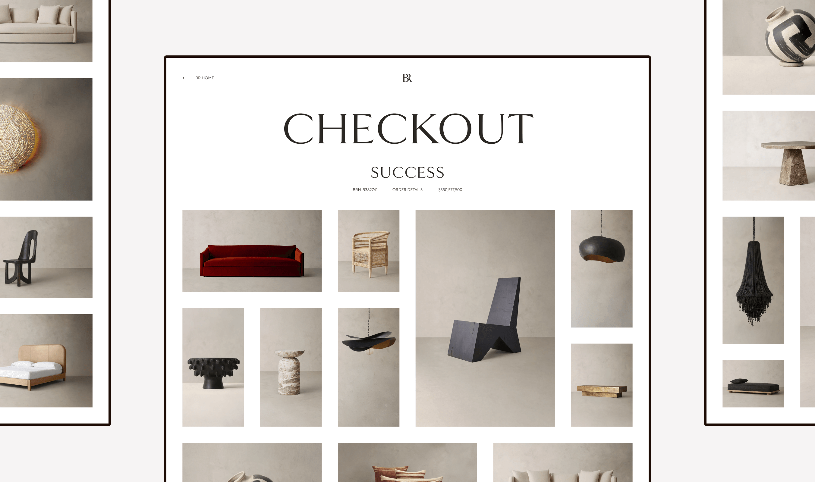
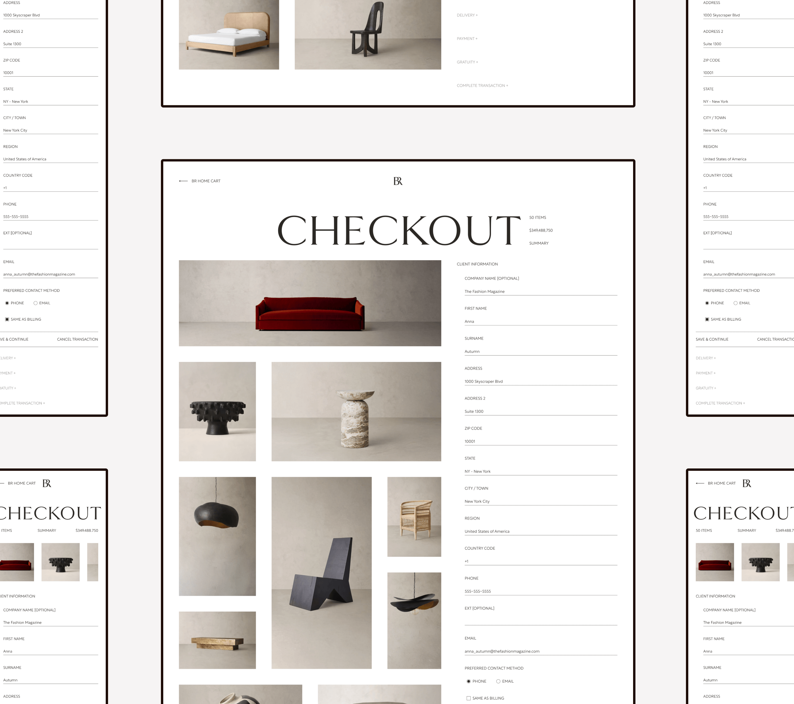
Checkout
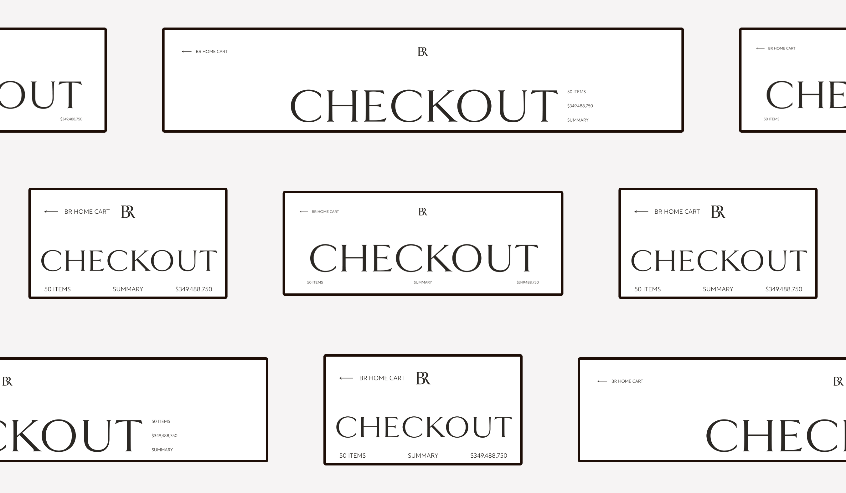
Header
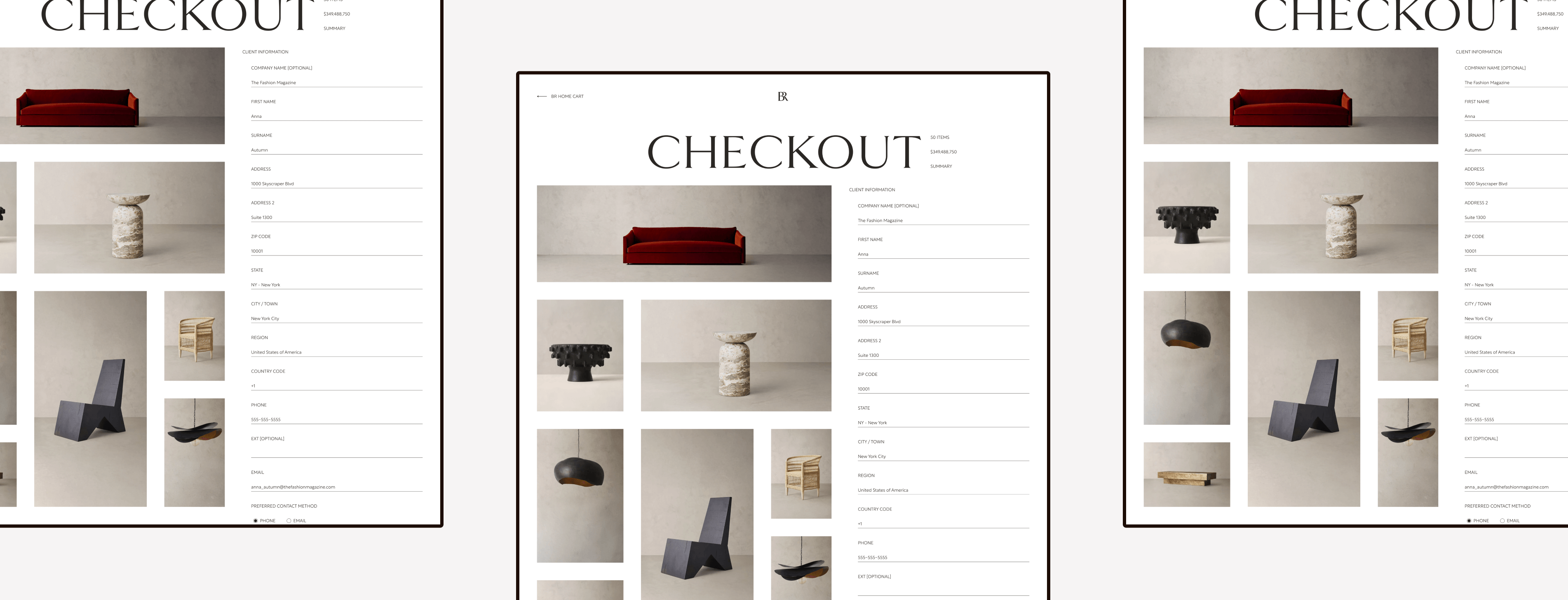
For the checkout portion of this design, I kept the header similar to the cart.
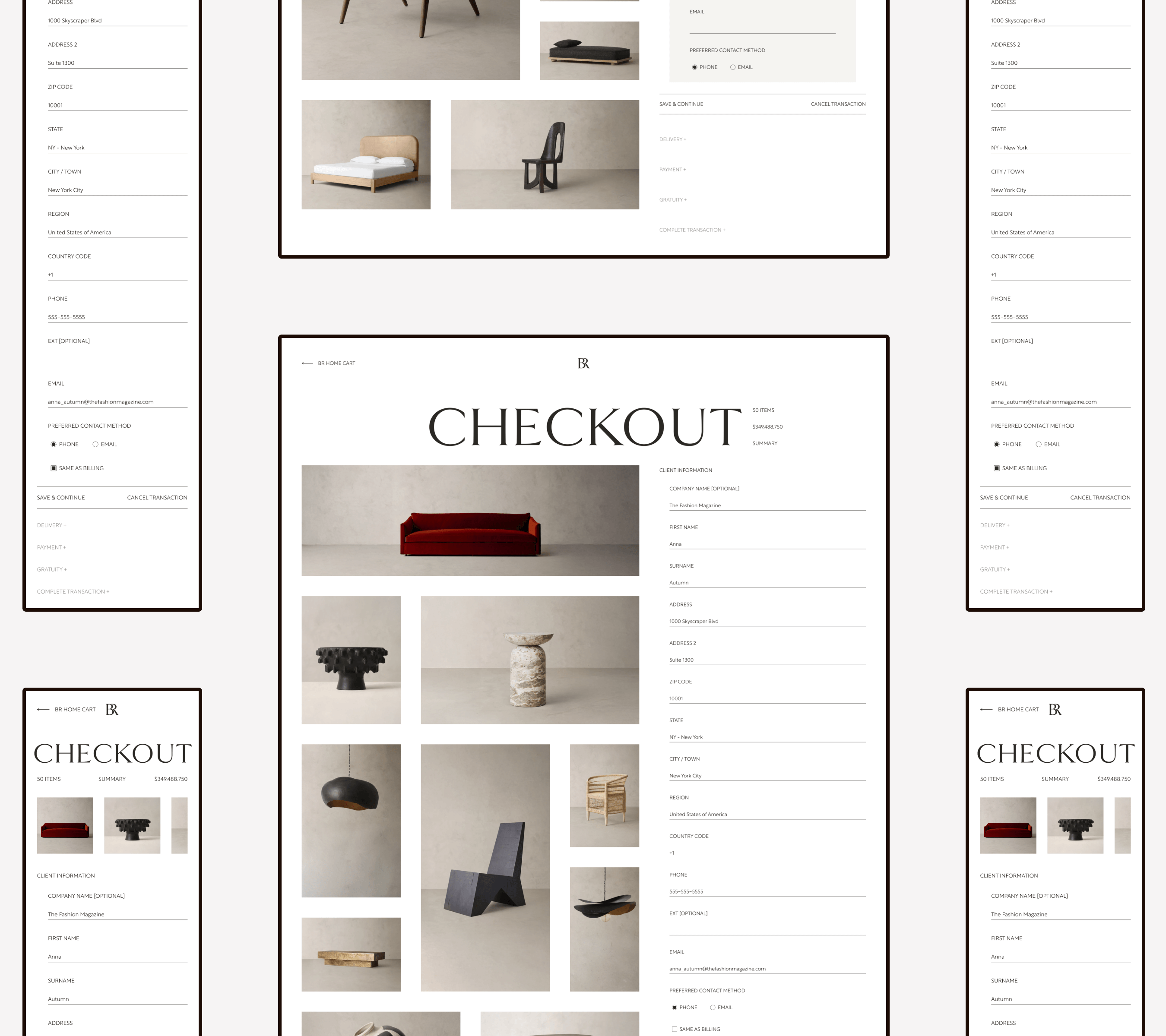
Checkout
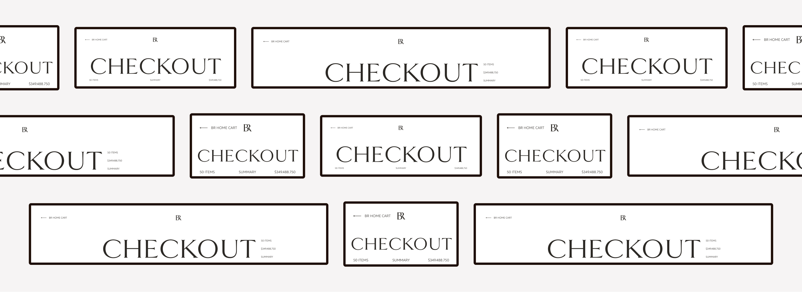
Cart
Content
I didn’t stray far from the norms. The usual sections are present for users to fill out, and users can view their cart items—only with this design, the cart products are still in the moodboard grid.
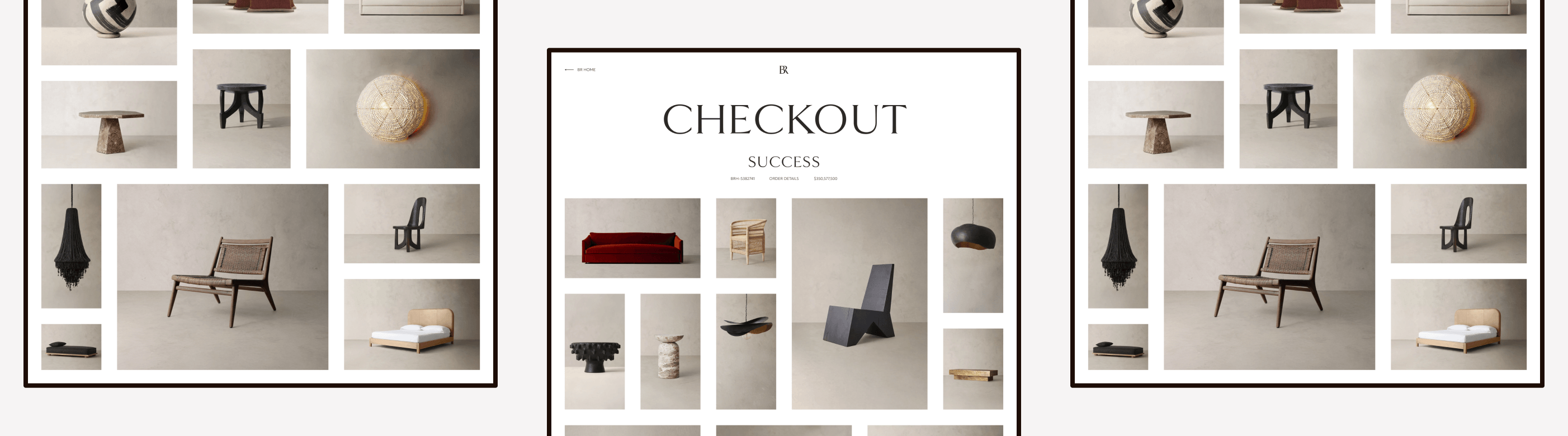
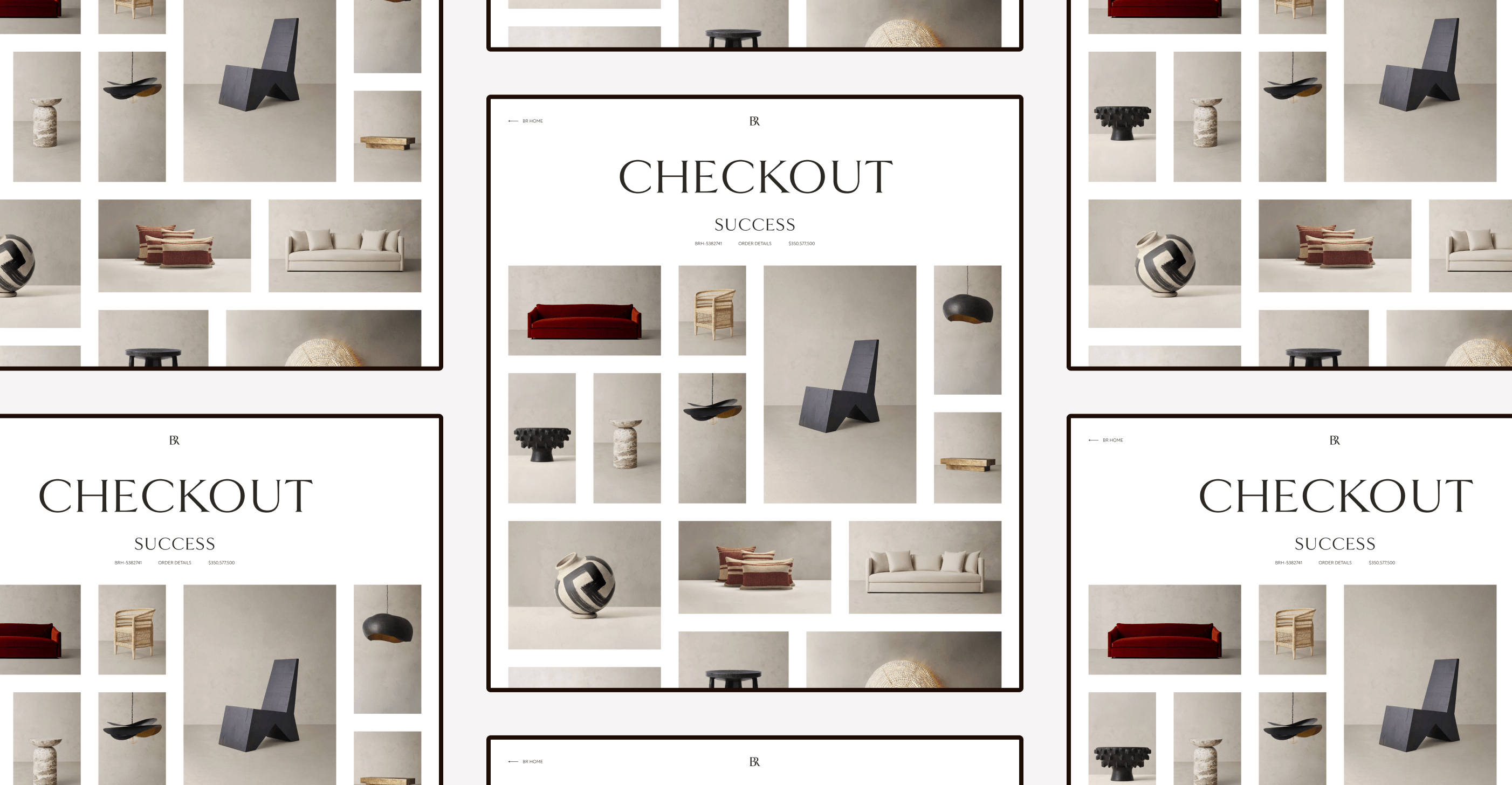
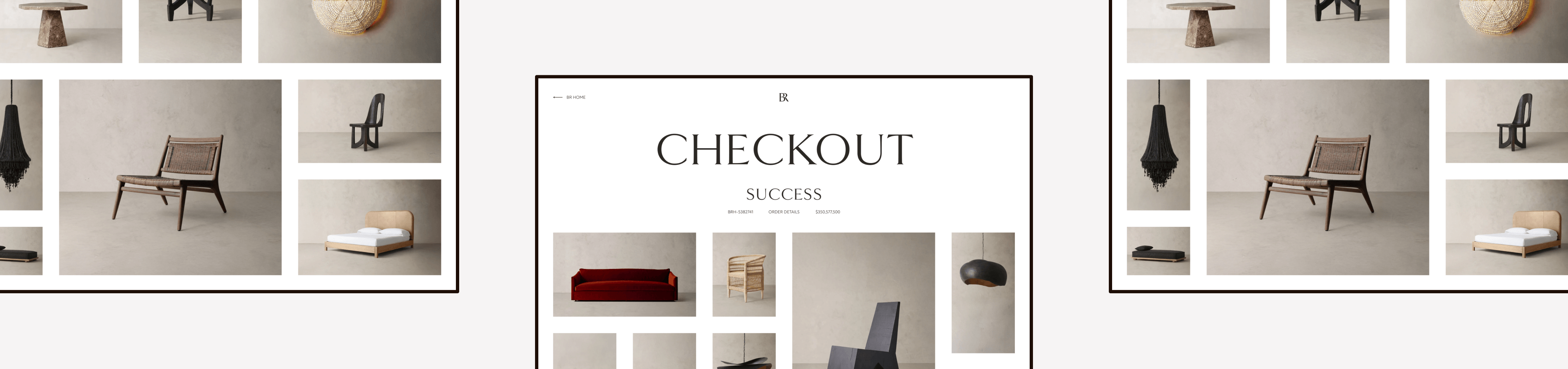
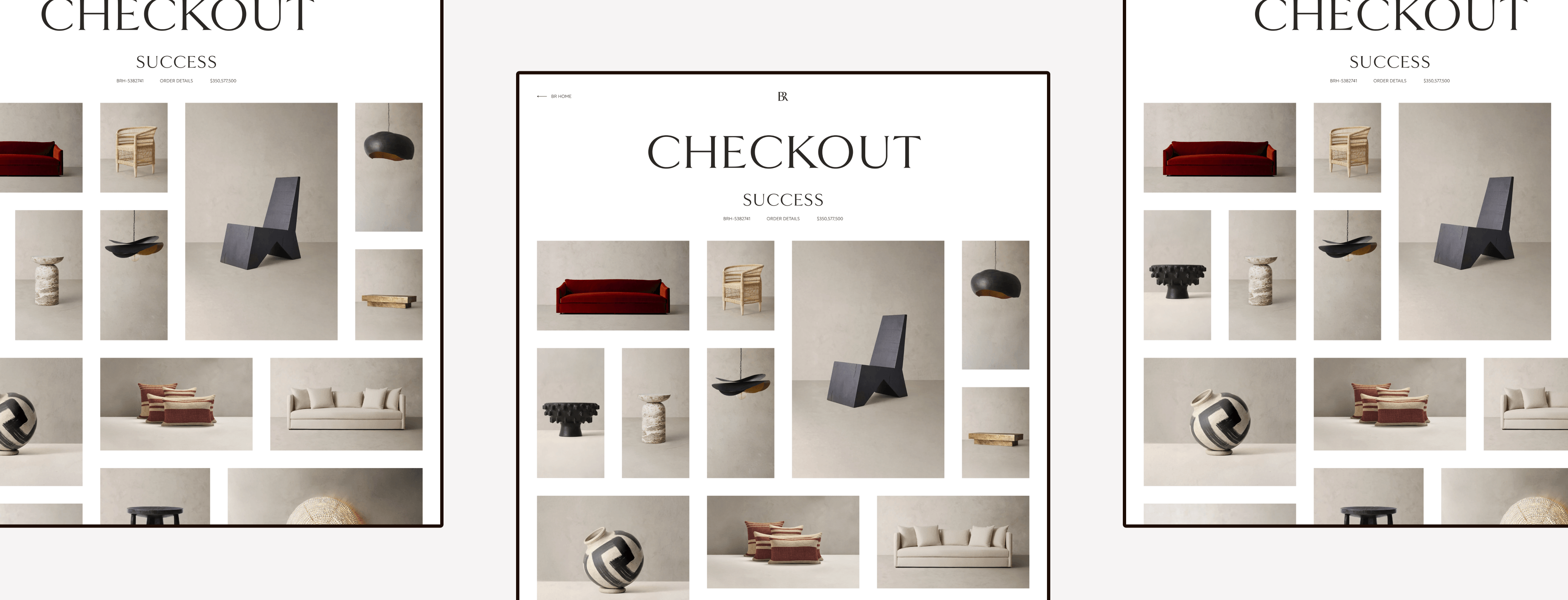
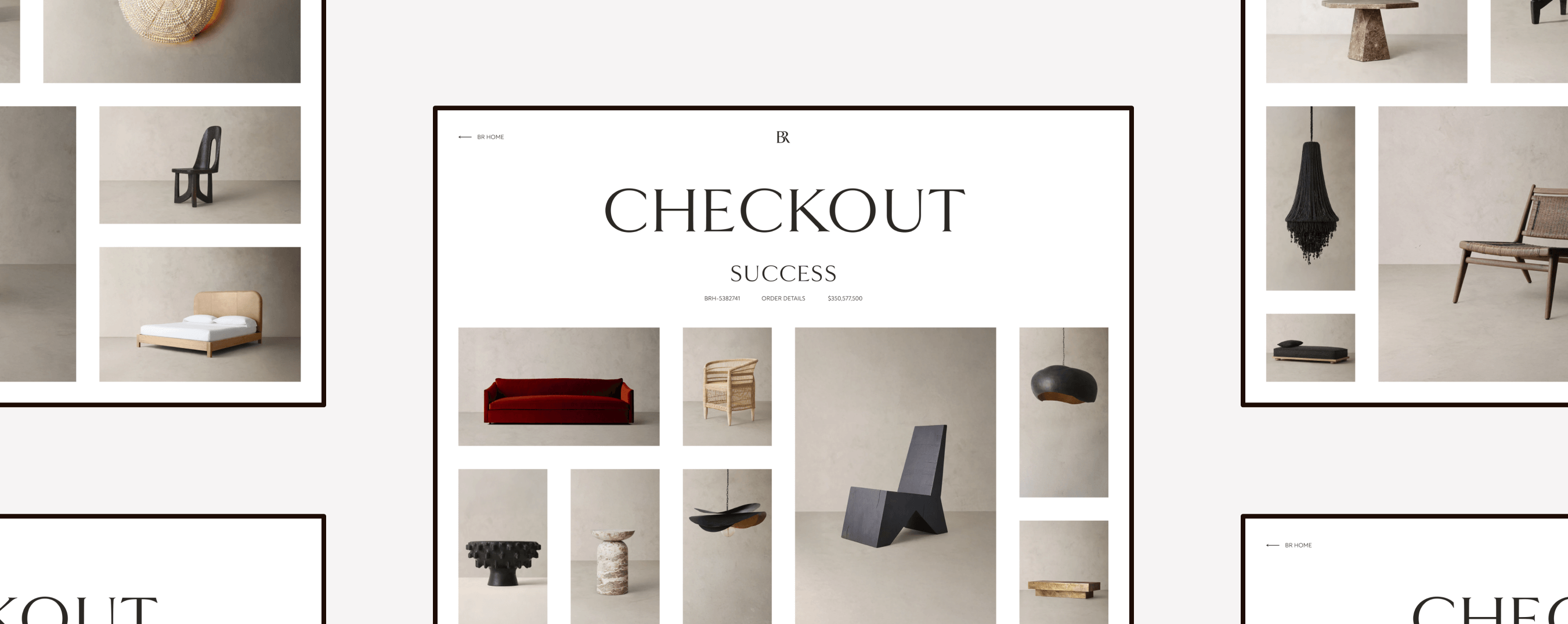
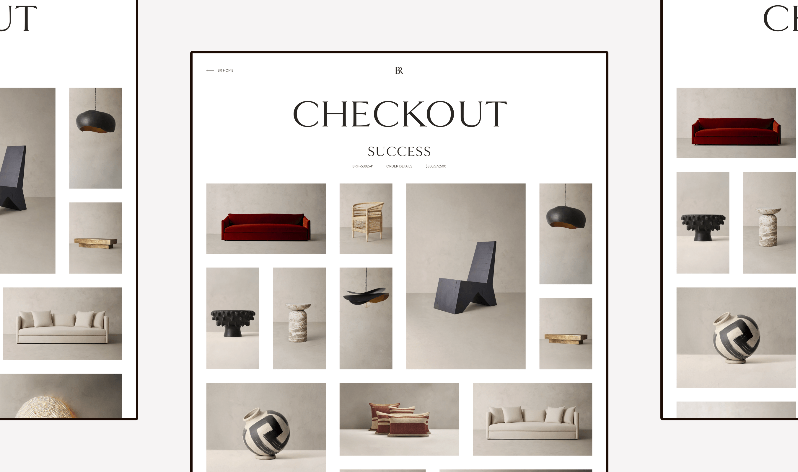
Successful Purchase
For the screen telling users their purchase is complete, I kept that simple too: the essentials are in the header, and the purchased items are displayed in the familiar grid.
The Final Results
Outcomes
So, how did we offer a cart and checkout experience that captures the essence of a luxury brand?
Research
Researched what other popular brands are doing
Inspiration
Took inspiration from established design patterns
A Luxurious Touch
Kept the experience clean and polished
Experiences
Due to company restructuring, I wasn’t able to gain much peer feedback or see if this design was technically feasible. So in my personal time, I fleshed out my idea and made responsive screens.
View Full Experience

Cart
View Cart
Checkout
View Checkout
The Final Results
My Takeaways
Taking unconventional design approaches doesn’t mean you have to reinvent the wheel. You can take parts of other established experiences and apply them to your scenario, even if the design solution hasn’t been traditionally done for your feature.
UI/UX Design Portfolio: Year 6 Edition
Concept
Cart to Comfort: Crafting a Chic Checkout
How might we offer a checkout experience that captures the essence of a high-end brand?
0 to 1 Design
E-commerce
Luxury Brand
Responsive Web
At a Glance
Chapter 01
The Challenges
- There were no user stories and barely any acceptance criteria.
- The brand was to be externally hosted. What were the limitations of the external host?
Solution: Let’s adopt established design patterns from other big companies and apply them to the cart and checkout experience.
Chapter 02
The Discovery
Gap Inc. wanted a website fit for a luxury brand, shoppers needed basic functionality, and stakeholders requested a unique cart and checkout experience. Before designing, I browsed around to gain design inspiration from others.
Chapter 03
The Design
When I view the websites of luxury brands, I think of “clean” and “polished”. There’s not much visual noise occurring on the page to distract you from the main attraction (from what I’ve seen, at least). So, that’s the approach I made to both the cart and checkout flow: clean and polished.
Chapter 04
The Final Results
Due to company restructuring, I wasn’t able to gain much peer feedback or see if this design was technically feasible. So in my personal time, I fleshed out my idea and made responsive screens.
My Takeaway: Taking unconventional design approaches doesn’t mean you have to reinvent the wheel.
Fine Print
Role
UI/UX Designer
Responsibilities
Cart Experience
Checkout Experience
Tools
Figma
Adobe Photoshop
Primary Deliverables
Cart Experience
Checkout Experience
Secondary Deliverables
High-Fidelity Wireframes
Prototypes
Company
Gap Inc.
Brand
BR Home
Industry
Home Furnishings
Luxury Retail
Outline
Front Matter
Chapter 01
Chapter 02
Chapter 03
Chapter 04
The Introduction
Imagine your company is creating a new brand, and you’re selected to be one of the few internal designers to work on it. That was my reality when the concept of Banana Republic Home, or BR Home, was ready to come to life.
BR Home
BR Home is currently a “home” category within Banana Republic, the iconic fashion brand; however, it was once a standalone luxury label with its own website.
External Partnership
An external design agency was hired to create the majority of the web experience, but Gap Inc. wanted some internal designers assisting, and that’s where I came in. I was tasked with creating the cart and checkout experience.
The Challenges
Project Ambiguity
There were no user stories and barely any acceptance criteria.
Thought
Let’s focus on ensuring I meet the current acceptance criteria. If they change, I can always adjust the design.
Design Limitations
The brand was to be externally hosted. What were the limitations of the external host?
Thoughts
Let’s design drafts and constantly ask for feedback. After receiving feedback, I can iterate and create a technically feasible design.
Opportunity
Since BR Home was going to be a luxury brand, I was encouraged to explore unconventional design approaches.
Thoughts
- How unique can I make this design before it becomes not user-friendly?
- I was told to push beyond traditional solutions, but I don’t want to stray far from well-known design patterns. So, let’s not reinvent the wheel to maintain a great user experience throughout the website.
How Might We...
How might we create a unique cart and checkout experience that has a good user experience?
How might we make the checkout experience unique yet luxury?
How might we offer a cart and checkout experience that captures the essence of a luxury brand?
The Challenges
The Solution
Let’s adopt established design patterns from other big companies and apply them to the cart and checkout experience.
The Discovery
Business Needs
We need a luxury website for the new home furniture and décor brand, BR Home.
User Needs
Shoppers need to edit items in their cart, remove items from their cart, and check out.
Design Research
Before designing, I browsed around to gain design inspiration from others:
Luxury Brands
- Gucci
- Louis Vuitton
- And more
Brands with Unique Carts
- Aēsop
- Zara
Internal Designs
Lastly, I peeked at other parts of the BR Home experience for design inspiration, and I really liked the concept of a moodboard grid.
Moodboard grids are an established design pattern on many digital experiences, like Pinterest and Instagram; however, they tend to only show images. If I were to go this route, how can I ensure that important text is shown to users?
The Discovery
Final Thoughts
A cart is like a moodboard, because you see all your selections in one place. So, I’m going to use this idea while incorporating other ideas from other websites.
The Design
When I view the websites of luxury brands, I think of “clean” and “polished”. There’s not much visual noise occurring on the page to distract you from the main attraction (from what I’ve seen, at least). So, that’s the approach I made to both the cart and checkout flow: clean and polished.
Cart Experience
Header
The header lists the essentials. If you want to know more about your cart, click “Summary” and the additional cart information appears (inspired by Aēsop).
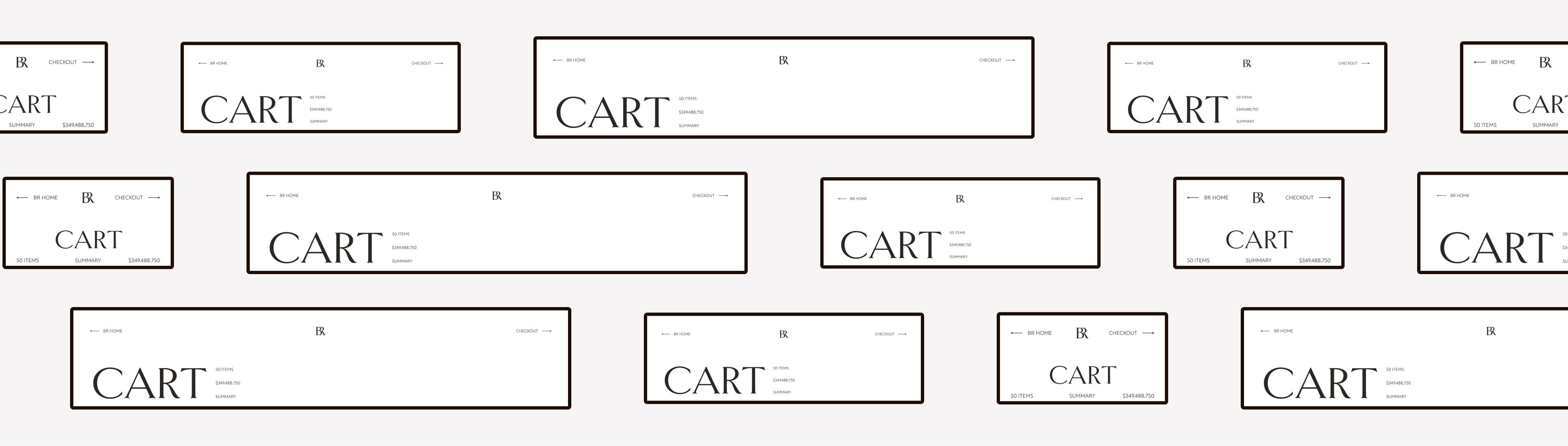
Products
This is where the moodboard idea comes in. As mentioned before, a cart is like a moodboard, because you see all your selections in one place. For the product area of the cart, I only displayed their images and arranged them in a grid.
Stakeholders told me that our intended consumer wouldn’t add much to their carts, but I still designed for the outliers.
Design Quirks
To view the details of a product, users would need to click its image, and the product grid would adjust itself.
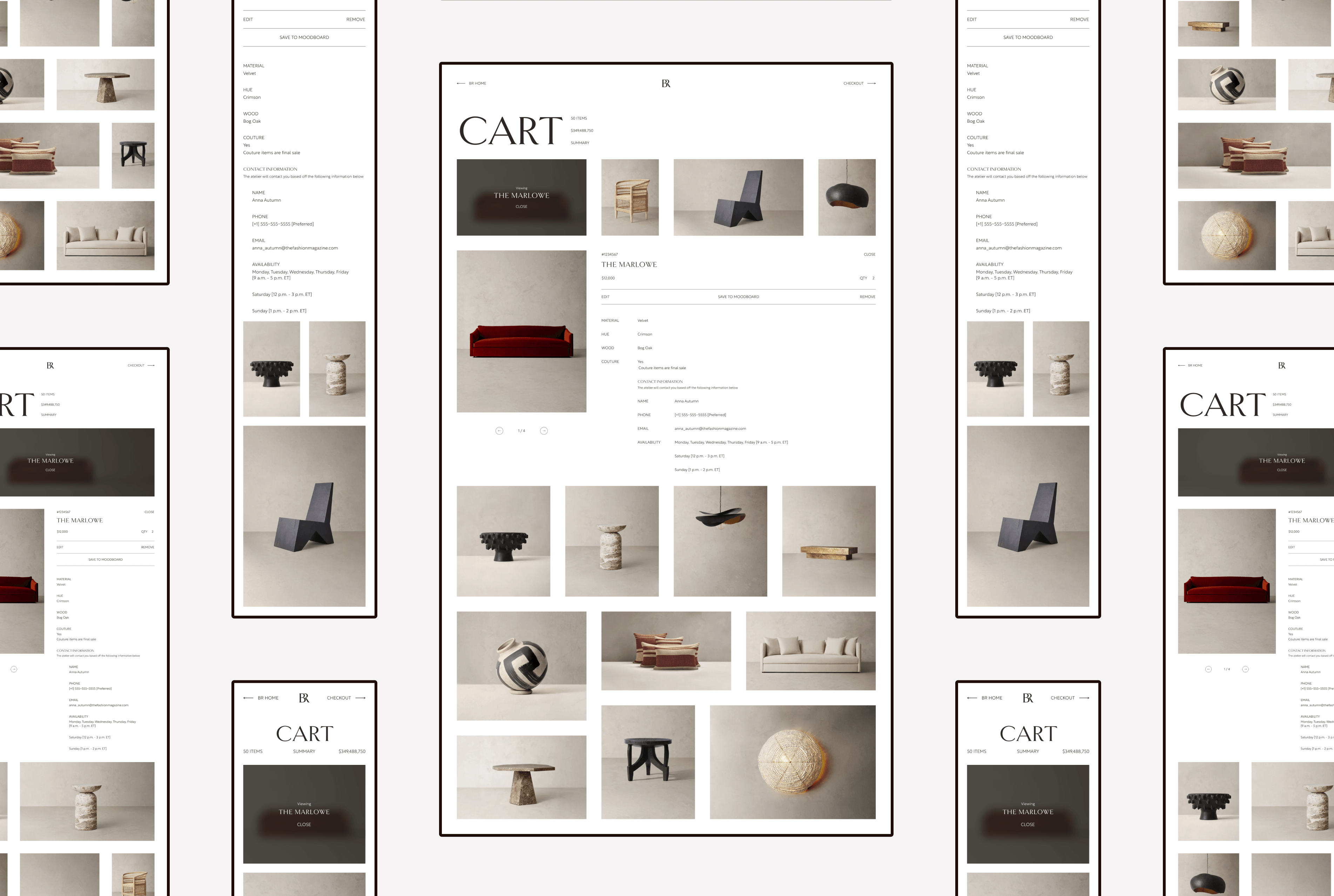
Additional Features
For the bottom portion of the cart, I enticed users to purchase more by displaying their moodboards (if they created any), adding a “final touches” section, and showing the current BR Home collections.
Checkout
Header
For the checkout portion of this design, I kept the header similar to the cart.
Checkout
Cart
Content
I didn’t stray far from the norms. The usual sections are present for users to fill out, and users can view their cart items—only with this design, the cart products are still in the moodboard grid.
Successful Purchase
For the screen telling users their purchase is complete, I kept that simple too: the essentials are in the header, and the purchased items are displayed in the familiar grid.
The Final Results
Outcomes
So, how did we offer a cart and checkout experience that captures the essence of a luxury brand?
Research
Researched what other popular brands are doing
Inspiration
Took inspiration from established design patterns
A Luxurious Touch
Kept the experience clean and polished
Experiences
Due to company restructuring, I wasn’t able to gain much peer feedback or see if this design was technically feasible. So in my personal time, I fleshed out my idea and made responsive screens.
View Full Experience
Cart
View Cart
Checkout
View Checkout
The Final Results
My Takeaways
Taking unconventional design approaches doesn’t mean you have to reinvent the wheel. You can take parts of other established experiences and apply them to your scenario, even if the design solution hasn’t been traditionally done for your feature.
UI/UX Design Portfolio: Year 6 Edition
Concept
Cart to Comfort: Crafting a Chic Checkout
How might we offer a checkout experience that captures the essence of a high-end brand?
0 to 1 Design
E-commerce
Luxury Brand
Responsive Web
At a Glance
Chapter 01
The Challenges
- There were no user stories and barely any acceptance criteria.
- The brand was to be externally hosted. What were the limitations of the external host?
Solution: Let’s adopt established design patterns from other big companies and apply them to the cart and checkout experience.
Chapter 02
The Discovery
Gap Inc. wanted a website fit for a luxury brand, shoppers needed basic functionality, and stakeholders requested a unique cart and checkout experience. Before designing, I browsed around to gain design inspiration from others.
Chapter 03
The Design
When I view the websites of luxury brands, I think of “clean” and “polished”. There’s not much visual noise occurring on the page to distract you from the main attraction (from what I’ve seen, at least). So, that’s the approach I made to both the cart and checkout flow: clean and polished.
Chapter 04
The Final Results
Due to company restructuring, I wasn’t able to gain much peer feedback or see if this design was technically feasible. So in my personal time, I fleshed out my idea and made responsive screens.
My Takeaway: Taking unconventional design approaches doesn’t mean you have to reinvent the wheel.
Fine Print
Role
UI/UX Designer
Responsibilities
Cart Experience
Checkout Experience
Tools
Figma
Adobe Photoshop
Primary Deliverables
Cart Experience
Checkout Experience
Secondary Deliverables
High-Fidelity Wireframes
Prototypes
Company
Gap Inc.
Brand
BR Home
Industry
Home Furnishings
Luxury Retail
Outline
Front Matter
Chapter 01
Chapter 02
Chapter 03
Chapter 04
The Introduction
Imagine your company is creating a new brand, and you’re selected to be one of the few internal designers to work on it. That was my reality when the concept of Banana Republic Home, or BR Home, was ready to come to life.
BR Home
BR Home is currently a “home” category within Banana Republic, the iconic fashion brand; however, it was once a standalone luxury label with its own website.
External Partnership
An external design agency was hired to create the majority of the web experience, but Gap Inc. wanted some internal designers assisting, and that’s where I came in. I was tasked with creating the cart and checkout experience.
The Challenges
Project Ambiguity
There were no user stories and barely any acceptance criteria.
Thought
Let’s focus on ensuring I meet the current acceptance criteria. If they change, I can always adjust the design.
Design Limitations
The brand was to be externally hosted. What were the limitations of the external host?
Thoughts
Let’s design drafts and constantly ask for feedback. After receiving feedback, I can iterate and create a technically feasible design.
Opportunity
Since BR Home was going to be a luxury brand, I was encouraged to explore unconventional design approaches.
Thoughts
- How unique can I make this design before it becomes not user-friendly?
- I was told to push beyond traditional solutions, but I don’t want to stray far from well-known design patterns. So, let’s not reinvent the wheel to maintain a great user experience throughout the website.
How Might We...
How might we create a unique cart and checkout experience that has a good user experience?
How might we make the checkout experience unique yet luxury?
How might we offer a cart and checkout experience that captures the essence of a luxury brand?
The Challenges
The Solution
Let’s adopt established design patterns from other big companies and apply them to the cart and checkout experience.
The Discovery
Business Needs
We need a luxury website for the new home furniture and décor brand, BR Home.
User Needs
Shoppers need to edit items in their cart, remove items from their cart, and check out.
Design Research
Before designing, I browsed around to gain design inspiration from others:
Luxury Brands
- Gucci
- Louis Vuitton
- And more
Brands with Unique Carts
- Aēsop
- Zara
Internal Designs
Lastly, I peeked at other parts of the BR Home experience for design inspiration, and I really liked the concept of a moodboard grid.
Moodboard grids are an established design pattern on many digital experiences, like Pinterest and Instagram; however, they tend to only show images. If I were to go this route, how can I ensure that important text is shown to users?
The Discovery
Final Thoughts
A cart is like a moodboard, because you see all your selections in one place. So, I’m going to use this idea while incorporating other ideas from other websites.
The Design
When I view the websites of luxury brands, I think of “clean” and “polished”. There’s not much visual noise occurring on the page to distract you from the main attraction (from what I’ve seen, at least). So, that’s the approach I made to both the cart and checkout flow: clean and polished.
Cart Experience
Header
The header lists the essentials. If you want to know more about your cart, click “Summary” and the additional cart information appears (inspired by Aēsop).
Products
This is where the moodboard idea comes in. As mentioned before, a cart is like a moodboard, because you see all your selections in one place. For the product area of the cart, I only displayed their images and arranged them in a grid.
Stakeholders told me that our intended consumer wouldn’t add much to their carts, but I still designed for the outliers.
Design Quirks
To view the details of a product, users would need to click its image, and the product grid would adjust itself.
Additional Features
For the bottom portion of the cart, I enticed users to purchase more by displaying their moodboards (if they created any), adding a “final touches” section, and showing the current BR Home collections.
Checkout
Header
For the checkout portion of this design, I kept the header similar to the cart.
Checkout
Cart
Content
I didn’t stray far from the norms. The usual sections are present for users to fill out, and users can view their cart items—only with this design, the cart products are still in the moodboard grid.
Successful Purchase
For the screen telling users their purchase is complete, I kept that simple too: the essentials are in the header, and the purchased items are displayed in the familiar grid.
The Final Results
Outcomes
So, how did we offer a cart and checkout experience that captures the essence of a luxury brand?
Research
Researched what other popular brands are doing
Inspiration
Took inspiration from established design patterns
A Luxurious Touch
Kept the experience clean and polished
Experiences
Due to company restructuring, I wasn’t able to gain much peer feedback or see if this design was technically feasible. So in my personal time, I fleshed out my idea and made responsive screens.
View Full Experience
Cart
View Cart
Checkout
View Checkout
The Final Results
My Takeaways
Taking unconventional design approaches doesn’t mean you have to reinvent the wheel. You can take parts of other established experiences and apply them to your scenario, even if the design solution hasn’t been traditionally done for your feature.